Bubbles, they bounce! Introducing bubble charts
Make your visualizations pop with our new Bubble Chart template
We are often asked for easy ways to visualize groups of people, objects or events while using labels and images. While our Scatter, Hierarchy and Survey templates allow this to a certain extent, we are now thrilled to introduce our brand new Bubble Chart template!
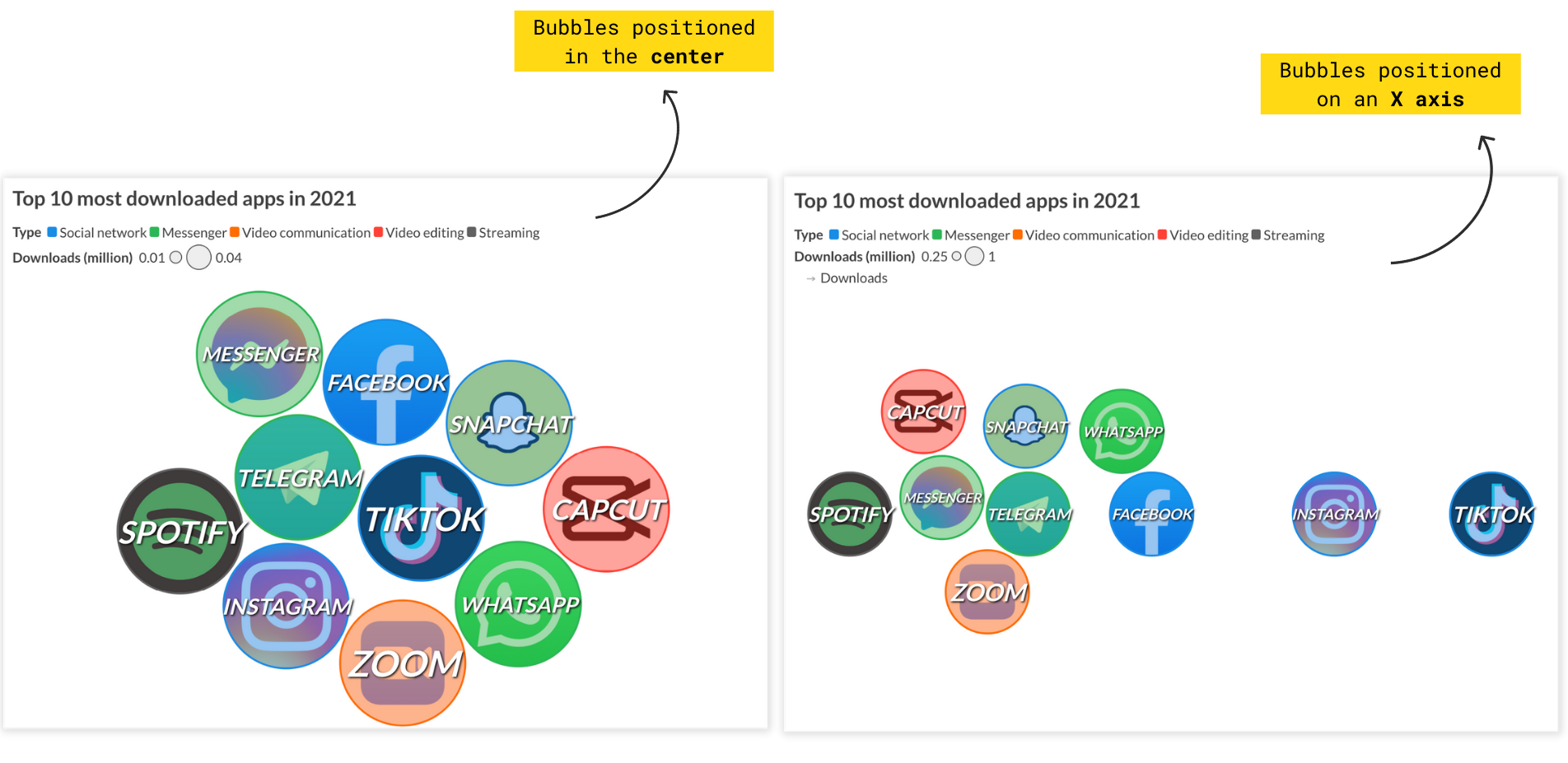
Designed with customization and simplicity in mind, our new template allows you to present individual data points as bubbles. With bubbles sized proportionally, positioned on an axis, grouped by color or accompanied by images and text, you can make engaging and beautiful visualizations.
Why use a bubble chart?
You can use a bubble chart for something as simple as visualizing a group of people with a bubble each, or add more information through coloring and sizing. You can even add a fourth dimension to your visualization through an X axis – for example, to examine differences over time or magnitude.
How to get started
To create your own bubble chart, your data must be in a wide format with one row for each bubble. The only required column is Label.
You can add additional columns to control the color, size, axis values and image for your bubbles, or add any extra information for the popups. When supplying axis values, your bubbles can be positioned along an X axis. Otherwise, your bubbles will appear in a circle layout.
If you don’t supply a column to proportionally size by, the template will automatically calculate the appropriate size for your bubbles, considering the number of entries as well as the height of the visualization.
Bubble trouble
While bubble charts are a fun and engaging chart type to use, it’s important to note that they aren’t the best choice for allowing your users to read specific values at a first glance. While the visualization may look pretty, it could be complicated for a non-experienced data visualization audience to taking so many variables into consideration. Therefore, it is important you provide additional visual clues.
- Use labels and appropriate colors – they improve your chart’s communication abilities.

- Get the most out of the legends – coloring your bubbles by category is another easy way to create a stunning, yet understandable chart. You can also benefit from highlighting specific bubbles to concentrate the attention on a certain aspect of your narrative.
- Add additional information in the popups and panels – they come in handy for displaying the exact value (size) of each bubble. Learn more about custom popups here.
By the way, in case you hadn’t noticed: The title of this blog post is inspired by the Flourish team’s favorite band, Hot Chip. We can’t wait to see what you create with this template. Tag us on social media or drop us a line at hello@flourish.studio.