Masters series: Recreating John Snow's cholera map
See an interactive version of John Snow's iconic cholera map

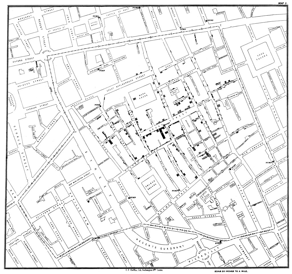
John Snow was an English physician who used a dot map to identify the source of London's cholera epidemic in the 19th century. Image via Wikimedia Commons.
The Flourish team spends a lot of time admiring work by the best visualization practitioners. And so do our users. When a cool visualization goes viral, we often get asked: “Can I do that in Flourish?”. Hence this blog series, which celebrates popular visualizations and looks at how you can achieve similar things in Flourish. You can check out previous Master’s series posts here.
For today’s Masters series post, we recreated a pivotal project in the history of mapping and epidemiology: John Snow’s cholera map. Using our 3D Map template with a styled base map and extruded regions, we displayed the iconic map with an additional height dimension.
John Snow was an English physician who lived in the 19th century. Although he did remarkable advancements in the field of anaesthetics, he is widely known among the data visualization community for his map depicting deaths in Soho from the cholera outbreak of 1854.
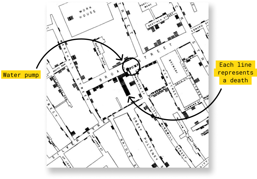
Unlike his contemporaries, John Snow believed cholera was transmitted through contaminated sources of water rather than through the air and he managed to prove his point through his now-famous map. After the cholera outbreak on Broad Street in 1854, he plotted deaths and discovered that most of them had occurred close to a public water pump.
Left: Snow's map of the cholera outbreak on Broad Street in 1854 was published in the report On the Mode of Communication of Cholera in 1855. Image via Wikimedia Commons. Right: Recreation using our 3D Map template
Why was this map so crucial?
Many of the things Snow did when he build his map were not new. But, as Michael Friendly and Howard Wainer explain in their book A History of Data Visualization & Graphic Communication, the novelty was the connection between the graphic representation and the search for a logical explanation for the cause of the disease.
Without visualizing the data on a map, it would have been difficult to realize that most cholera deaths were clustered around a single pump. Snow’s research paved the way for data visualization as a tool for statistical analysis.
How to make something like this using Flourish
Step 1: Prep your data
To build this map we used Dr. Robin Wilson’s data as our source. His files were optimized for GIS systems which are not compatible with Flourish. In order to work with them, we converted the files with the coordinates for the pumps and the deaths to be in a CSV format.
The original data contains a single set of coordinates for each building where cholera deaths were registered, which would result in a point map. In order to create our extruded map, we needed regions that contained the death data instead. To achieve this, we wrote a script that converted the initial single-pair coordinate sets into custom GeoJSON regions that replaced the stacked bars of the original map. These custom polygons are rectangles with four sets of coordinates, one for each corner, and a “count” property that contains the number of people who died at that specific location.
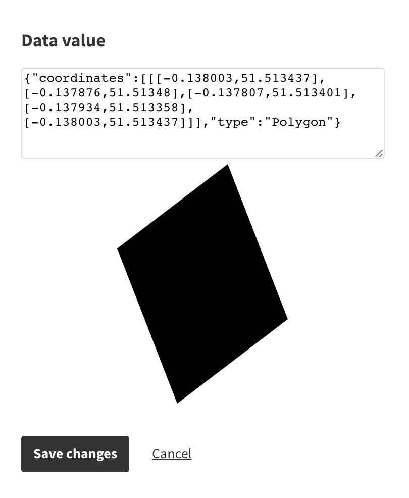
The process to get or create custom GeoJSON files varies from case to case; however, one thing you need to be aware of when uploading custom GeoJSON files into Flourish is that the JavaScript object follows this format:
{"coordinates":[[[-0.138003,51.513437],[-0.137876,51.51348],[-0.137807,51.513401],[-0.137934,51.513358],[-0.138003,51.513437]]],"type":"Polygon"}
The object is composed of two parts: the “coordinates” key term ahead of the latitude and longitude pairs that compose the figure, and a key-value pair that reads “type”:”Polygon”.
While we wrote a script to help us translate the latitudes and longitudes from the dataset to polygons, it’s also possible to use free tools such as GeoJSON.io to draw the shapes you’d like to extrude with your data.
Step 2: Build a 3D Map
Once you have sorted your polygons, it’s time to start plotting!
Select one of our 3D Map template starting points and clear the Points sheet and the Regions sheet. Then, upload your own data into both of these tabs.
In the Regions sheet, bind your custom polygons to the Geometry binding and bind your numeric data to the Value and Height bindings. In this case, we bound the number of deaths to both.
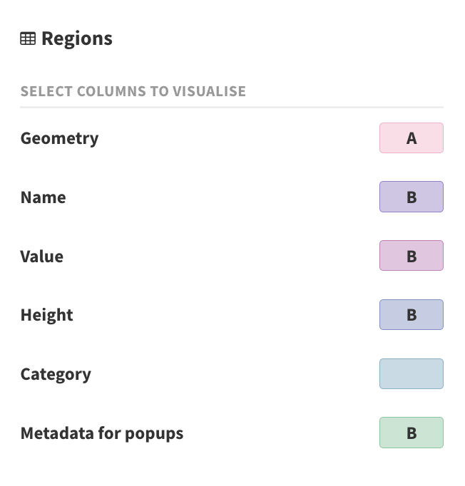
If you have points data, bind it accordingly in the Points sheet. In our case, we used points to represent the water pumps.
In the Preview tab, go to the Base map setings and change the Map style to your liking. We used the Positron base map style but you can choose whichever style you prefer.
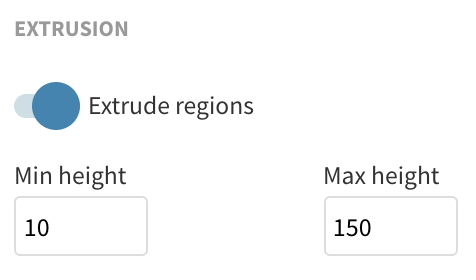
Go to the Regions settings and toggle the Extrude regions option on. This will adjust the height of your polygons to match your numeric data. Under these settings, set a minimum and maximum height for your extruded regions.
Under the Region fill settings, change the Scale type from Categorical to Numeric. This will shade the blocks according to the number of deaths. You can choose from a wide range of palettes or create a custom palette.
Finally, to constrain the zoom level and the vertical rotation of the map (also called pitch), go to the Viewport and interaction settings.
Step 3: Build a story
Add the final touches to your visualization by adding it to a Flourish story.
- Create a Flourish story and add the visualization as a slide.
- Scale and rotate the map to your liking. Unlike regular visualizations, stories capture the current position of your map and will always display it like that.
- If you only want to display a single visualization, disable your story navigation in order to create a single-slide story. Alternatively, you can string together different views of your map and allow your users to animate between them.
Try it yourself – and don’t forget to credit!
We would love to see anything you make with this kind of technique, so whether you decided to give this famous map your own twist or create something new with custom polygons and extruded regions, let us know via Twitter.
Thanks to Dr. Robin Wilson for compiling this data and making it available to the public. And to the Flourish team – Mark L, Tim, Andrew W, Bobby, Luisa, Eade, Helena, Ilias and Olivia – for collaborating on this project.
Have you come across a brilliant visualization you’d like to see in this series? Let us know!