Create interactive pictograms without coding
Create beautiful and interactive isotype charts with our Pictogram template
Pictogram charts are a great choice for communicating statistics in a visually engaging way. Use our Pictogram template to encode numeric data as groups of repeated icons, each of which represents a fixed quantity.
Pictogram charts are often used for single-dimensional data, with one bar of icons per category. But as the examples in the above story shows, a second dimension can be added using a stacked bar layout.
What are pictograms and when should you use them
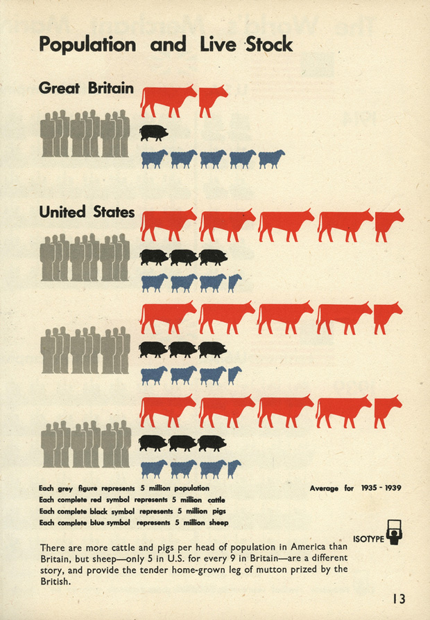
Otto and Marie Neurath shaped modern information graphics and visual storytelling with isotype charts. Image via brainpickings.org
Pictographic visualization was pioneered in the early twentieth century by Marie and Otto Neurath and Gerd Arntz. Their aim was to educate people about the world by making statistics more accessible. Indeed, the word “isotype” was their acronym (or possibly backronym), for “International System Of Typographic Picture Education”.
As Jason Forrest writes in his excellent history of isotype charts on Nightingale, Otto Neurath described his design philosophy as being optimized for engagement and memory rather than visual precision. “It’s better to remember simplified images than to forget exact figures.”
The pros and cons of pictograms reflect this history. They are visually memorable, and the icons can make categories immediately legible – unlike, say, a bar chart where the reader has to look back and forth between bars and legend. Pictograms can also help readers understand large numbers by breaking them into more manageable units. And because they can be “counted” and don’t rely on reading axes, they can be great for quickly conveying approximate values.
Bar charts are better for accurate encoding of numeric values, but color legends can take longer to decode than icons
On the flip side, pictogram charts break many of the normal “rules” of accurate visualization. While a bar chart encodes a single value in a single visual dimension (length), an isotype uses multiple irregular shapes arranged in a flowing 2D grid. This makes the visual a much less pure representation of the numerical values. Moreover, since each icon is unique, some may look more visually prominent than others. And in the case of non-symmetrical shapes, two “half” icons may not add up to one whole in terms of width or area. So, as with any visualization type, there are pros and cons to consider.
Customize your pictogram by uploading your own icons
Our Pictogram template comes with a collection of common icons built-in. If you only need a single icon in your graphic, simply open “Icons” in the settings panels and choose from the dropdown. For more control, you can use the “Icons” data sheet to assign specific icons to particular categories in your data. (To use a built-in icon here, just enter its name, which you can check in the settings panel.)
Where the template gets really powerful, however, is its support for creating your own icons by extracting shapes from any SVG image. We used this feature, plus some standard Flourish styling options, to create the following interactive homage to the Neurath “Population and Live Stock” isotype reproduced above.
This example also showcases some of the other options the template provides to fine-tune your visualization. These include:
- Multiple orientations: this example flows left to right, but you can also choose to flow your groups from the top, bottom or right
- Controls: to create an inline menu, like the year switch above, just select multiple value columns
- Popups: this example uses the default popup content, but you can also customize your popups and panels
- Icon value: the template automatically selects an appropriate icon value (one million in this example), but you can override this if you need to
Proportional pictograms
The examples above are focused on “raw” numeric values, but pictograms can also work well for communicating proportional values, such as parts of a whole or percentages. When using them in this way, it’s sometimes best to add faint additional icons representation the “other” part of the whole. This is easily done in the settings panel – just turn on the Filler Icon setting.
How to create a pictogram with Flourish
To get started making your own pictogram:
- Select a starting point in the template chooser.
- Upload your data and set your columns: Main category for separate “bars”, and Subcategory for stacks within bars.
- Either choose a single icon in the “Icons” settings panel, or choose to use the Icons sheet and optionally upload your own custom icons.
Learn more in our overview help doc or by watching our “Tea break” webinar recording about the template.
Our Pictogram template is free to use, so get started now and let us know what you think!