Announcing 3D region maps
Use elevation levels to visualize geographic data
Today at Flourish we’re launching a 3D region map, the latest in our growing arsenal of powerful mapping tools. In the same way that some of our other maps allow you to shade regions different colors, this new template allows you to set the elevation of each region based on a column of data.
The 3D region map is a versatile template, but it’s especially useful when you have localized data – like US states or UK parliamentary constituencies – and want to emphasize large disparities between certain areas.
So for example, here’s a map showing the share of real estate sales, between 2014 and 2016, that were made by overseas investors in each of London’s 32 boroughs.
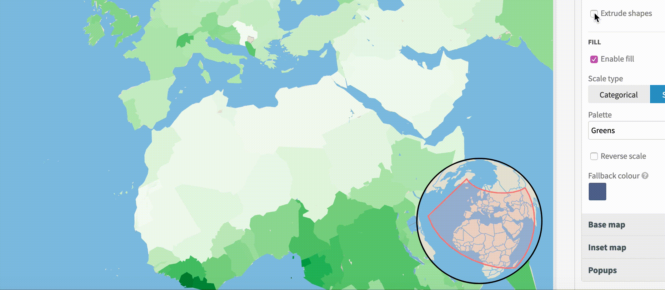
While the 3D region map shows elevated regions by default, you can always turn that feature off, if you simply want a region map which loads quickly and smoothly pans in three dimensions. Just go to the Regions tab on the settings panel and untick “Extrude shapes”.
Like all Flourish templates, you can create a visualization in this style by uploading a spreadsheet in the right format. Check out the requirements and get started.
Among other things, this template allows you to:
- Select the style of the background map
- Change the color and height of the elevated regions
- Choose from categorical, sequential or diverging color palettes
- Style custom popups to display extra information about each region
- Animate around the map in a Flourish story to create a narrative
Behind the scenes
Like the Arc and Marker maps, both of which we launched at the end of last year, under the hood, the 3D region map uses a combination of open technology – like deck.gl, Mapbox GL JS and WebGL – to quickly and smoothly render the base map, as well as the elevated regions on top.