Why data visualization needs a play button
Audio can enrich visual storytelling and bridge the gap between the exploration and explanation of data. You can now make audio-driven visualizations, or Talkies, without coding. Click play to learn more!
Look at the play button on the visualization below. What do you expect to happen when you click it? Perhaps you assume a video will play, allowing you to “lean back” and watch a pre-defined narrative, as opposed to an interactive graphic where you “lean in” to find your own stories? If so, you’d be half-right. You will get a lean-back story, but it’s not a video and the content is interactive and explorable.
Example Talkie by Katie Riley
Audio-driven data storytelling
So what is this exactly? Conceptually, you could call it an “interactive presentation that gives itself” (an absentation?). Technically, you might say it’s “a series of code events synchronized with timecodes in an audio file”. At Flourish, we like the name Talkies. But whatever you call them, the idea is to combine clear narrative and interactivity: to break down the distinction between data explanation and data exploration.
As Alberto Cairo put it when reviewing our early hand-made audio-driven visualizations:
“Should we explain the data, perhaps through a narration, or should we let readers explore the data at will? … if your graphic is a digital and interactive one, why shouldn’t you combine narration with exploration?”
The main barrier to this combination has been that making Talkies by hand is difficult and fiddly for coders and impossible for anyone else. But Flourish enables anyone to make audio-driven charts and maps quickly and easily. We hope you’ll agree that this opens up an interesting new format for data storytelling.
So, why does data visualization need a play button?
Here are just some of the reasons why you may opt for adding an audio narration to your charts and graphs:
See an example of a Flourish Talkie here
- To bridge exploration and explanation: merging the clear guidance of narrated explanations with the engaging interactivity of data exploration offers users a unique, immersive experience. It’s essentially offering the best of both worlds — guided insight with the freedom to explore!
- To personalize the data experience: adding a human voice to data visualizations introduces a personal touch, making the information feel more relatable.
- To enhance accessibility and comprehension: audio explanations can make complex data more accessible, helping to clarify visuals for a wider audience – including those who may find traditional data visualizations challenging to interpret.
The backstory
We first experimented with Talkies long before Flourish existed, in our days as a bespoke visualization studio. In fact, my co-founder Robin Houston came up with the concept for our very first project, the Carbon Map, back in 2012.
We were grappling with how to make our fancy interactive map comprehensible to new viewers. Would they understand that the countries were sized to reflect data points? Would they bother reading the text descriptions of the various metrics? Would they notice the shading dropdown, and if so would they discover any interesting combinations of shading and sizing?
I suggested we make a video explaining how the map works and showing some interesting views. But Robin (as usual) had a more interesting idea: upload just a voiceover and synchronize this with different map views using code. There were lots of potential benefits: faster to load and higher resolution than a video; interactive rather than static; responsive rather than fixed aspect ratio; and a much nicer user experience than having a separate explainer video. We could even translate the story into different languages just by switching out the audio file and timecodes! Here’s what we ended up with:
The result was published on The Guardian and generated a lot of positive feedback. The analytics were interesting too. Almost 100% of users clicked the play button, and most of those watched the full 90-second introduction. Then some people clicked away (often assuming they had watched a regular video!) while others stayed for ages digging into the data.
Examples of voiceover-led visualizations
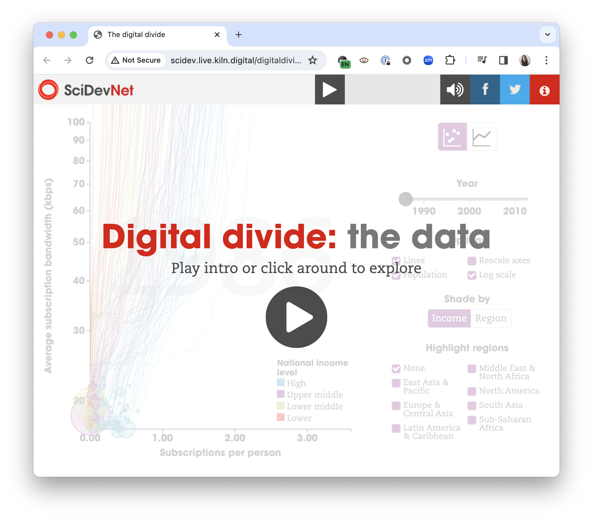
We realized we’d stumbled onto something quite interesting and explored the new format in a bunch of other projects over the next few years. Digital Divide used a Talkie to explain a complex scatter plot, drawing inspiration from Hans Rosling’s TED talks, while First World War was a multilingual documentary that combined video and audio in the Talkie. You can find many more examples on the Kiln website.
Along the way we created talkie.js, an open-source library to encourage other developers to add voiceovers to their own interactives. But what we really wanted to do was create a tool that allowed non-technical users to create their own Talkies. Enter Flourish.
How to create a Talkie without coding
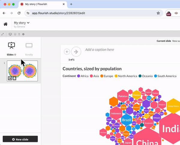
To create a Talkie, you need to create a Flourish story with as many slides as you like. Use the toggle icon under the Slides option to open a dropdown menu with additional settings, and enable the Autoplay story. This will display the button from where you can add your voiceover as an MP3 file.
Once you’re done, you can set durations for each slide to line up with the audio. That’s all – you have created your first Talkie! Hit the Export & publish button in the top right-hand corner of the screen to share your story with the world.
Another option is to skip the audio upload step to make an autoplaying story that silently progresses through the slides at specified times, optionally looping at the end. This can be handy, for example, when using a Flourish data story on a big screen at an event.
Tips
A few lessons from our experience making voiceover-led visualizations:
- Short is sweet. Try to keep the voiceover to one or two minutes. You can leave the detail in the interactive for the user to explore.
- Keep things moving! If nothing changes on the screen for more than a few seconds, a Talkie can feel visually boring or even broken. So in general it works best to minimize the words per slide, unless you have long animations.
- You can add “normal” slides as well as visualization to your Talkie by clicking Add slide and then Basic slide.
- Add some public-domain music behind your voiceover before uploading for a more fun and professional feel.
We can’t wait to see – and hear! – what you create with Flourish.