Unlock smarter decisions and enhance insights with live data visualizations
Explore the benefits of creating real-time charts and maps from CSVs and Google Sheets
Struggling to keep your visualizations up to date? With Flourish, you can connect directly to an online CSV file or Google Sheet, instead of manually uploading your data to our platform. Whether it’s a file on a company server, a government statistical bulletin, or real-time election results, gone are the days of manual uploads! With Flourish, your charts and maps evolve as your data does.
How does it work?
Live-updating data visualizations are directly linked to an external data source, such as a public CSV file. Rather than uploading datasets to Flourish manually, this technique enables automatic syncing. As a result, whenever the linked data source, like a Google sheet, is updated, the corresponding Flourish chart will also update in real time.
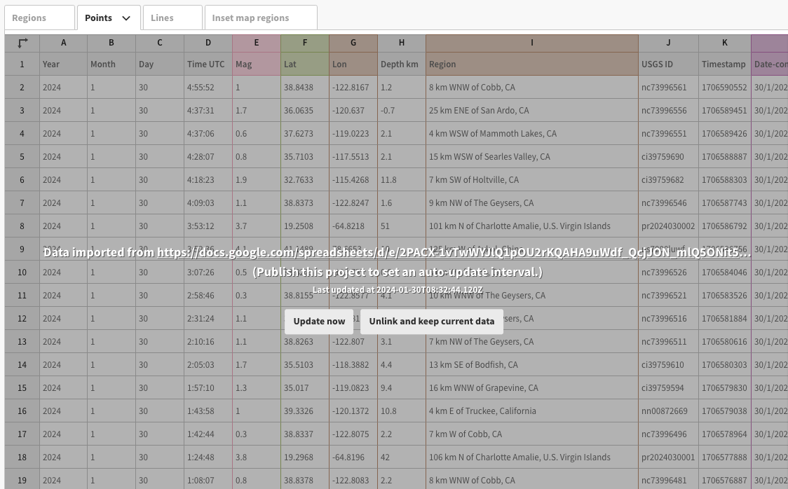
Once imported, your data sheet will display greyed out to reflect that it is linked to a remote source so can’t be edited.
The advantages of visualizing data as it happens
Real-time data visualization offers a wide range of benefits across various sectors. For example, it enables journalists to report on the latest developments promptly, allows sales teams to monitor and react to live sales data effectively, and assists researchers in monitoring real-time shifts in areas such as climate change.
1. Easily maintain accurate data
Flourish’s live data function is a game-changer in ensuring your data remains up-to-date. This is particularly beneficial under tight deadlines, such as on election night, where manual updates would be not only time-consuming but also potentially impossible.
Instead, this streamlined, automated process saves time, ensures accuracy, and reduces the chances of human error.
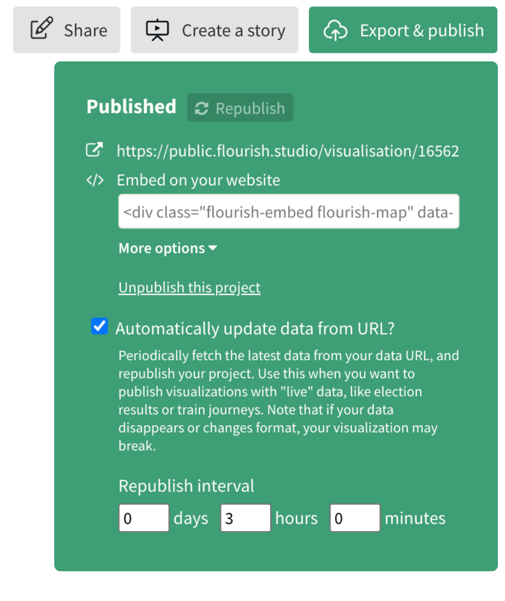
Flourish also offers the flexibility to customize the frequency of your chart updates. Depending on your account tier, you can choose to republish data as often as every few minutes, tailoring this feature to your unique needs. Our team is on hand to explain further how this can positively impact your workflow and efficiency.
2. Incorporate more complex data wrangling
Unlike the basic method of just uploading or pasting data into Flourish, linking your visualizations to a Google Sheet allows you to leverage complex formulas directly where your data lives, enhancing your data analysis with advanced calculations.
Besides, the live data feature is incredibly useful for projects that need collaborative spreadsheet editing or a detailed version history. It means you can collaborate in real-time and track changes easily, making your Flourish project not only more dynamic but also more transparent.
3. Improve decision-making
For businesses, access to real-time data leads to making more informed decisions. Whether it’s tracking a marketing campaign’s success or monitoring website traffic spikes, immediate insights lead to timely actions.
AdKaora, a leading proximity marketing agency, harnessed the capabilities of Flourish to streamline and customize their reporting. This innovation allowed their clients to access up-to-the-minute data whenever needed. To cater to their specific requirement of very frequent updates (every minute), AdKaora utilized the Flourish API, which effectively facilitated the creation of dynamic, constantly updating charts for their clients.
However, for scenarios where less frequent updates are sufficient (such as hourly), the live data function stands as an equally robust solution. It offers a powerful and adaptable approach to real-time data visualization, equipping clients with a first-rate tool for gaining immediate insights.
Getting started
The powerful live data feature is available for users on our business plans.
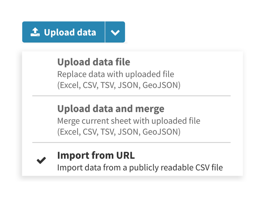
Users with access to the feature can find it in the dropdown next to the Upload data file button in the Data tab. Choose Import from URL, click the button, and then enter the URL of a publicly accessible CSV file.
Once imported, your datasheet will display greyed out to reflect that it is linked to a remote source so can’t be edited. However, you can still scroll the sheet to browse its contents and select the right columns. You can also “unlink” the data at any time to convert it to a normal editable Flourish data sheet.
Seamless automatic updates with Flourish
When you publish a visualization or story based on a live data source, you can optionally set Flourish to check the data regularly and republish the graphic automatically if there has been a change. The maximum republishing frequency depends on your account tier.
The best thing about this design is that your underlying data source only gets “hit” each time Flourish checks for changes, not each time a viewer looks at the chart. That means you can publish live graphics for large audiences without worrying that the underlying data source might not be able to cope with lots of traffic. And if the data source ever goes offline, so Flourish can’t access it, the published graphic won’t break.
Ready to bring your data to life? Dive into Flourish and start creating dynamic visualizations today!