Flourish year in review 2022
Reflecting on a year of growth and collaboration
2022 has been a busy year for Flourish. We officially joined the Canva family, expanded our team, and released several new visualization templates. We also made some significant improvements to our existing features and continued to grow our user base. Here’s a look at some of the highlights from the past year.
Winter: Flourish x Canva
Winter was all about “the announcement” – our acquisition by Canva! We were thrilled to bring our interactive visualizations to Canva’s platform, and the reactions were amazing. It’s been a blast working closely with the Canva team to find new ways to combine our two tools and create truly magical results. One of our favorites are interactive reports – a way to replace static PDFs with documents full of interactivity and animation using Flourish and Canva together. Embed them on your website or share the Canva link with everyone to spread the magic!
In addition to integrating with Canva, we also shipped some major platform updates, including data typing and eight new visualization templates. It’s been a busy and exciting time, and we’re looking forward to continuing to grow both Flourish and Canva and empowering teams around the world to create professional, interactive content. Explore the new visualization templates we launched in 2022 in the visualization below:
Spring: Sports and collaboration
Simple but effective, slope charts have a number of great uses: ranging from visualizing changes that occur over time to ranking by values 📈
— Flourish (@f_l_o_u_r_i_s_h) April 12, 2022
👉 Click here to read the full help doc about slope charts and when to use them: https://t.co/LGvNlFin39#DataVisualization #Data pic.twitter.com/6qebCjlOD2
2022 was a great year for sports fans with the 24th Winter Olympics held in February and Wimbledon taking place in the summer. We also couldn’t stop ourselves from obsessing over Wordle and all its alternatives – but who can blame us?
However, the most anticipated sports event for us was surely the FIFA World Cup that kicked off in November. We were so excited about the event that we devoted one Flourish webinar to the occasion and even launched our brand new Tournament template! Now everyone can visualize their favorite sports tournament for free.
But sports weren’t the only thing on our minds. In late March, we launched our first customer success story with Finance Uncovered, who used Flourish to enhance their investigative reporting and bring The Pandora Papers to light. And of course, the Russian invasion of Ukraine was a big topic of conversation among many Flourish users, as you can see from some of the examples in our community.
More product updates 🚀
- We added labels to the Projection Map template
- We launched our premium templates in the template chooser, to ensure that users on our Business, Publisher and Enterprise plan can easily access them
- We launched one of the most exciting Flourish features yet – the auto-setting of columns in the data tab! When data is uploaded, Flourish can now interpret it, determine which data type each column contains and automatically choose suitable columns.
- We launched the “base visualization” feature for our API, making it possible to easily replicate and override certain aspects of a visualization created in the Flourish app.
Canva life: summer
Summer was a very exciting time in the world of Flourish x Canva!
To celebrate the summer season, we welcomed Canvanauts from around Europe for a very special Canva sports day, and plenty of picnics in the park for recovery afterwards.
We also opened the doors to our new Canva UK campus, complete with more space and (more importantly) more snacks. We even gave our followers a tour of the new space in collaboration with Canvalife on Instagram.
In addition to all the fun, we worked with some of our customers to showcase how they use the Flourish product. For example, check Adkaora’s and Kontinentalist’s customer stories. We also launched our experts network, which connects approved agencies and freelancers with expertise in using Flourish to those who need them.
But the highlight of the summer was definitely the launch of our new our new Timeline template. It’s the perfect tool to visualize all of the Queen’s most important moments before her platinum jubilee.
More product updates 🎉
- We added spikes to our Projection Map template
- We made it possible to create a grid of sankeys within our Sankey Diagram template
- Flourish stories can now play on load or loop
- We launched our Data Explorer template
Autumn: maps madness
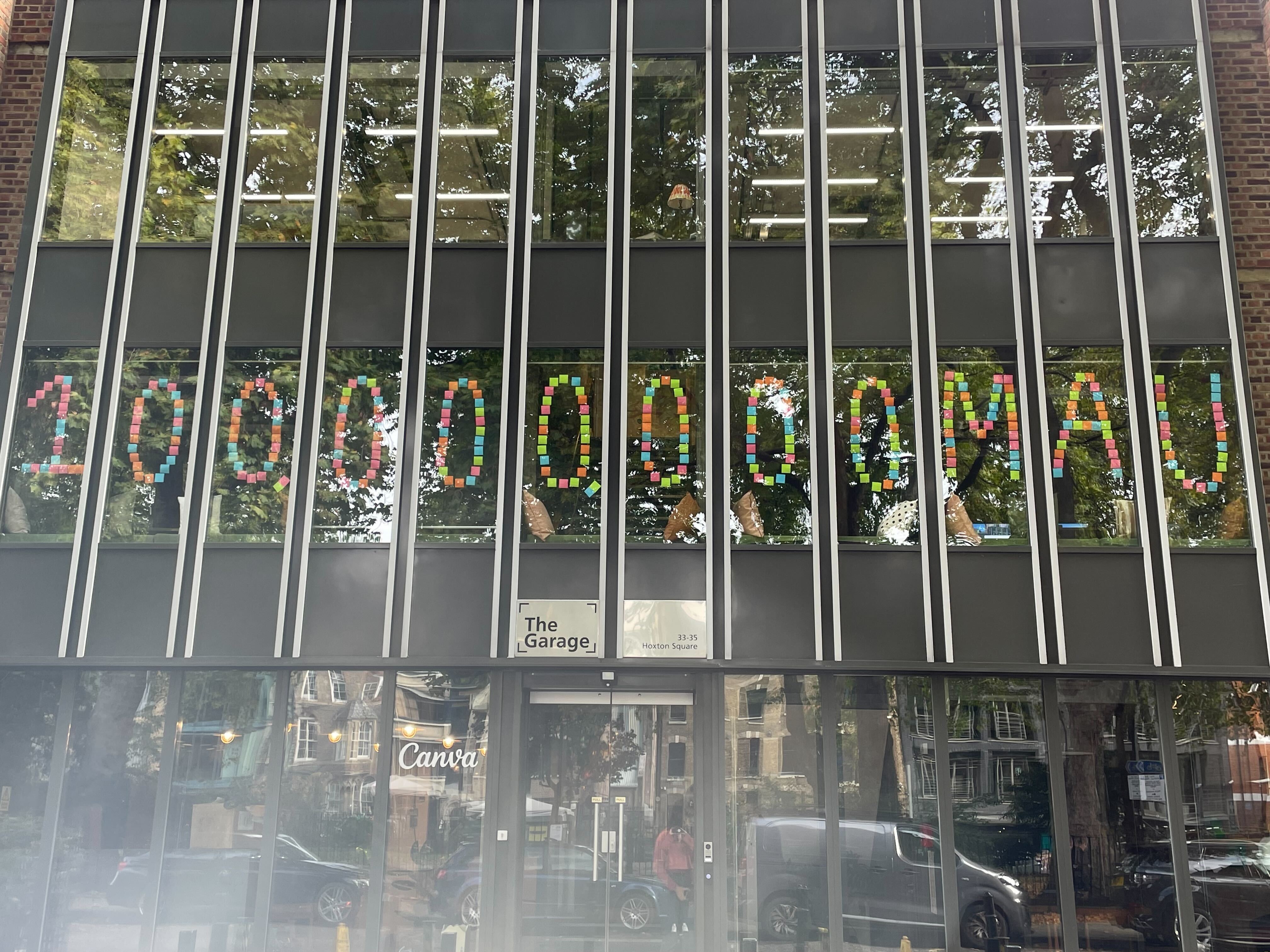
100 million monthly active users: Celebrating Canva's huge milestone in our London campus
The fall season brought plenty of excitement to the Flourish headquarters. We celebrated Canva reaching 100 million monthly active users with a team picnic and some post-it art in our office windows. We also brought back our monthly webinars, focusing on a specific topic each time more in-depth. Keep an eye out for future webinars!
We had even more to celebrate as we updated our powerful Projection Map template. Now, you can see your map regions in a separate sheet within the Data tab.
In a recent webinar, @MafeCafe discussed some common (& not so common!) mistakes in data visualization & shows us how to avoid such pitfalls. 📉
— Flourish (@f_l_o_u_r_i_s_h) October 28, 2022
👉 Click here to register for our next webinar: https://t.co/AyJc5YD9pf#DataVisualization #Webinar pic.twitter.com/AO2jWODkaj
This change simplifies mapmaking by splitting the regions from the values, making it easier to import your own data.
Just when you thought it couldn’t get any better, we rolled out the new arrow map mode to our Projection Map template right on time for the US midterms and the Brazil presidential elections. Now, you can choose between circles, spikes, and arrows to showcase your data.
Swing is a popular election variable to visualize through arrows in a map. It shows the extent of change in voter support, typically from one election to another, expressed as a positive or negative percentage.
Sticking with our map focus, we made it possible to plot lines on your 3D Maps, allowing you to map anything from railways, to gas pipelines and even your own running routes.
More product updates 🚀
- We launched the Gauge template, perfect for highlighting a single metric and showing uncertainty
- We added more beautiful examples to our API and SDK docs to help you harness the power of Flourish
- You can now create a grid of charts using slope charts, great for comparing change over time across categories
Winter (again): Data visualization 💖
Join us on Nov 30 for @theduncanclark’s talk “From Static to Stories: The Evolving Landscape of Data Visualization”. Duncan is the co-founder of @f_l_o_u_r_i_s_h and Data Visualization Lead @canva. Spots are limited, register here: https://t.co/hNGcHlhzyu pic.twitter.com/sChTdokZo0
— Data Visualization Society (@DataVizSociety) November 24, 2022
As the year came to a close, we spent a lot of time with something incredibly important to our core: the data visualization community. We partnered with the Data Visualization Society and delivered two sessions in the run-up to their Information Is Beautiful Awards and co-hosted a screening event at our office.
We’re thrilled about the potential for this partnership to promote the value of data visualization. By working together, we can help to educate people about the importance of data visualization and how it can be used to make better decisions and drive positive change.
More product updates 🚀
- We launched the Marimekko template to help you visualize magnitude and part-to-whole data in a single chart
- We made it possible to create a grid of slope charts within our Slope Chart template
- We added FAQ and Security pages. All existing and potential users alike can browse the most frequently-asked questions and find useful information about Flourish security.
See you next year!
As we look back on 2022, we are grateful for all of the exciting moments and accomplishments that have made it such a memorable year for Flourish. From our acquisition by Canva and the integration of our tools, to the release of new visualization templates and platform updates, we have had a busy and productive year. We are also grateful for the support of our users and community, who have helped us to continue to grow and improve. We are looking forward to an even better year in 2023 and we can’t wait to see what the future holds for Flourish. Thank you for being a part of our journey!