



What great scrollytelling looks like — and how to build it yourself
Discover scrollytelling examples and how Flourish makes scrollytelling possible without writing a single line of code
Most data stories are built the same way: a chart, a caption, maybe a paragraph of context. Then another chart. Then another. By the third, your reader has already opened a new tab.
The issue isn’t the data. It’s the pacing. Presenting everything at once forces your audience to do all the interpretive work themselves — and most people won’t bother. They need to be guided.
That’s exactly what scrollytelling does. Instead of showing everything at once, content reveals itself step by step as your reader scrolls — so their journey through the page becomes the story. Charts animate, maps zoom, timelines advance. You show them one thing at a time, in the order that makes the most sense. They set the pace. You set the story.
This example shows how a single dataset can be transformed into a guided narrative — each scroll step revealing one insight at a time, so the reader never feels lost or overwhelmed.
Why scrollytelling works so well for data storytelling
Scrollytelling isn’t popular just because it looks great. There are real, human reasons why it works better than a static chart — especially when your data is complex, or your audience isn’t a room full of analysts.
Traditional charts often force readers to process everything at once. Scrollytelling breaks information into manageable moments, allowing you to reveal context gradually and direct attention to the most important insights.
As users scroll, charts can animate, filter, zoom, or transition between views. This creates a sense of progression that feels more natural than clicking through slides or jumping between static visuals.
At the same time, scrollytelling creates a stronger narrative flow. Instead of presenting disconnected charts, you guide readers through a structured journey with a beginning, middle, and end. This approach makes complex datasets feel approachable while helping viewers retain key information more effectively.
The scrolly below puts this into practice with a line chart that builds progressively, letting the reader absorb each data point before the next appears.
You can also use your scrolly captions to actively lead your audience through a complicated chart. Here the captions are actively directing the reader’s eye to the most important elements at each step.
How animation helps your audience follow along
When charts animate between states as your reader scrolls, they can watch change happen rather than mentally reconstructing it from two separate visuals. Smooth transitions make it easier to track movement, compare values, and notice patterns that might otherwise feel abrupt or invisible.
Highlighting specific data points, filtering down to a subset, or zooming into a region of a map — all of these create stronger continuity throughout your story. The reader always knows where they are, what changed, and why it matters.
What separates a good scrolly from a great one
The best scrollytelling pieces feel effortless to read. That simplicity doesn’t happen by accident — and Flourish gives you the tools to achieve it without compromising on quality or spending hours on production.
- One idea per section: Focus on one key insight at each scroll step rather than presenting every finding at once. Build a curated sequence of story points that guides your reader through the data rather than overwhelming them with it.
- Let your annotations do the work: Add labels, annotations, and highlights directly onto your visualizations. The most effective annotations don’t describe what the chart is showing; they reinforce the insight the reader should take away from it.
- Use color to direct attention: Strategic highlighting is one of the most effective tools in scrollytelling. Keep secondary elements muted so the focal data point draws the eye. This visual hierarchy becomes especially powerful across multiple scroll transitions, where you want the reader’s eye to land in exactly the right place every time.
Build your scrolly in three simple steps
Building a scrollytelling piece used to mean hiring a developer, fighting with JavaScript libraries, and praying it didn’t break on mobile.
With Flourish, you can create immersive, scroll-driven stories directly in the story editor. The result? An experience that looks like it took a whole dev team to build — created by you, in a fraction of the time.
All it needs are three simple steps:
- Create your visualizations: Start with any Flourish template. Add your slides in the story editor just as you would for any Flourish story, with captions, text, and annotations.
- Switch to scrolly mode: Once your visualizations and captions are in place, select Scrolly in the story navigation settings. That’s it — your story becomes a scroll-driven experience in a single click.
- Publish and embed anywhere: Publish your scrolly and embed it as you would with any other Flourish visualization or story. It looks great on every screen size, no extra setup needed.
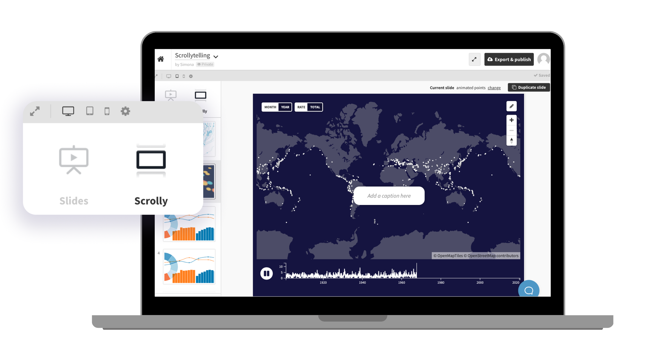
Customize your captions further
You can also place your scrolly captions to the left or right of the chart. Placing captions to the side rather than overlaying the chart works particularly well here — the reader can read the caption and interact with the map simultaneously, without either competing for attention.
Why scrollytelling continues to grow
As online audiences become more selective with their attention, static charts often struggle to hold engagement. Scrollytelling offers a more natural and immersive way to communicate insights by combining narrative structure with interactive data visualization.
With Flourish, teams can create these experiences without relying on custom development or complex production workflows. Whether you’re building a newsroom feature, a branded report, or an educational project, scrollytelling helps transform data into something people genuinely want to explore.
And when readers stay engaged longer, the story behind the data becomes far more memorable.