Daring to diverge: Flourish and WPP’s journey in data storytelling
Uncover the process behind creating engaging and interactive visualizations that push the boundaries of conventional data design
In data visualization, we make a multitude of strategic design choices to enhance the way data is perceived and interacted with.
In partnership with WPP, the advertising, PR and technology powerhouse, we have transformed a complex dataset into engaging, interactive visualizations that invite discovery and insight.
All the Flourish visualizations that were created for the WPP Best Countries project
This blog will cover our process: how we defined the purpose and goal, balanced conventions with innovative design choices, and the impact on engagement and understanding.
The brief was to visualize the WPP Best Countries study on how countries are perceived by the general public, business decision-makers, and opinion leaders. The outcome of the study is an annual Best Countries ranking based on the global survey of 87 countries, measuring a series of characteristics.
Factors and attributes, coloured by the UK ranking. Created with the Flourish Sankey template
We have transformed this comprehensive dataset into a series of compelling and interactive visualizations. Our goal was to transform a complex dataset into an understandable, engaging visual exploration, one that is just as insightful as it is beautiful.
Before we visualized the data, we reminded ourselves of the conventions in data visualizations and defined our purpose and project goals.
Conventions in data visualization
Data visualization, much like any language, begins with understanding its grammar — the essential dos and don’ts that pave the way for clear and impactful communication.
These conventions teach us that pie charts sum to 100% and that bar charts start from zero. We learn that the right choice of chart type can take your data’s story to the next level. Conventions introduce us to the significance of chart titles, colors, and text.
By recognizing these conventions, we learn how to use them to create visualizations that not only communicate but also engage and inform.
We have created our own five-point framework that offers a way of grouping these conventions, to help elevate your charts and drive effective data communication.
Crafting with purpose: choices, not rules
“Designing visualizations doesn’t consist of applying any rules. Rather, it’s based on making justifiable - ethically and functionally - choices according to certain goals and within various constraints” – Alberto Cairo
Becoming familiar with data visualization conventions empowers us to make informed design decisions. Our decisions define how our message is received: whether it captivates, informs, or inspires.
Our choices might follow a convention or intentionally break away from it, but the key is to understand our purpose.
Defining the purpose
When creating any data visualization, start with defining your purpose:
Why are you creating this visualization?
Are we aiming to influence decisions swiftly, or to invite our audience into an immersive, exploratory experience? Whether designed for quick decision-making or immersive exploration, understanding the who, what, and where of your audience allows for tailored and effective visual stories.
Is your visualization intended for a detailed report, a social media post, or perhaps an exhibition? Each context demands a unique approach, emphasizing clarity, engagement, or exploration. If the purpose is to drive decision-making, or the time spent will be very brief, the visualization will be most effective if it is simple, clear, and familiar. But if the purpose is for people to immerse themselves and visually explore, this allows more freedom of expression, and success will inevitably be measured differently.
Three words can often help when doing this: Who? What? Where?
Answering these questions helped us understand the project and define our purpose.
Defining the project goals
“Your data visualization is neither good nor bad but your own declared goals make them so.” – Lisa Charlotte Muth (adapted from Shakespeare’s Hamlet)
We then defined our project goals:
After defining our purpose and goals we were equipped to create impactful data visualizations that would resonate with our audience.
The choices we made, driven by our goals
“Successful aesthetic data visualization design should balance conventions, familiar forms with novelty, which is able to attract readers into the exploration because they see something that they haven’t seen before.” – Giorgia Lupi
Color choices
The ranking of the countries in the data was a significant part of the project.
Normally, ranks would be used with a sequential color palette as there is not usually a meaningful ‘mid-point’.
But, we decided early on to use a diverging palette across the project, to maximize the perceptual difference between country ranks. The divergent palette also allowed us to easily identify the high rankings and the low rankings for any given characteristic, helping us to tell the stories in the data.
In practice, this means higher ranks were represented by a light teal color while lower ranks were colored pink, both colors from WPP’s extended palette in their brand guidelines.
Heatmap of country rankings for all attributes, sorted by overall rank. Created with the Flourish Scatter template
Although the project consisted of more than one dataset, we wanted to maintain coherence in the color scheme. We used the same colors in all of our visualizations.
In the visualization below, we retained the light teal-pink extremes when communicating the direction of change over time. This created a visual link with the color used to communicate high-low ranks in the other visualizations.
The choice was justified by the fact that both up/down and high/low have an inherent positive-negative, and that is how the color would be understood.
Change in country ranks from last year to this year, by region. Created with the Flourish Slope Chart template
Exploring unusual and novel chart types
Hierarchical radial bar chart
One of the central designs of the project was a hierarchical radial bar chart, created with the Hierarchy template.
If the design had intended to communicate ranks to drive decision-making with clarity, and by using familiar chart types, we would almost certainly have recommended a bar chart. However, that was not the purpose.
This spiral-like visualization immediately felt quite striking and it became a graphic logo for the project. Its efficient use of space also meant it was perfect for t-shirts, posters, and postcards.
The Flourish visualizations, none of which required any custom code, were all enhanced further in Canva, allowing us even more flexibility when making data visualization design choices.
We added ‘How to Read’ explainers to each visualization to help the audience understand what the various graphic elements referred to. We also added custom color legends and annotations. These enhancements combined to create a coherent aesthetic and to ensure the more novel designs were still accessible.
Overall ranks, highlighting top 10 countries. Created with the Flourish Hierarchy template
Sankey
A Sankey chart would usually visualize the flow between two sets of values. But we were only interested in a single set of values for each country. This means that the Sankey resembled a customized stacked column chart.
Throughout the project, we wanted to emphasize curves and softer, more organic shapes. We achieved this by choosing a Sankey instead of a traditional stacked column chart.
Dominant patterns in factor rankings for each country. Created with the Flourish Sankey template
Using a grid meant we could both tell a zoomed-out and a zoomed-in story: while all countries and trends are visible with one glance, viewers can also explore individual countries.
Dominant patterns in factor rankings for all countries, sorted by overall rank. Created with the Flourish Sankey template
Curved lines with the Scatter template
We also visualized pathways for all the countries.
We used our Scatter template and chose to use curved lines to visualize country ranks across categories. To maintain the aesthetics of the curve, the line can sometimes appear exaggerated, especially where there are extreme values.
The design was a novel way of gaining high-level insight on regional patterns, challenging the convention yet providing clear insight.
Common sub-regional patterns across factors. Created with the Flourish Scatter template
Sunburst
Usually, a sunburst would be used to show hierarchical data or parts of a whole. We used it to show the relationship between each country’s overall rank and their rank for each factor, such as Entrepreneurship.
The factor rank means looking at the higher level, rather than every one of the 70+ attributes. The factors are what drives people’s perception of a country and, in turn, perceptions of the products and services it exports.
In each sunburst, countries are sorted by their rank for that factor, but the color always shows their overall rank. Where the colors of the inner and outer rings were similar, the correlation was high. The colors being different signifies a low correlation.
The density of information present in this visualization encourages the audience to spend time with it, reading and exploring the various stories in the data.
Country rankings for each factor, colored by Overall rank. Created with the Flourish Hierarchy template
Inverting the axis
Visualizing the DNA country profiles as a radar chart also posed an interesting challenge.
Typically, the Y axis in a radar chart would show smaller values in the center and larger values on the outside. But this doesn’t work with ranks as then countries with high ranks would counter-intuitively have small areas. Whereas the lowest-ranked countries would be represented by the biggest areas.
This is why we decided to invert the Y axis on our radar chart, ensuring that higher ranks stand out.
Regional, sub-regional and country-level patterns in factor ranking. Created with the Flourish Radar template
The Best Countries 2024 Parliamentary reception
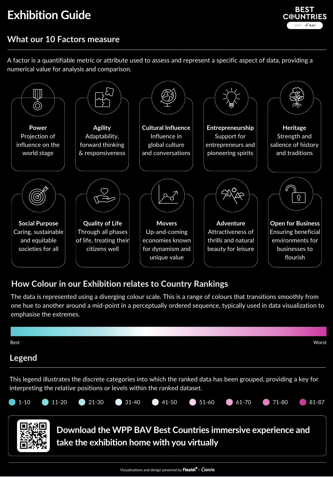
We created an exhibition guide to introduce attendants to the data visualization series
A highlight of the project was the Best Countries 2024 Parliamentary reception at the House of Commons, taking place on April 16.
Attendees at the fully-booked event learned about the study, while exploring the data visualizations on posters and iPads.
Multiple large screens showcased the animated data stories on loop and metaverse headsets enabled even deeper immersion.
David Roth, Chairman WPP BAV, gave the Swiss Deputy Ambassador Chantal Moser a framed radial bar chart to mark their top spot in the 2024 Best Countries rankings.
You can interact with all the visualizations in this presentation:
Conventions in data visualization are important. They serve as our foundation, guiding us toward effective communication.
However, our project showcases the transformative power of thoughtful design choices — how selecting the unconventional can illuminate data in new ways, inviting engagement and discovery.
In every visualization, understanding our audience and defining our purpose is key. Good design lies in meeting intended goals, sometimes by following conventions, other times by daring to diverge.
With this project, we demonstrate that when the time is right, challenging the norms can lead to richer, more engaging data storytelling.
When you start your next project, remember: don’t hesitate to challenge established conventions. Think about when it might be beneficial to try new methods. This approach can unlock new opportunities in how you present data, leading to more insightful and engaging experiences for your audience.