Flourish year in review 2021
Looking back at the year that was – across our community, product and company
In many ways, this year felt like an extension of the previous one, due to a pandemic that continued to dominate lives around the globe. In that context, it’s no surprise that COVID remained a key visualization topic for the ever-growing Flourish community, along with other big themes such as climate, politics and the Olympics. Flourish the company also saw a lot of growth: the team almost doubled in size since January, as did the number of business customers. Let’s take a moment to look back over the year, starting with a few top-level community numbers.
Still remote: winter
💬✨🖼️ Introducing popup panels 🖼️✨💬
— Flourish (@f_l_o_u_r_i_s_h) March 4, 2021
In addition to popups, you can now add panels to your Radar Chart and Projection Map visualizations, giving you more flexibility to tell rich data stories.
👉 Learn more and check out the examples in our blog: https://t.co/XMpemhq2Ig pic.twitter.com/Xg6rk49o46
At the start of the year, our team was still remote and under lockdown rules. With the pandemic requiring an ever-greater amount of information to be presented, we launched popup panels to help our users tell richer data stories. Seeking distraction and inspiration from seminal data visualizers, we also launched our first Masters series blog post.
More product improvements ✨
- We shipped several improvements for our business customers, including custom fonts in stories, enforceable multi-factor authentication and republication approvals
- Our 3D Map template became much more powerful through raster tile support, annotations, a heatmap mode and new animations
- We introduced improvements such as shading between lines in our Line, Bar, Pie template
- It became possible to use public data files from Dropbox with our Live CSV feature
Some community visuals: COVID
The big thaw: spring
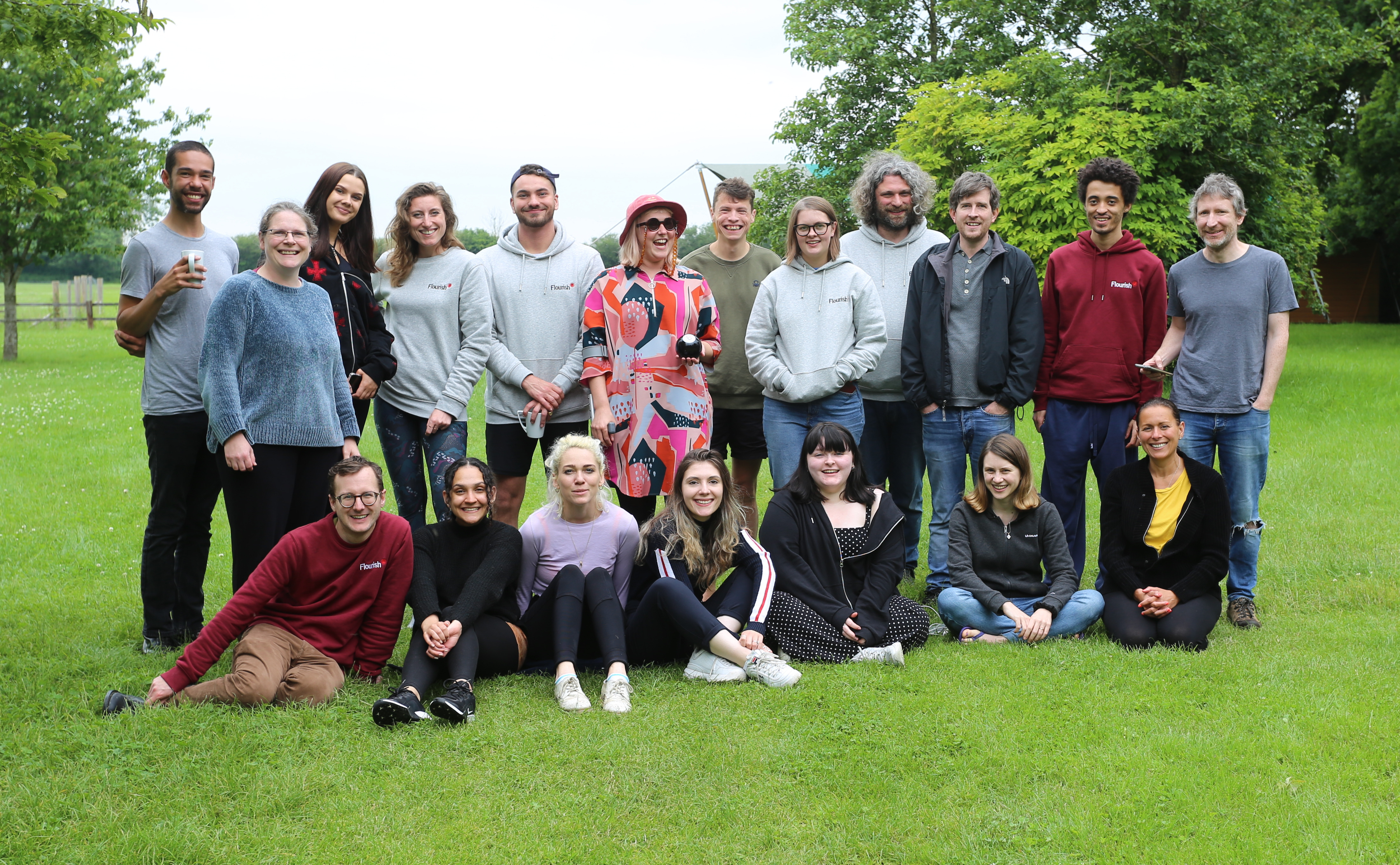
With lockdown easing, some of our growing team took the opportunity to meet up for a glamping retreat in Wiltshire
🚨 New template alert! 🚨
— Flourish (@f_l_o_u_r_i_s_h) May 27, 2021
Today we're happy to announce not one, but TWO new templates!
Our new Countdown and Number Ticker templates make it easy to count up to a number, or down to a date.
🎰 Check out examples and create your own via our blog: https://t.co/jM8lnMY1jw pic.twitter.com/RSDmSKEXrG
In the spring we introduced some chart accessibility guidelines and also made our editor more accessible by adding improved keyboard navigation. We opened our “Tea Break” webinar series to the whole community and enhanced our maps with a host of new features. On our blog, we took a deep-dive into visualizing local elections and celebrated the arrival of two new mini templates: Number Ticker and Countdown.
More product improvements 🌤️
- We added new styles, an aspect ratio mode and filtering to Slope Charts
- The Scatter template got alignment and styling for labels
- We allowed you to color your Radar Chart visualizations by a category
- Our Sankey Diagram template received filtering capabilities and a setting for adding node headings
- We added popup panels and improved filtering to our Cards template
Some community visuals: politics & society
Brief normality: summer

A breath of fresh air: The new Flourish HQ
👾🖼️🚸 New template alert! 🚸🖼️👾
— Flourish (@f_l_o_u_r_i_s_h) July 9, 2021
Our new Pictogram template lets you create beautiful interactive isotype charts.
It supports multiple orientations, filtering, popups, filler icons, and more.
👉 Learn more in the blog: https://t.co/iX2ngoYQd9 pic.twitter.com/t063KvrLPp
Over the summer, the global news cycle started to become more varied again, with several sports events making headlines, most notably the Tokyo Olympics. To celebrate, we launched a new Sports Race template and wrote posts about visualizing both the Olympics and the Euros. We also launched our popular Pictogram template, and – after 18 months of working from home – moved into a lovely new office space in Shoreditch, London’s tech capital.
More product improvements 😎
- We added a new visualization type, the Waterfall chart, to our Line, Bar, Pie template
- Our Quiz was enhanced with support for HTML inputs, making it possible to display images as questions
- We published a simple five-step guide to data visualization
- We recreated some of the IPCC’s climate charts and drew lessons on how charts can help us communicate effectively
- We added a new “reveal” mode to our Line Chart Race template
- We made it possible to download GeoJSON files directly from your data tab
- The Slope Chart template received improved labelling with automatic overlap prevention, connector lines and richer styling settings
Some community visuals: economics and sports
Environmental emergency: autumn
Need specific regions for your Flourish map? Visit our new GeoJSON repository, full of reliably-sourced regions that have been tested and resized, all ready to download and use for your own custom maps! 🌍🗺
— Flourish (@f_l_o_u_r_i_s_h) October 1, 2021
👉Click here to see all of our new resources: https://t.co/oLp0fJv1e0 pic.twitter.com/SdBUUcDkZ6
After a summer full of weather extremes, and with world leaders converging on Scotland for the COP26 conference, climate became a key visualization topic for the community. On the blog, we wrote about the strengths and weaknesses of different chart types. And we introduced two new templates: Gantt Chart and Word Cloud. Finally, we unveiled a brand-new training series for our business and enterprise customers.
More product improvements 📊
- The latest “Masters series” focused on the visualization legacy of W.E.B. Du Bois
- By popular demand, we launched a repository of GeoJSON files for making custom maps
- It became possible to set Flourish stories to autoplay on load
- We added a thumbnail feature that lets you access a static image of any published visualization on a fixed URL
- We improved Flourish’s data merging feature
Some community visuals: environment
21 in 21
One final thing to celebrate: in 2021 we welcomed 21 new amazing team members, each of whom have helped shape Flourish’s evolution.
With the end of the year in sight, we’re ready to wind down for a much-needed break. Thank you so much for all your ideas and feedback this year – and for all the incredible visualizations and stories you’ve created. We can’t wait to see what you make in 2022!