How to create stunning marker maps: dot maps, locator maps, and more
Visualize data with icons, emojis and images for a more engaging user experience
The Flourish Marker Map template is a powerful tool for visualizing locations at specific coordinates. Whether you want to plot thousands of locations categorized by color (known as a symbol map or dot map), place a few locations within the context of a country or region (locator map), or display points of interest in a city (icon map or guide map), this template has you covered.
Similarly to our 3D Map template, the Marker Map combines gorgeous vector-based maps and open-source WebGL tech, making it faster, smoother and capable of handling larger datasets. The template also supports 3D, enabling you to create truly immersive visual stories by panning, zooming and changing perspective – as shown in the above tour of United States national parks and monuments.
What’s a marker map?
A marker map is a type of data visualization that uses distinct markers to represent specific locations on a map. These markers can be playful and varied, including icons, images, and even emojis, which add a layer of customization and creativity to your visualization.
Unlike traditional symbol maps that use points or spikes to highlight density or distribution, marker maps are better suited for visualizing individual locations or points of interest – such as restaurants, landmarks, or event venues. By leveraging the flexibility of different marker types, marker maps can enhance the user experience and make the data more accessible and enjoyable to explore.
Make your own marker map with Flourish
To get started, all you need to do is upload a single spreadsheet of locations with columns for latitude and longitude. But looking in the Data tab, you’ll see there are actually four data sheets to play with:
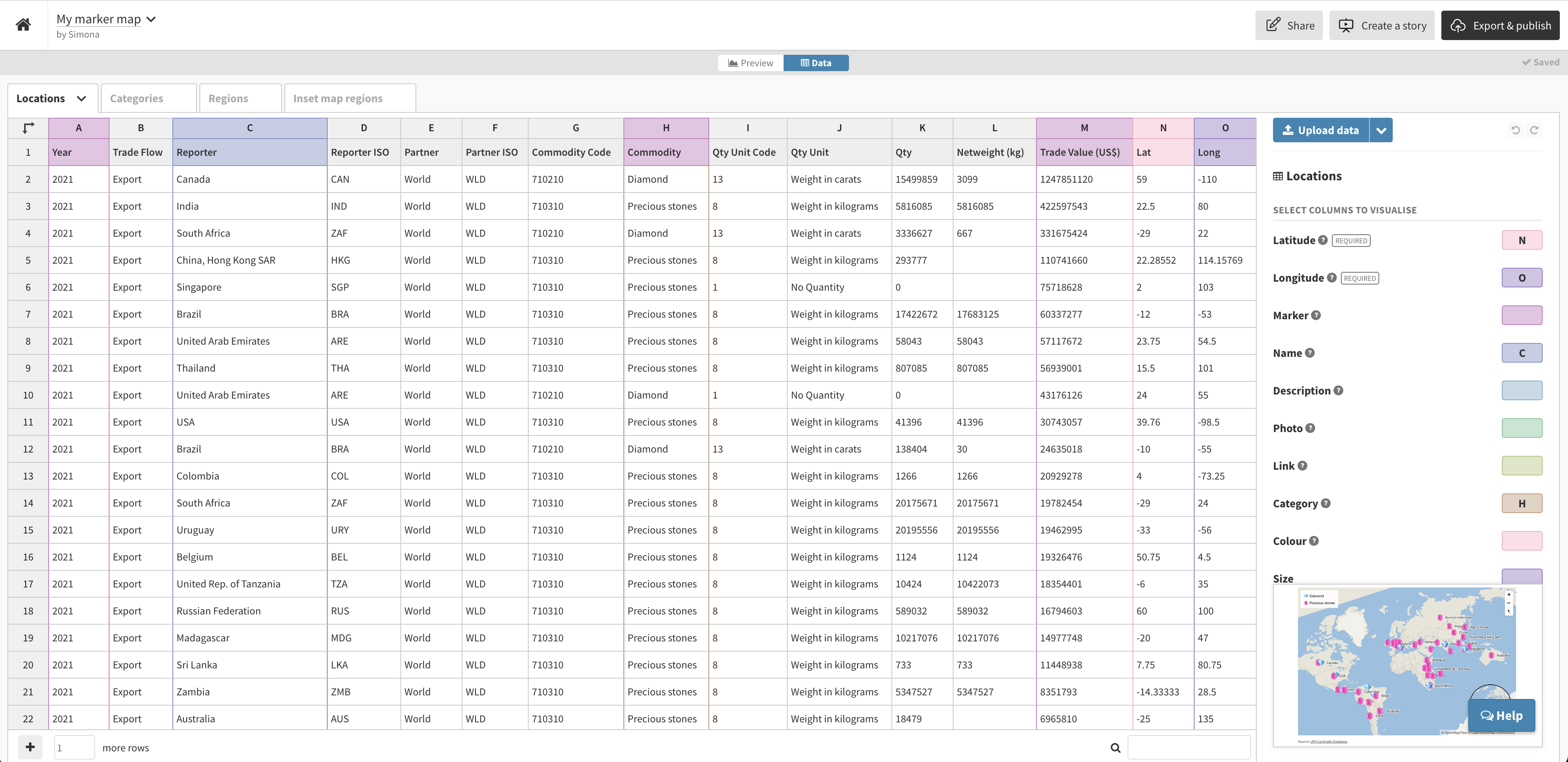
Locations: This is the main sheet, where each row becomes a marker on the map. In addition to the required latitude and longitude columns, you can also set other columns for marker icon/image/emoji, size, metadata to include in pop-ups and so on.
Categories: This optional sheet allows you to style markers in groups – which is handy for bigger datasets. When you use this sheet, the template also automatically creates a legend, which doubles as a filter: click any category to hide and show markers of this type.
Regions: In this tab, you can upload your own GeoJSON file (or even just paste in rows from any Projection Map example) to add an additional layer to your visualization beyond the markers. This is useful if you need to color specific regions or countries based on categorical or numerical values.
Inset map regions: This is where you can optionally customize the inset locator map in the bottom right corner. If you leave this sheet empty it defaults to a globe, but if you want to show a specific country, city, borough or even a street you can upload a GeoJSON file containing the relevant shapes.
Icons, images and emojis – oh my!
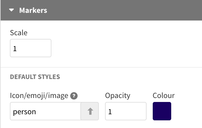
In terms of the markers themselves, you can choose between Font Awesome icons, emojis, or even custom images you’ve uploaded to Flourish.
The Font Awesome icons can be specified by name and added to the Markers settings in the Preview editor. Emojis can be typed in directly to the Data tab or copied and pasted from elsewhere. Lastly, you can upload custom images in the Data tab – read our help doc to learn more.
Visualizing regions and points
Since the Marker Map template supports the visualization of regions, you can easily create choropleth maps that have a little extra information in the form of a marker – as we did in the example below:
Choropleth marker maps combine the strengths of choropleth maps and marker maps, providing a richer context and more detailed insights. By layering markers over a choropleth map, you can highlight particular data points without losing the broader regional context. This dual approach helps users understand how specific locations relate to the overall regional data.
Try it now!
It’s never been easier to make a beautiful high-performance marker map (or dot map, or locator map, or icon map…). Regardless of what you call it, we can’t wait to see what you create!