Hi everyone,
We’re back with our regular newsletter after celebrating our 50th issue last time. Keep reading to learn about what’s new in Flourish and what’s up next.
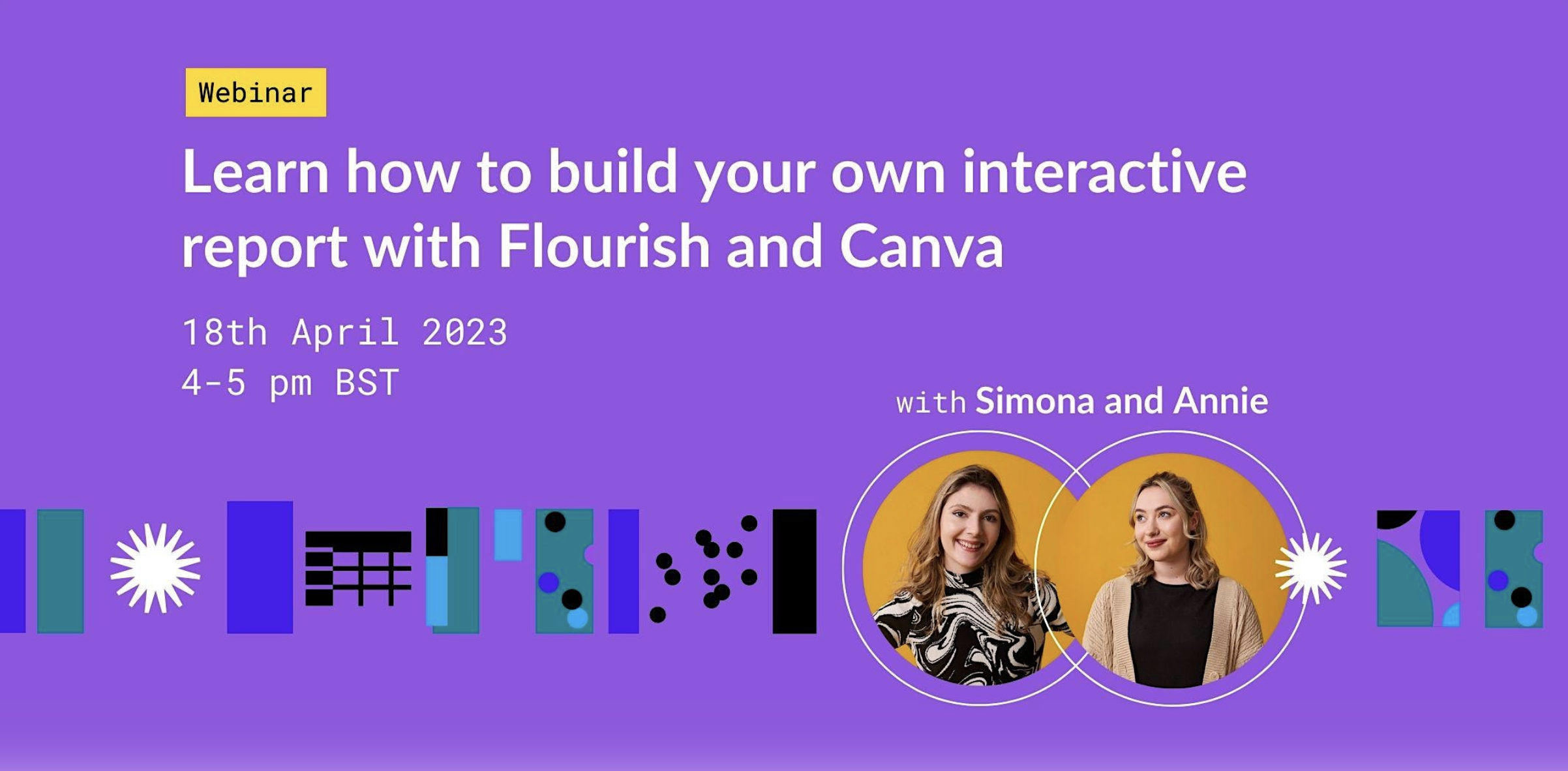
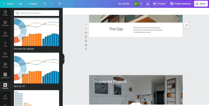
Learn how to build your own interactive reports with Flourish and Canva
Join Annie and Simona in tomorrow’s webinar to learn how to drive effective decision-making with data storytelling. In this exciting hour-long session, you’ll learn how to transform your regular reports into engaging presentations and websites using Canva and Flourish. Discover why interactive reports are more engaging than static PDFs, learn how to embed your Flourish charts in Canva, and pick up many tips and tricks. See you there!
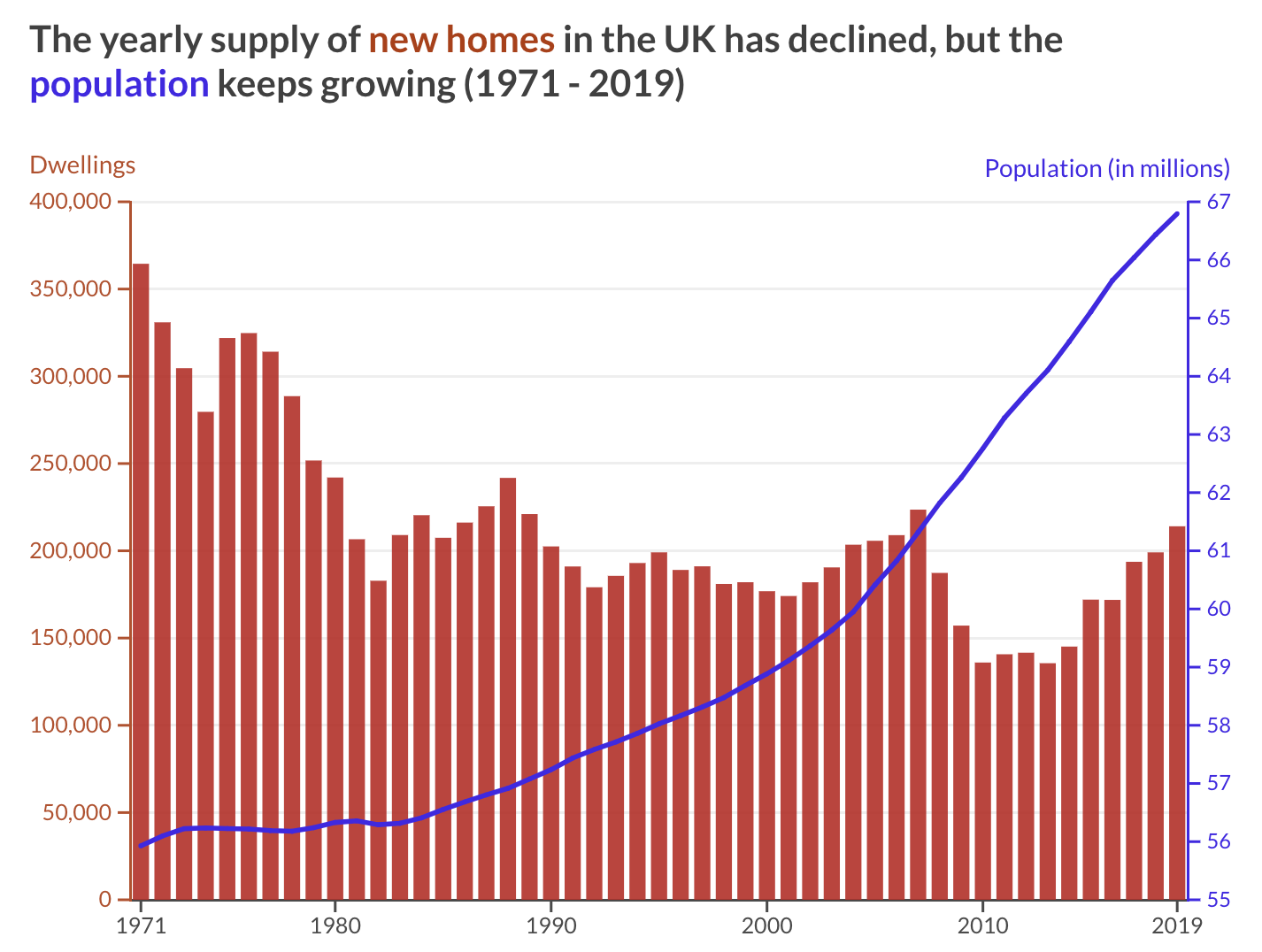
Dual axis charts: double the fun or double the trouble?
Dual axis charts can be tricky to master and some data visualization practitioners have sworn them off completely. But, are they really off limits? Spoiler alert: they are not! In our latest blog, we explore the benefits and drawbacks of using a chart with two axes. We offer suggestions on how to make them work for you and we give you some alternatives if you want to avoid them.
• Read our blog post to learn more
More updates
• Do you want to learn the basics of Flourish? Register in our training site for free.
• Our Heatmap template now has interactive popups and panels. Give them a go!
• We’ve improved our image download options for JPG, PNG and SVG. Here’s what it means for you.
Check our changelog to see more updates on what’s new in Flourish!
We’ll be back in a few weeks with more updates. Until then, as always, just hit reply with any ideas, questions, or feedback!
Best wishes,
Mafe and the Flourish team
Did someone forward this message to you? Join the list!
Flourish, part of the Canva family
33-35 Hoxton Square
London N1 6NN