Hi everyone,
Hope you’re having a great summer! Here’s the latest news for you from Flourish.
New: Extra color options
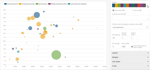
Our programmer Tim has been writing about new color options for categorical data. These include new ready-made color palettes for your visualizations, and clever new tools that can auto-generate suitable extra colors for an existing palette. This is helpful when you know you want to use a couple of specific colors, and want the rest of your palette to harmonise.
• Read Tim’s post on the new color features
Featured user project: Beautiful tweet maps
It was the All-Ireland Hurling Finals this week, and Flourish user Vincent Ryan from the Google News Lab used our time map template to visualise Twitter users reacting, minute by minute. If you want to build one for your own hashtag, you’ll need code to get your raw Twitter data, but then making a tweet map is as easy as duplicating Vincent’s example.
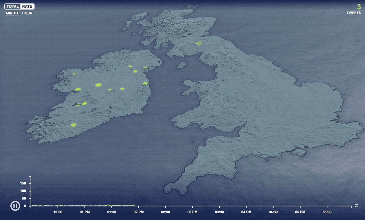
• Duplicate and edit the tweet map • See the UK time map template
New: Passwords and more for Business users
If you’re a Business user, you can now publish visualizations behind a password, which is great for getting feedback from colleagues without Flourish logins. New company pages let you view colleagues and their projects; and we’re beta-testing advanced approvals policies.
• Read more about new Business features
Got feedback or ideas for us? As always, just hit reply and let us know :)
Best wishes,
Duncan, Robin and the Flourish team
Flourish, part of the Canva family
33-35 Hoxton Square
London N1 6NN