How to create interactive gauge visualizations
Track everything from KPIs to elections data with our new Gauge template
Visualizing key metrics in a straightforward yet compelling way is an often-voiced need across organizations of all sizes. Whether you’re looking to communicate a score and its scale in a report, capture KPIs (Key Performance Indicators) in an internal dashboard or check if you’re driving at an appropriate speed – gauges are all around us.
Today we’re releasing a new template for creating fully customizable and animated gauge visualizations that you can embed in any website. Best of all? The new template is free to anyone to use. See it in action in the example below:
Gauge charts, also known as speedometers or dials, are often used to highlight a single key metric, such as an internal score or status. They allow anyone to understand whether something is within, below, or above a certain range of values. The example below shows an example used in a sales data context, making it clear whether a team is reaching its target and allowing quick comparisons across different sales districts.
What’s handy about gauges is that you’re not only displaying a number, but also showing where on the scale that number sits. That’s quite useful when you’re trying to understand things like how close you are to hitting a goal.
How to get started
The template requires only a simple spreadsheet of data, where each row represent a gauge and each column represents a filter state. Simply bind several rows of data to create a grid of gauges, or bind multiple columns of data to create a filterable gauge.
The result will be a mobile-friendly radial gauge visualization that scales to different sizes and displays a different number of columns in a grid depending on the screen size. For best results, we recommend using a script embed.
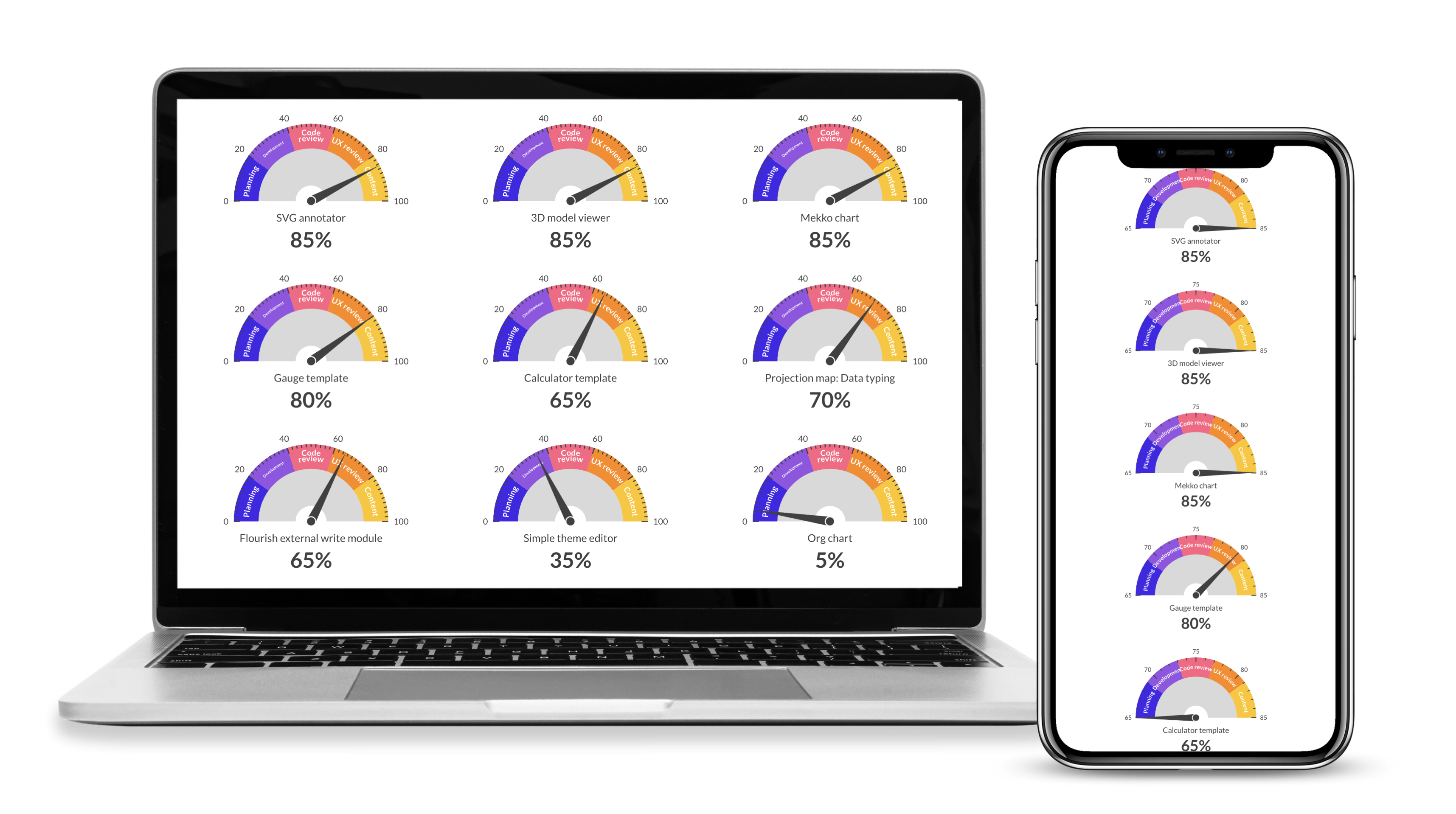
Like any Flourish chart, your gauge visualization will display the appropriate layout across different screen sizes.
Needle, needle, on the wall…
Gauges don’t have the best reputation when it comes to using them for data visualization, specifically around elections. This largely has to do with a specific gauge used in the New York Times in 2016 that became known as “the needle”.
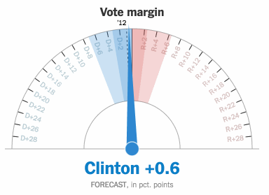
The New York Times’ election “needle” sparked controversy in 2016 because of its rapid changes in predicted outcomes. Image via Will Oremus on Medium.
The New York Times’ election needle shocked the world when it swung drastically between Clinton and Trump’s chances of winning the election, estimating the final result by looking at what votes were left to be counted. At the beginning of the night, the visual had showed an 85% chance of Clinton winning – but by 10 pm that same evening, the needle pointed to a 95% chance of Trump winning the election. Meanwhile, a jitter effect was used to visualize the certainty of the forecast – more jitter signalled more uncertainty, as the range of possible results was larger. An extreme emotional reaction across social media and news articles alike followed the use of the needle, tarnishing faith in polls and the visualization technique itself.
But the needle, which the New York Times has since used for US congressional elections, did what it was set up to do – It forecasted the outcome of the election based on the votes that were already counted. And because incomplete election results are often unrepresentative, what’s important is to give context to the numbers.
Today, the gauge is often seen in political forecast ratings and predictions, such as in Politico’s forecast across every political district in 2022.
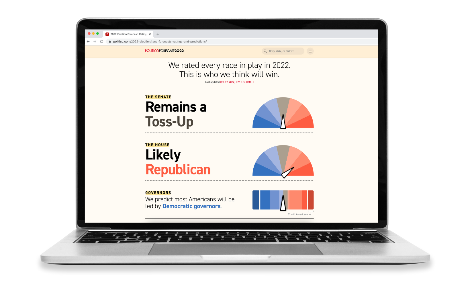
Politico use gauges in their midterms coverage to forecast the results of each state.
Gauges for sports
Gauges can also be used to visualize sports data – such as the probability of relegation, champions league qualification or winning the league. You can even add a filter to toggle between different views by adding multiple columns of data.
To get started
- Select one of our Gauge starting points.
- Go to the Data tab and paste, upload or link the values you’d like to visualize as gauges.
- Bind multiple columns to display optional controls.
- You can easily customize your scale in the Scale domain settings.
- Customize the look-and feel of your gauge in the settings. You can customize everything from the gauge shape and color to axis ticks and highlights.
- Optionally add your visualization to a Flourish story to animate between different views.
- Publish and embed to generate a script or iframe embed code.
A run-through of creating a gauge visualization in Flourish using our premium live data feature.
Learn more about the different gauge settings in our help doc.
Happy gauging!
Get started with your own gauge for free now – and make sure to share your creations on social media using the hashtag #madewithflourish!