When tables are the most effective form of data visualization
7 situations where it makes sense to use an interactive table instead of a conventional visualization – and how to make them in Flourish
Tables have long been a staple of data visualization, offering a clear and straightforward way to present information. Yet, in an age where vibrant infographics and dynamic charts often steal the spotlight, tables are sometimes undervalued.
However, tables can be incredibly powerful and practical, particularly when enhancing them using our Table template.
We’ll explore seven situations where tables are the best choice for presenting data. Throughout this journey, we’ll share tips and tricks to make the most of Flourish’s capabilities, ensuring that your tables are not just informative but also engaging.
Let’s give tables the credit they’re due and see how they can offer unparalleled insight when designed with intention.
What are tables and when should you use them?
Tables are a fundamental form of data visualization that organizes information in rows and columns, allowing users to easily compare, analyze, and understand data patterns or relationships.
Whether to use a table or a different type of data visualization depends on the nature of your data and the insights you want to convey.
In general, tables are ideal for presenting precise values or specific data points in a structured format. To better understand when to utilize tables for data visualization, explore these seven practical examples.
1. Focus on how individual, precise values
If your focus lies on the exact numerical values in your data and you want to reference specific data points accurately, tables usually offer the most clarity and precision.
A simple table is ideal to show individual values, especially if the precise value is key rather than a trend or general pattern.
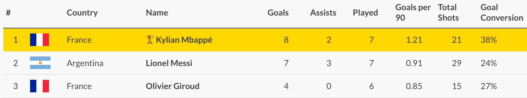
2. Show ranks
Tables are particularly effective for ranking data because they present a clear, ordered list of items that allows for quick comparison and assessment.
With a table, your viewers can immediately grasp the hierarchy of values—from the highest to the lowest or vice versa—making it an excellent choice for leaderboards, sales figures, or any other data where the ranking is significant.
Moreover, tables can easily accommodate additional columns to provide context or supplementary data, such as percentage change or categorical groupings. This further enriches the ranking narrative without sacrificing readability.
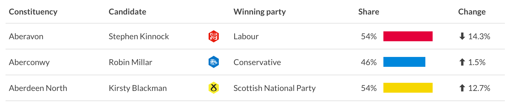
3. Make your data set explorable with a search
Make your data explorable with a searchable table. With one click, you can add a search to your table and empower your readers to navigate through the information and pinpoint the data they’re interested in.
This search functionality transforms a static table into a dynamic tool, where users can filter results based on their queries, and efficiently drill down through layers of data. This not only enhances user engagement but also generates a more personalized analysis, as you can easily slice through the volume of data to extract exactly what you are most interested in.
Add emojis such as arrows to make the information easier to digest, color your cells as a cue for the percentage change direction or add mini bar charts to show a trend visually.
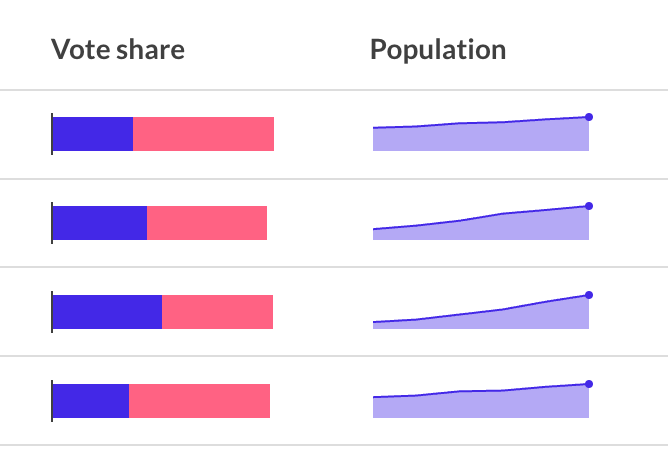
4. Compare values
Tables are excellent for facilitating comparisons by presenting data side by side in a clear manner. Users can quickly compare corresponding values, such as quarterly sales over multiple years.
Placing values side by side highlights differences and similarities with ease, allowing your readers to quickly analyze trends and outliers.
With Flourish, you can add mini line charts, also called sparklines, to show the trend visually. Make sure to shade your cells to highlight a certain figure, as seen in the example below, to draw attention to the drop in sales between Q1 and Q2 of 2020.
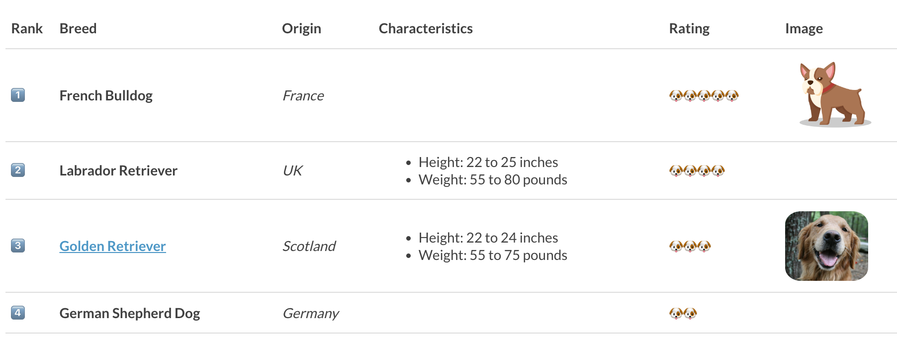
5. Show different metrics
Tables help you present data sets with multiple values and units of measure without having to create complex visualizations.
The linear and organized format of a table helps to maintain clarity and prevent misinterpretation. Using a table, you can ensure that even complex information with diverse units of measure remains accessible and understandable to your viewers.
By allocating separate columns for each metric, tables allow for the easy comparison of varied data types — be it financial figures, performance statistics, or demographic details — within the same visualization.
In the table below, we can easily present and compare universities by their ranks, number of full-time students and share of international students.
You can also add a mini stacked bar showing the female-to-male ratio in a visual way and a search bar to make the data explorable.
6. Turn your table into a heatmap
Heatmaps are particularly useful for identifying patterns, outliers, or correlations within large datasets, as the color intensities guide the viewer’s eye to areas of interest.
In Flourish, you can easily transform a conventional table into a heatmap, by coloring cells based on their values, making it easier to spot high and low points at a glance.
Below, we have multiple columns showing the same information (the maximum temperature) so we are using the same color gradient for all columns. The higher the temperature, the darker the cell background.
7. Visualize qualitative data
Lastly, use a table to present your qualitative data in a structured format, making it easy to compare and analyze non-numerical information or categorical variables.
Reveal patterns by coloring cells by a categoric value, for example the genre of a film in the example below. Add emojis and mini bar charts to make your table stand out.
You want to add extra information to a cell but don’t want your table look cluttered? In Flourish, you can add popups to any cell in a table.
Read more about how to add popups in our help doc.
How to improve your tables
There are multiple tips and tricks to enhance your tables and make them stand out. Generally, adding visual elements to your table will help users gain insight from the data faster than a basic table. Color gradients help viewers identify patterns and outliers, icons help identify a change in measures between dimensions.
- Add mini bar and line charts to show part-to-whole relationships or development over time. Also called sparklines, mini line charts are ideal to show data spanning longer time periods in just one table cell.
- Incorporate custom HTML and CSS to format your text or add images, symbols and even emojis! This allows for a visually enriched table experience – read more in our help doc.
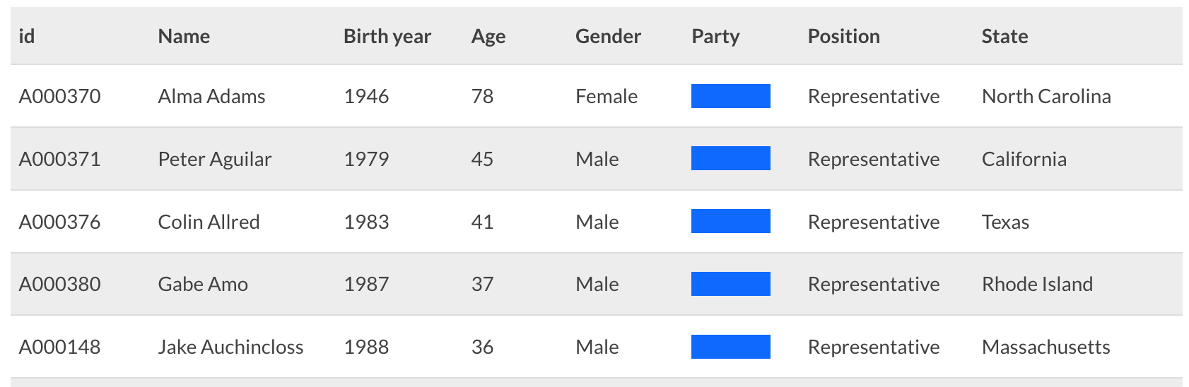
- Use colors to direct the reader’s attention towards crucial details and help them navigate the table. Color can emphasize important information by highlighting specific columns or rows that readers need to pay attention to. Use different colors for distinct categories (such as political parties) to help the reader navigate and understand your table.
- Consider grey stripes for long tables with many columns.
As we have learned, tables offer a direct way to showcase information, often outperforming more complex visual aids in clarity and precision. From ranking and making datasets searchable to comparing values and showcasing diverse metrics, tables are extremeliy versatile.
By integrating visual elements like color gradients, sparklines, and custom HTML, your tables can leap beyond basic grids to become compelling narratives.
Ready to elevate your data storytelling? Dive into Flourish and unleash the full potential of tables in your next project.