Hi everyone,
It’s that time again! Today we have two exciting new templates to share and a whole pile of new features, including our first major data transformation tool. Here goes…
New template: Point map
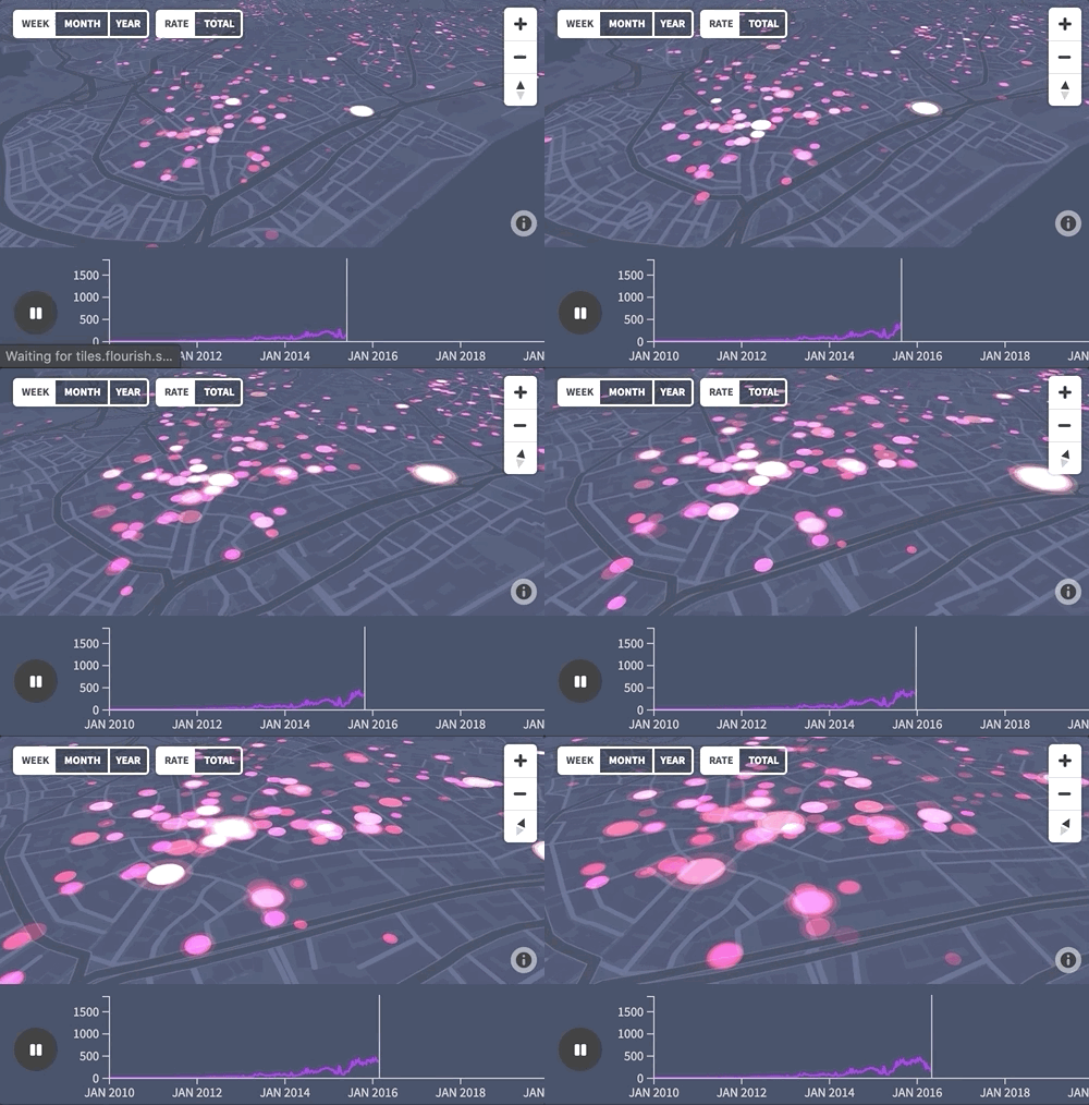
Our powerful new “Point map” template makes it easy to visualize large geographic datasets. Use it to display tens of thousand of points either all at once or over time, with a mini line chart acting as a summary and time control.
• Blog post: Visualizing large geographic datasets
• Example: The jaw-dropping rise of AirBnB in Istanbul
New template: Cards
Often the best way to show structured information is not a traditional visualization, but a nicely produced content grid. Hence we created the Cards template, which allows you to easily create a beautiful carousel or grid of content blocks.
• Read the blog post and view examples
New feature: “unpivot” data to long format with one click
You can now easily convert data from “wide” format (e.g. months in column headers) to “long” format (e.g. a month column plus a value column). This will help you get common data formats into the shape required for long-format templates such as Scatter. Let us know what you think!
• Unpivot data columns: read the blog post
You asked, we built…
We love hearing about what features you’d like to see in Flourish, and we note down each request. This month we added a lot of 2019’s most frequently requested features:
• Date handling has been much improved on in our standard line charts template, letting you separately set the input and display formats.
• You can now add custom color scales in our standard maps template.
• Node labels are now supported (as well as node images!) in the network graph template.
• Custom survey maps. You can now upload a custom map image covering any region to a visual made with the Survey template.
We’ll add blog posts or help articles about all these features and flag them up in a newsletter soon!
Want to test our new code-free scrollytelling tool?
Last month, when we revealed our hidden “scrollytelling” feature, we said we would soon be launching a new version that allows you to do scrollytelling without any coding. This is now built! If you’d like to help test it in your CMS or blog, please reply to this message.
How to visualize elecciones
Ahead of the elections in Spain, Pablo at Google News Lab kindly translated our popular blogpost about visualizing election data into Spanish.
• Nueve ideas para hacer gráficos en elecciones!
We’re hiring (soon)
Although we haven’t put ads up yet, we expect to soon be hiring more customer support and business development roles in London. If you’re interested, send a note to jobs@kiln.digital and we’ll make sure you get alerted when ads go up.
Coming up next…
We’ve recently been building and launching things faster than we have time to promote. So expect another update soon when we officially launch the features currently on the site in beta: dual axis charts, beeswarms, violin plots and quizzes. Phew!
As always, we’d love your feedback and ideas. Just hit reply…
Best wishes,
Duncan and the Flourish team
PS. In case you missed it last time…
• Flourish’s secret scrollytelling feature
• Animated arrow plots
• UK election hexagon map example
• A new list of Flouirish’s many map templates
• Configuring the “All” option in scatter plot filters
• You can now find invoices in your account page
• The Hierarchy template now includes a menu for switching value columns
Flourish, part of the Canva family
33-35 Hoxton Square
London N1 6NN