Hi everyone,
March brought a lot of exciting content and new features that we want to catch you up on!
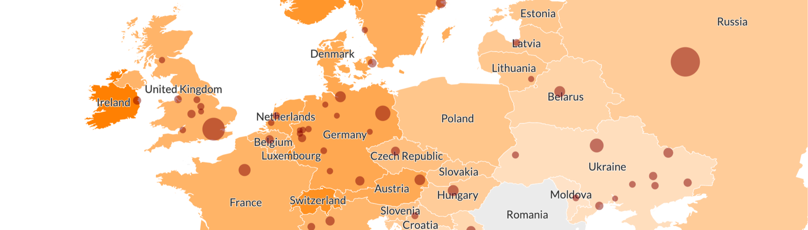
Region labels in projection maps
This feature was requested again and again by users from around the world and we’re thrilled to announce it’s finally here: you can now display region labels directly on your projection maps and even specify certain labels to show or hide.
• Get started with region labels now
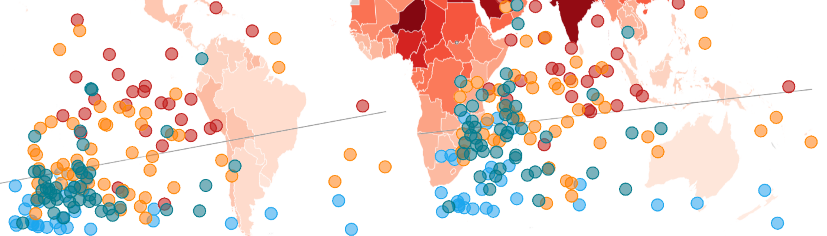
World Health Day
We were inspired by this year’s World Health Day campaign “Our planet, our health” to examine data on air pollution’s distribution and effects to understand how one of urbanization’s most harmful consequences can impact our health.
Our first customer story: Finance Uncovered
We worked with the investigative publication Finance Uncovered to showcase some of the insights revealed by the leak known as the Pandora Papers. Through maps, surveys and stories, we managed to visualize over two decades of financial data on anonymously owned properties in the UK.

Five ways to effectively visualize survey responses
Surveys are a great way to collect quantitative and qualitative data. In this blog post, we gathered a series of good practices and resources to help you visualize results from questionnaires and polls.
Upcoming webinars
Our “Tea Break” webinars – available to all users – are a great way to learn about new parts of the Flourish world. On April 12th we did an overview of the Heatmap template and you can watch the recording here. To finish off this month we’ll teach you “How to flourish at data storytelling” (pun intended!) on April 26th, then we’ll start May with a session on “Five useful Flourish tips and tricks”. Join us to learn more about how to make the most of your Flourish visualizations.
Can’t make it? No problem. You can find all the recordings of our previous webinars on our YouTube channel.
• Sign up for our “Tea Break” webinars

Other updates
• We’ve added two new GeoJSON resources to showcase the regions and districts of Ukraine. Visit our repository to download the files and check this help doc to learn how to upload your own regions to Projection maps.
• It’s now possible add axis highlights to the “Gantt” template using the same syntax as other templates that support this feature.
• Adding charts to popups just got easier! We’ve introduced a new syntax for embedding visualizations within charts. The new feature is currently live in our Line, Bar, Pie template and we’ll be rolling it out to other Flourish templates in due course. You can learn more in our help doc.
Planned downtime
The Flourish app will be out of service on May 3rd for around one hour at 2 am UTC time. Learn more about what this means for you and your projects on our site.
We’re hiring!
The Flourish and Canva teams are growing and we have great opportunities across several teams. We’re currently looking for a a senior backend engineer, an infosec compliance analyst, and an operations lead to work on the Flourish platform.
• Does this sound like you or someone you know? Apply now or spread the word!

We’ll be back in a few weeks with more updates. Until then, as always, just hit reply with any ideas, questions or feedback – and keep an eye on the changelog for more updates!
Best wishes,
Luisa and the Flourish team
Did someone forward this message to you? Join the list!
Flourish, part of the Canva family
33-35 Hoxton Square
London N1 6NN