Hi everyone,
We hope you’ve had a great summer! We’ve been keeping busy and are excited to share some new features, content and inspiration with you.
Find stories within your data and tell them beautifully with our Data Explorer
This template allows you to mix and match your data to create multiple charts with ease. From beeswarms and scatter plots to maps and cartograms, the Data Explorer has it all! This template is included in our premium plans. Learn more about them here.
• Check out our blog post to learn more
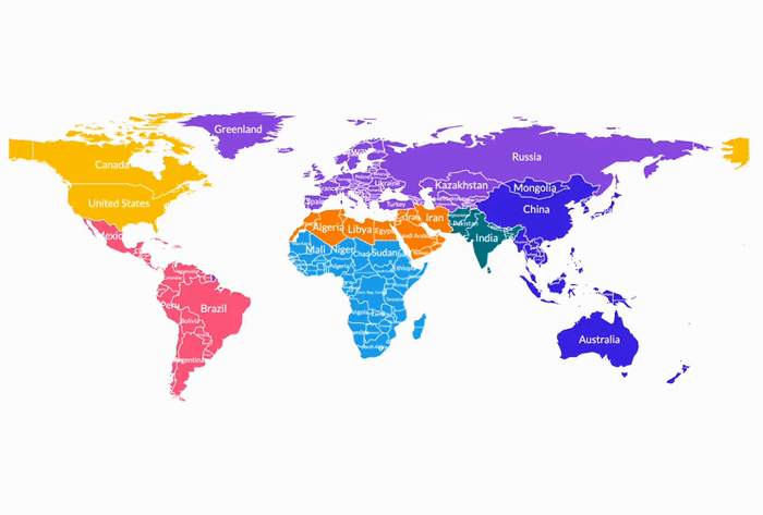
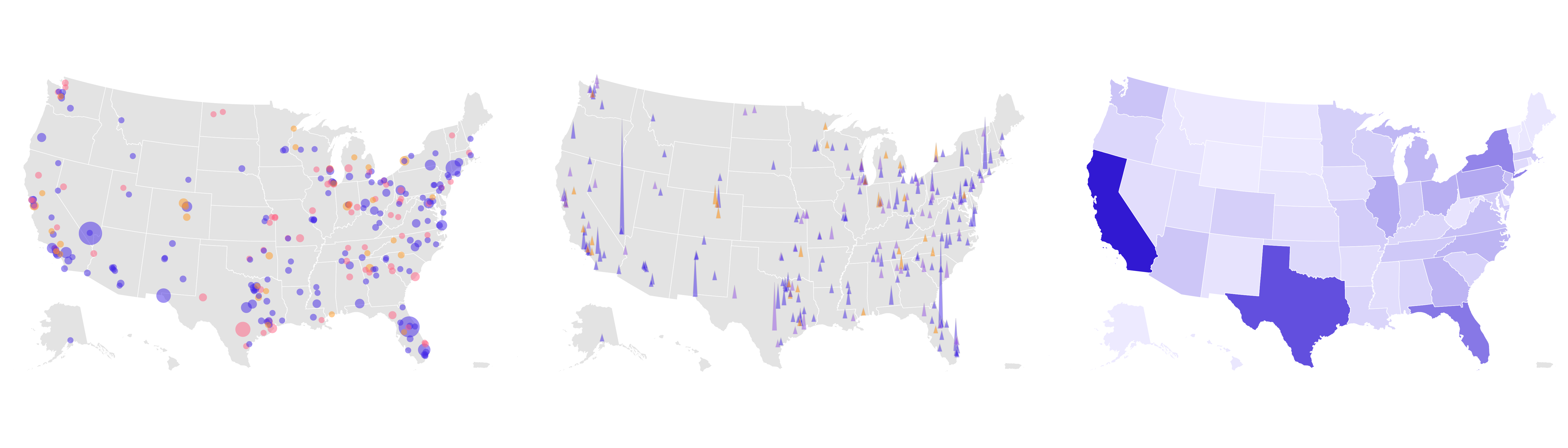
How to choose the right map type for your data
Maps are a great resource to show data and insights, but choosing the right map type can be challenging. We have created a guide to help you understand the different map types we offer, when to use them and how to create your own with ease.
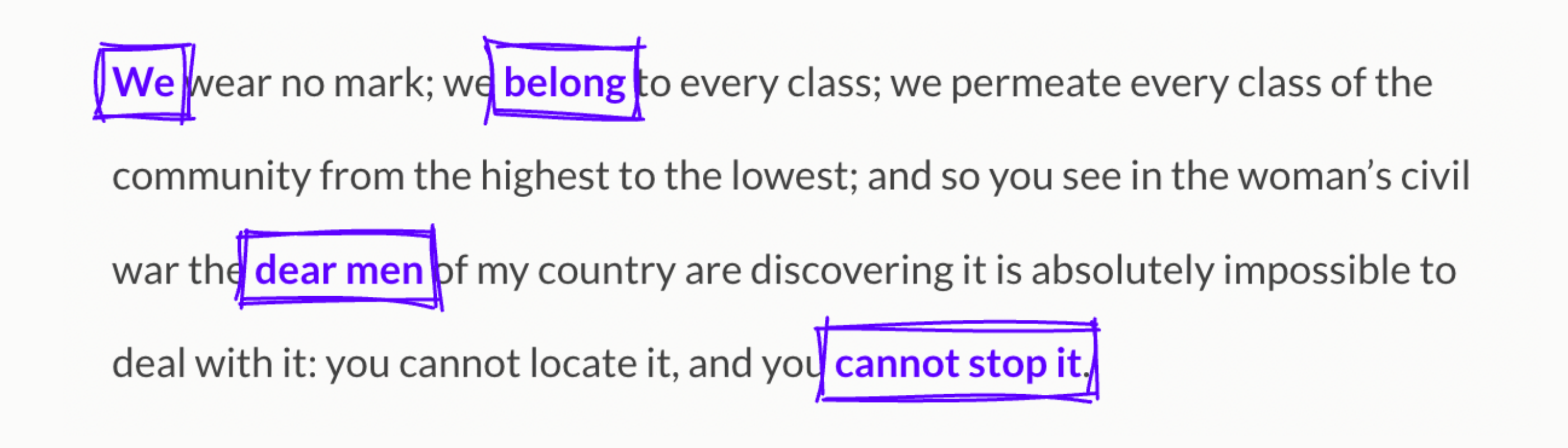
Bring your text to life with our Text Annotator template
Whether it’s a poem, the lyrics of your favorite song or a document, our new template allows you to add notes and explanations to any text. Teachers can use this to explain passages in a book, newsrooms can highlight quotes from speeches, and developers can even annotate code! This template is included in our premium plans. Learn more about them here.
• Read the full story on our blog
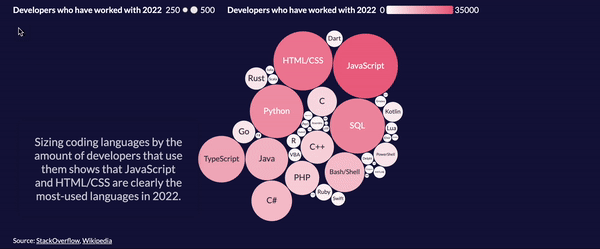
Discover the latest trends in software development with our interactive scrolly
We took a look at the 2022 StackOverflow developer survey to learn more about today’s developer landscape. Check our interactive scrolly to learn more about which languages developers prefer, which ones they’re keen on learning and more.
• View our interactive scrolly
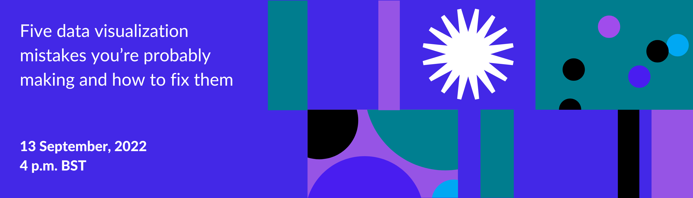
The Flourish webinars are officially back!
The wait is over! Our revamped webinar series is now live. Celebrate with us and join our first session on Tuesday, September 13th (4-5 p.m. BST) to learn about five data visualization mistakes you’re probably making and how to fix them.
• Visit our website for more details
More updates
• You can now add a line layer to the 3D Map template. Good for visualizing borders, rivers, railway lines and more!
• Automatically assigned data types are now available in our Line Chart Race template
• You can now set your stories to autoplay and loop on load, a great alternative to screen recording!
Check our changelog to see more updates on what’s new in Flourish!
Come work with us!
The Flourish and Canva teams are growing. We have great opportunities across several teams, including senior backend and visualization engineers and a data visualization project expert, to work from our brand-new office in London.
• Apply now or spread the word!

We’ll be back in a few weeks with more updates. Until then, as always, just hit reply with any ideas, questions or feedback – and keep an eye on the changelog for more updates!
Best wishes,
Mafe and the Flourish team
Did someone forward this message to you? Join the list!
Flourish, part of the Canva family
33-35 Hoxton Square
London N1 6NN