Streamgraphs: how to make them and what you need to know
Streamgraphs effectively showcase data trends and patterns, and with Flourish, crafting one is easy and code-free
One standout feature of our Line, Bar, Pie template is the ease with which you can switch chart types at the push of a button. Curious to see your data in an area graph instead of a line chart? No problem! You can effortlessly transform your visuals within seconds.
Not only does this adaptable template support line, bar, pie and other charts, but it also introduces you to the visually captivating streamgraph. Like the other chart types on our platform, the streamgraph comes equipped with a range of customization tools, including series and row filters, annotations, custom popups, and eye-catching animations, allowing for a rich and engaging data visualization experience.
What are streamgraphs?
A streamgraph is a variation of a stacked area chart. Instead of plotting values against a conventional Y axis, the streamgraph offsets the baseline of each “stack” to make it symmetrical around the X axis.
This results in flowing, organic shapes – “streams” – displaying the change over time. According to a paper on the topic by Lee Byron and Martin Wattenberg, the streams are perceived as familiar, which makes them visually appealing and easy to understand.
Removing the baseline can often make individual categories more legible, and flowing in both directions reduces the sense of a vertical hierarchy. A streamchart also avoids one series being different from all the others by virtue of having one straight side.
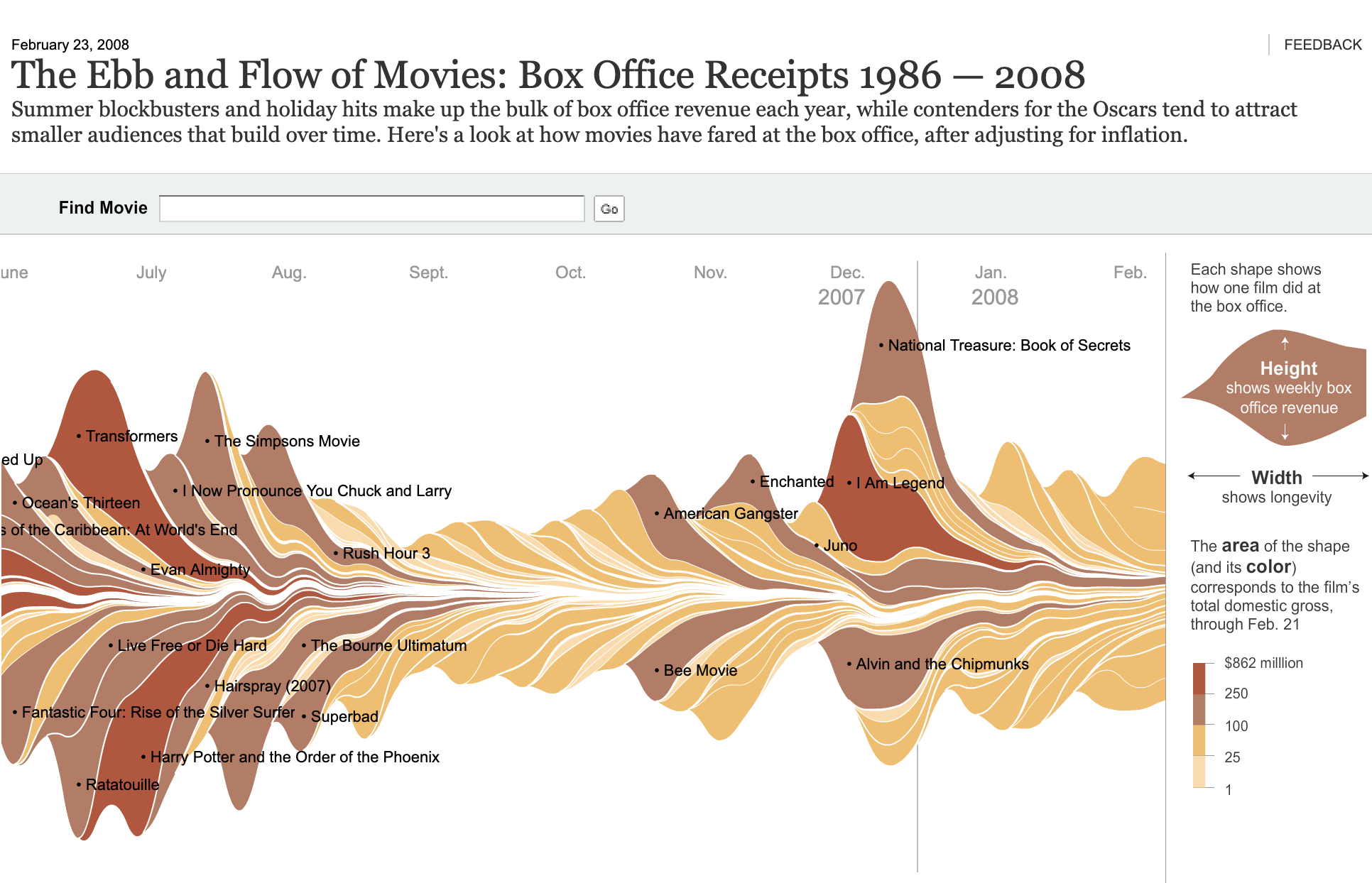
Typically, streamgraphs are best when working with a handful of “streams”, but as always with data visualization, there are exceptions. One of the charts that helped popularize the technqiue was “Ebb and Flow of Movies” by Mathew Bloch, Lee Byron, Shan Carter and Amanda Cox at the New York Times. This very distinctive chart has dozens of small streams representing blockbuster movies. It manages to show both the overall seasonal trend and its composition, with individual movies each undergoing their own peak and decline.
The challenges with streamgraphs
Although many people perceive streamgraphs as easy to read and intuitive, they do have some downsides. As with any stacked area chart, they can easily get cluttered if you try and add too many categories at once. Adding interactivity, such as a search box or filter, can help deal with this issue if your dataset has lots of categories – read the section below for a deeper dive on the topic.
Another limitation is that streamgraphs don’t support negative values. That’s because there’s no clear zero baseline to differentiate positive from negative. Hence in streamgraph mode any negative values in your data sheet are ignored – just as they are in proportional charts such as pies or percentage bars.
A final downside with streamgraphs is that the lack of a Y axis makes it impossible to read the scale at a glance. Interactive popups can help with this, however, and so can annotations.
Tackling those challenges with interactivity
As Andy Kirk wrote in his blog post on streamgraphs, this visualization technique is at its best as an interactive exploratory tool, enabling users to take a journey along the flow of patterns.
In Flourish, you can add a layer of exploration by using a filterable legend or controls, or by adding your streamgraph to a Flourish story to bring it to life and highlight changes.
The chart above showing Olympic medals won by countries over time combines two features: a filterable legend and a row filter that allows you to switch between summer and winter games. Clicking on a country in the legend removes it, allowing you to view the remaining streams in more detail. Meanwhile, the axis highlights provide additional context to moments when the streams narrow.
Lastly, by hovering over each stream, you can see more information in the popups about the total medals each country has accumulated at that moment in the timeline.
How to create streamgraphs in Flourish
To create a streamgraph, simply select the streamgraph starting point from our template page. Or choose the streamgraph option from the Chart type dropdown when working in the Line, Bar, Pie template.
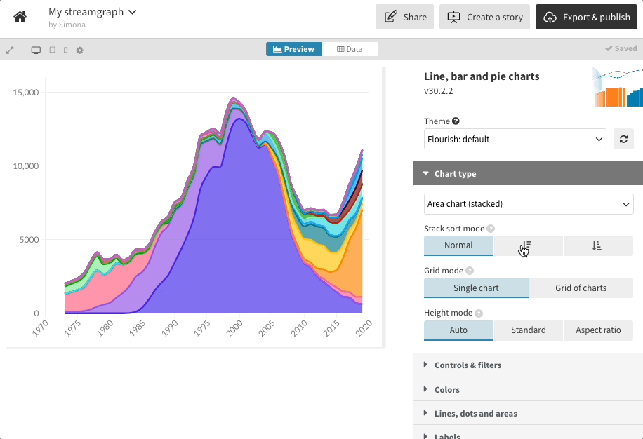
Switch between chart types with the click of a button
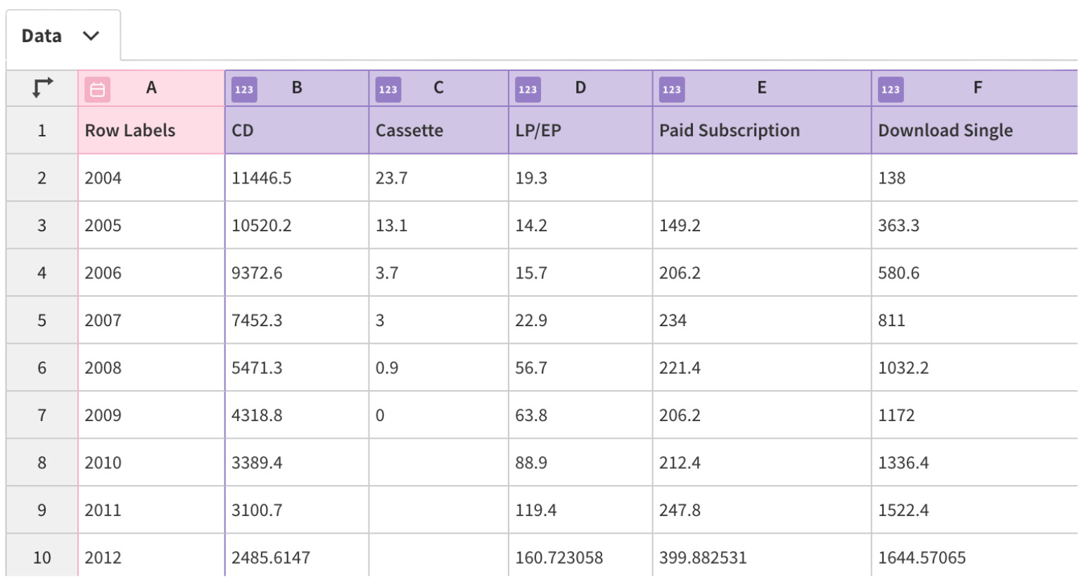
Just like our standard line and area charts, the template uses wide data format, so when adding your data, you need a column for each “stream” in the chart.
Flourish streamgraphs also support auto-setting of columns in the Data tab – an exciting feature that interprets the dataset you upload, works out the data type each column includes (this could be text, numbers or dates) and automatically binds columns under the most appropriate settings. Read more about this in our blog.
Once your data is in place, you’re all set to dive into the creative side of things. Want to arrange your insights into a neat grid of small charts (small multiples) or introduce a handy filter to the mix? Rest assured, the Line, Bar, Pie template seamlessly adapts to your vision, empowering you to craft your charts just the way you want them.
We’re excited to see how you harness the power of streamgraphs to elevate your data storytelling. And if you’re looking for more creative ways to visualize your data, check out our other blogs below for additional tips and techniques.