Hello everyone,
Greetings from an increasingly chilly London. We have a few exciting things to share this week.
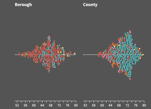
Introducing beeswarms, violin plots and WebGL scatters
You can now easily make beautiful beeswarm and violin plots to show distributions in your data. These chart types have been added to our Scatter template, which also now includes a WebGL mode, enabling it to display and smoothly animate tens of thousands of points simultaneously.
• Read the blog post and see the examples
Live maps and charts for the UK election
Calling newsrooms! If you’re covering the UK general election next week, you can make use of our live interactive results maps and charts. We’ll be making these freely available for you anyone to embed, and they will update automatically as results come in.
• UK election maps: make our own or embed our live ones
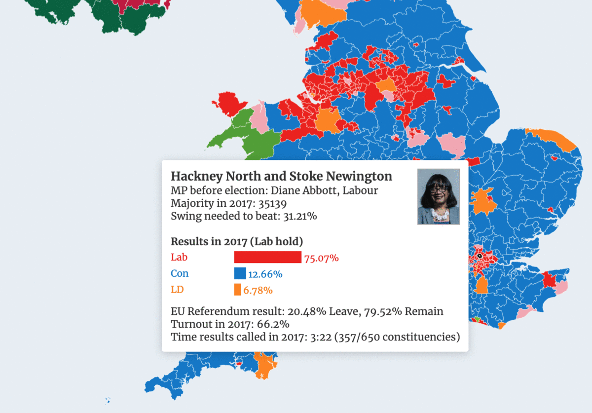
(Psst … behind the scenes, the maps will use Flourish’s new live data functionality. Yes, you heard correctly! More news on that coming soon.)
Bar-race time controls, totalizer chart and vertical mode
Lots of you have asked for a time slider control for Bar Chart Race graphics. This went live yesterday! Even cooler, the slider doubles as a mini line chart showing the totals across the dataset. The updated template also offers a vertical bar mode and timed captions with images.
• Try the updated Bar Chart Race template
You asked, we built…
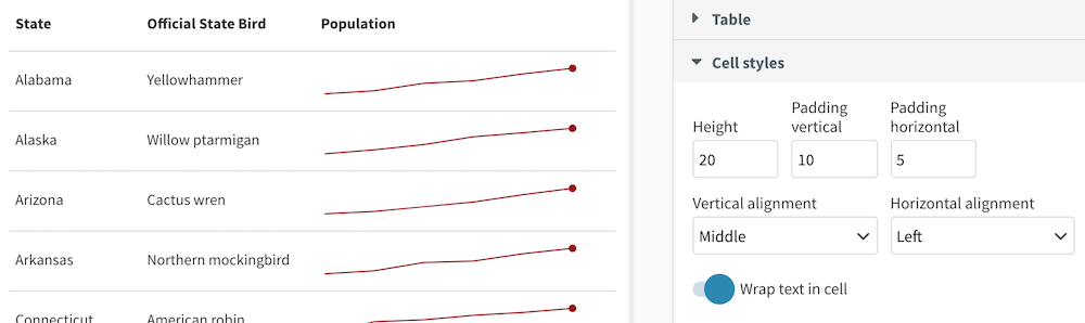
As always, we’ve been busy adding new loads of small improvements based on your feedback. For example, the Line Chart Race now supports “ticking” labels to add dynamism to animations. Parliament Charts reveal party names and totals on hover. And the Table template includes text alignment options.
Join our team!
We’re currently looking to fill two exciting roles at our office in London: a Full-stack JavaScript Developer to work across our Node and AWS stack, and a Support Specialist to help our rapidly growing user base be successful.
Share your best Flourish visualization
The next newsletter will include some of our favourite Flourish projects from 2019. Have you made something you’d like us to consider including? Hit reply and send us a link!
Best wishes,
Duncan and the Flourish team
PS. In case you missed it last time:
• Visualize big geo-datasets with the Point map template
• Create content grids and carousels with the new Cards template
• Easily unpivot your data in the Flourish data table
• Line charts now include proper date axis controls
• Add custom continuous colour scales in maps
• The Network template now supports node labels and images
• You can add a custom maps to a Survey template
• Nueve ideas para hacer gráficos en elecciones!
Did someone forward this message to you? Join the list!
Flourish, part of the Canva family
33-35 Hoxton Square
London N1 6NN