Your ultimate guide to creating custom maps with Flourish
With our Projection Map template, you can upload new geographies and customize them
Did you ever find yourself struggling with inflexible templates that don’t quite capture the nuances of your local story? None of the map starting points were the right fit?
With the freedom to upload your own GeoJSON into Flourish, the only limit to what you can visualize is your own creativity. Whether you’re an analyst pinpointing market trends across unconventional territories, an environmentalist tracking endangered species habitats, or an educator illustrating historical trade routes, the custom map feature in Flourish is a game-changer.
How to create a custom map
With our Projection Map template, you can create data-driven maps for any region you care about.
Before you start, check that your data is in the right format. To add your own regions to a Flourish map, you will have to upload them in a GeoJSON format. If you have geospatial data in another format, such as a shapefile, you can convert it to GeoJSON using a tool like Mapshaper.
We recommend GeoJSON file sizes up to 5 MB. Anything larger will reduce performance. To learn how to resize your GeoJSON file, head over to this help doc.
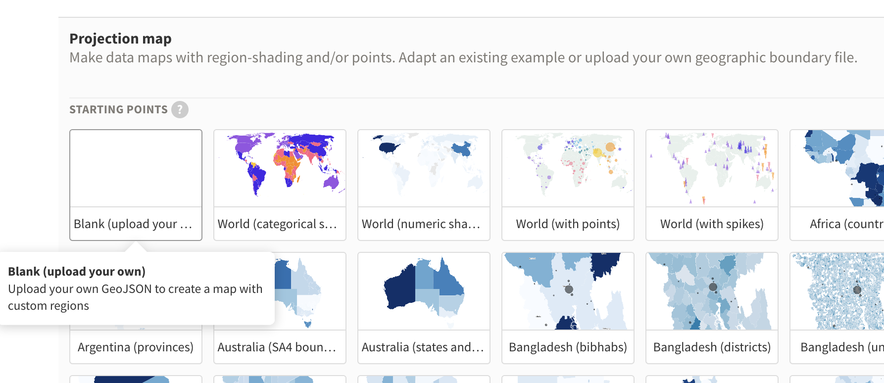
1. In the template chooser, select the Projection map (Blank) starting point
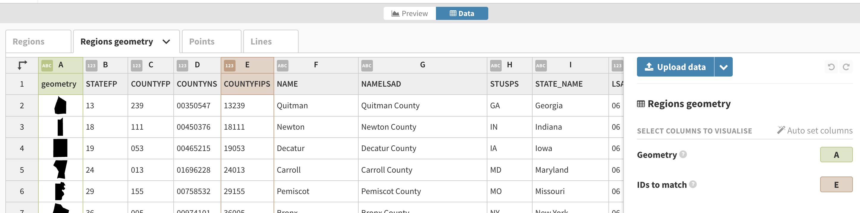
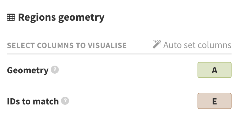
2. Upload your GeoJSON in the Region geometry tab and bind your geometry column under GeoJSON geometry setting in the Data tab.
If you upload your GeoJSON and your map doesn’t seem to display, the coordinates in your GeoJSON are probably not WGS84. Read our help doc to learn how to transform your coordinates to WGS84.
3. If needed, adapt the map projection:
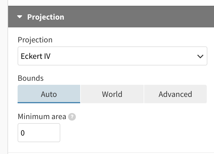
Our maps offer a wide range of projections for you to choose from. Most thematic maps are best with equal area projections, rather than the default Mercator. For example, if you’re building a map of the US, try the Albers USA projection. (If you’re not sure what any of this means, check out our help doc).
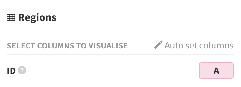
4. Connect your geometry to the rest of your data
Do this by selecting a column that serves as the connection between the Regions and Regions geometry tabs. That could be ISO codes, constituency names, or any other unique IDs. Bind it under the ID setting.
5. Customize your map until you’re ready to share it with the world!
You can even combine it with other features such as the ability to add line layers to your custom map.
Tips for finding your GeoJSON file
Following these steps, you can map out everything from local neighborhood projects to thematic maps of fantasy worlds, all with the intuitive ease of Flourish’s platform.
Struggling to find the right regions for your map? Check out our GeoJSON repository where we’ve sourced, checked, and resized various region files ready for you to download and use in Flourish.
Plus, a simple online search can lead you to a government site, OpenStreetMap data, or an open data portal, which often offers data for their country or city. For example:
- geoportal.statistics.gov.uk (for the UK)
- download.geofabrik.de (OpenStreetMap data)
Now it’s your turn – Flourish arms you with the power to break free from conventional boundaries. Start by uploading your own GeoJSON files!