Dot plot vs scatter plot: Everything you need to know Learn the key distinctions and how to pick the right chart for your data Posted on 17 June 2026 by Lavinia Rossi
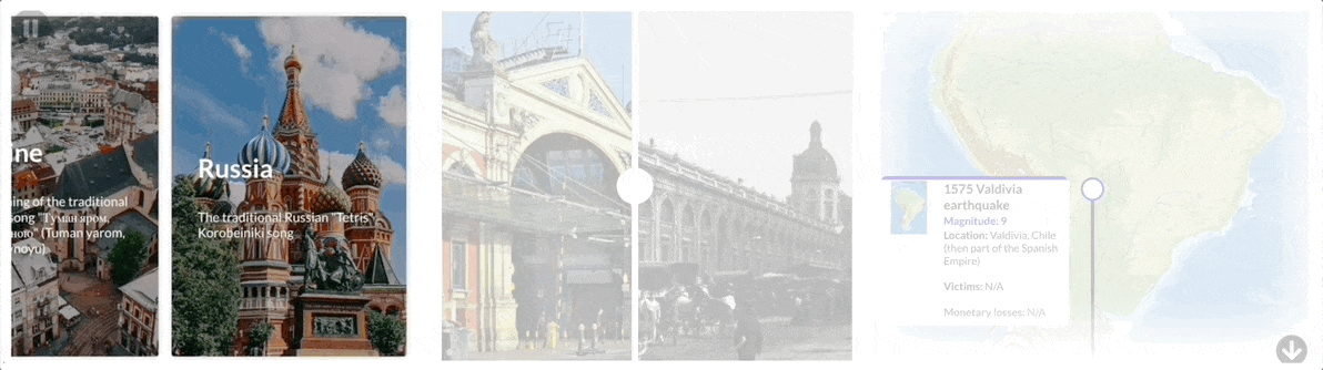
What great scrollytelling looks like — and how to build it yourself Discover scrollytelling examples and how Flourish makes scrollytelling possible without writing a single line of code Posted on 27 May 2026 by Vanessa Fillis
Grouped bar charts: What they are and when to use them A clear guide to comparing categories side by side, and how to build them in Flourish Posted on 13 May 2026 by Lavinia Rossi
What are radial hierarchy charts and how to create one (with examples) Understand how radial charts work – explore radial trees, sunburst diagrams, and when to use each Posted on 08 May 2026 by Lavinia Rossi, Oli Darley, Simona Tselova
8 types of charts you need to master data visualization A beginner-friendly guide on what each chart shows, how to read it, and how to make it clearer Posted on 13 April 2026 by Simona Tselova
How to use radar charts for clear, insightful data stories Learn when radar charts work, when they mislead, and how to create clearer alternatives with Flourish Posted on 30 March 2026 by Duncan Clark, Simona Tselova, Lavinia Rossi
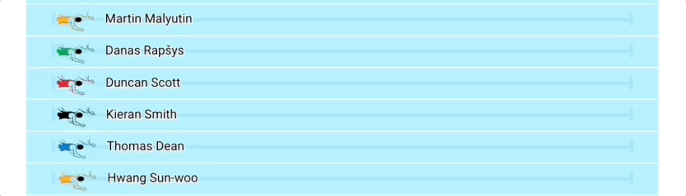
Visualize the World Cup: 15 charts to power your football coverage From fixtures to player stats, build interactive football visuals for every stage of the tournament Posted on 27 January 2026 by Joseph Witcombe and Simona Tselova
Sales reporting: how to create interactive sales reports that drive business decisions A practical approach to sales reporting that leadership teams rely on Posted on 07 January 2026 by Rob Porter
A marketer’s guide to data storytelling: from insight to impact Showcase results, identify trends, and get buy-in with visualizations that speak louder than numbers Posted on 05 June 2025 by Cherie Robertson
From numbers to narrative: smarter ways to share sales performance Learn how to turn sales metrics into clear, useful stories that drive action Posted on 05 June 2025 by Cherie Robertson
Eurovision through the years: a charted history of music’s biggest contest Explore the history and trends of Eurovision, illustrated in 9 comprehensive charts Posted on 15 May 2025 by Vanessa Fillis and Simona Tselova
4 powerful ways nonprofits use data visualization to share their stories Learn how nonprofits are transforming complex data into compelling visual stories using Flourish Posted on 07 January 2025 by Luisa Bider
The Eras Tour in charts: visualizing Taylor Swift’s record journey Unpacking the tour’s milestones and global impact through data storytelling Posted on 10 December 2024 by Annie Parker
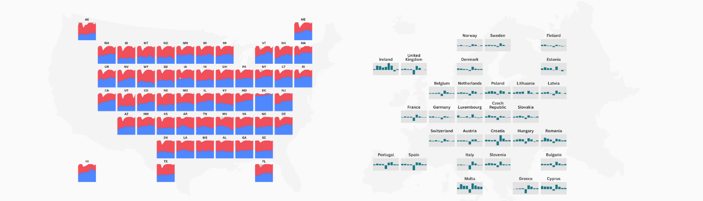
Grid maps: where charts meet maps for easy data comparison Explore small multiples like never before and discover a better way to compare regional data Posted on 23 October 2024 by Duncan Clark
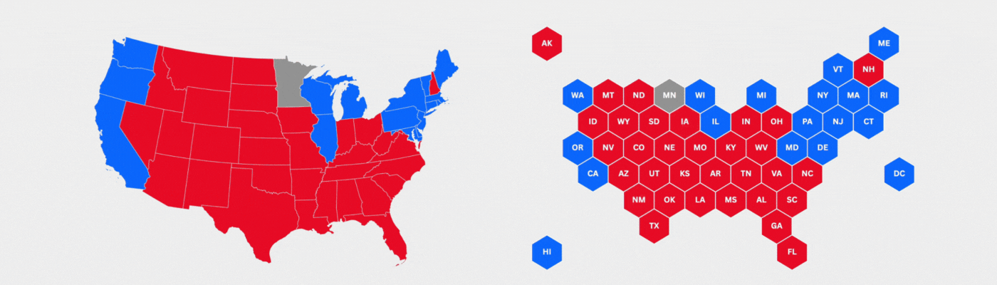
Visualizing 100 years of US elections with interactive maps Explore how political landscapes shifted over the last century with dynamic visualizations Posted on 09 October 2024 by Vanessa Fillis
16 ways to visualize US elections data Master every stage of election reporting with our guide to visualizing US election data: from predictions to post-vote insights Posted on 06 September 2024 by Flourish team
How to create animated 3D point maps without coding Animate thousands of data points to show movement over time in a dynamic and engaging way Posted on 19 July 2024 by Simona Tselova
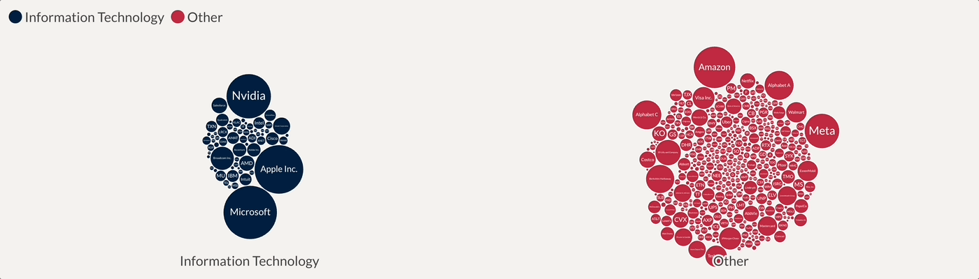
8 easy ways to visualize financial market data Bring clarity to complex financial data with interactive data visualizations Posted on 19 June 2024 by Scott Barber and Vanessa Fillis
Daring to diverge: Flourish and WPP’s journey in data storytelling Uncover the process behind creating engaging and interactive visualizations that push the boundaries of conventional data design Posted on 19 April 2024 by Oli Darley
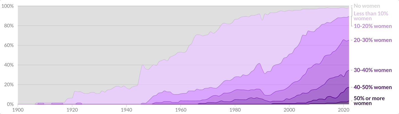
A visual exploration of gender inequality statistics in 2024 Visualizing the gender divide from the classroom to the boardroom Posted on 08 March 2024 by Vanessa Fillis and Mafe Callejón
How to visualize the Olympics Exploring the evolution, achievements, and highlights of the Winter and Summer Olympics through data visualization Posted on 26 February 2024 by Vanessa Fillis
9 ways to transform text and images into interactive visualizations From cards and quizzes to photo sliders and timelines, Flourish helps you turn any qualitative data into stunning pieces of content Posted on 10 January 2024 by Simona Tselova
Explore the data behind the Nobel Prize in 7 interactive charts Revealing patterns in gender, age, and nationality of prize winners through data visualization Posted on 08 December 2023 by Vanessa Fillis and Mafe Callejón
3 reasons why visual communication is key to business growth Insights from Canva’s Visual Economy Report to elevate how your business communicates Posted on 08 September 2023 by Annie Parker
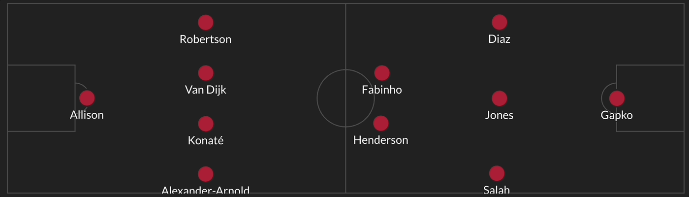
8 ways to visualize football data Bring Premier League data to life with interactive charts, league tables, fantasy football, and more Posted on 10 August 2023 by Joseph Witcombe
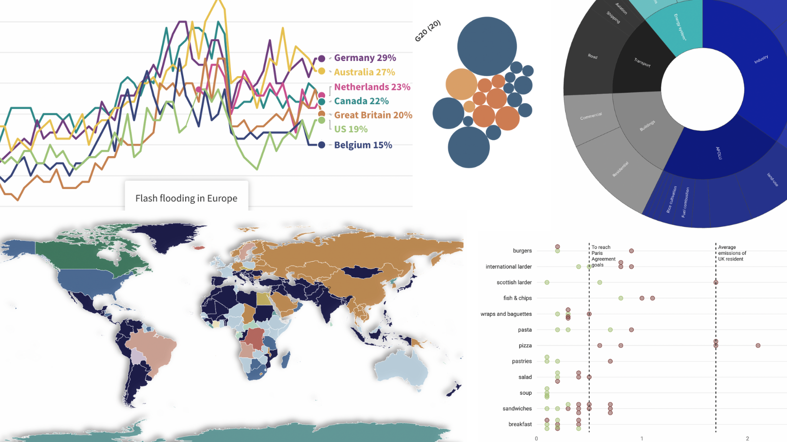
Record-breaking heat: visualizing the effects of the climate crisis We explored rising temperatures and their impact through interactive data visualizations Posted on 13 July 2023 by Vanessa Fillis
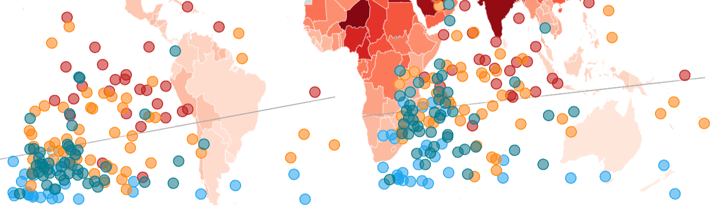
World Refugee Day: visualizing migration trends We looked at the latest migration data to understand where people go when they have to leave their homes Posted on 20 June 2023 by Mafe Callejón and Vanessa Fillis
How to visualize Google Trends data Uncovering insights – how to make the most of Google Trends with Flourish Posted on 10 March 2023 by Luisa Bider
We don’t make mistakes, just happy accidents: Visualizing Bob Ross’ works Exploring the palette and patterns of Bob Ross’ paintings through data visualization Posted on 17 February 2023 by Luisa Bider
My type on paper: the data behind Love Island success We analyzed the data behind Love Island to find out which couples are still together, and who might've entered the show looking for fame instead of love Posted on 03 February 2023 by Annie Parker
A visual exploration of a 15th century bookshop A collaborative project with the University of Oxford Posted on 25 January 2023 by Mafe Callejón
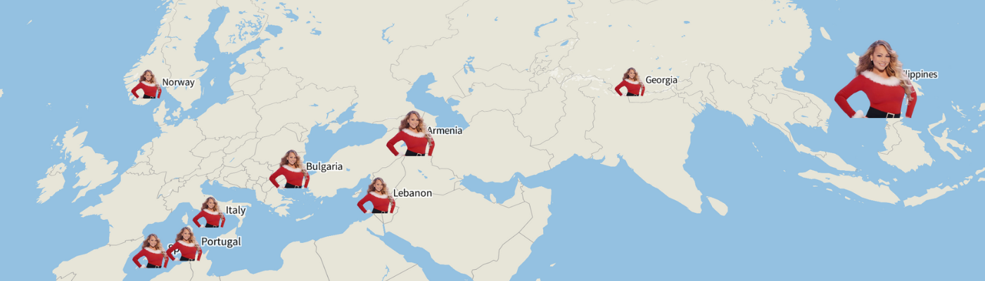
All I want for Christmas… is data 🎵 Using Billboard charts and Google Trends data, we visualized the search trends behind the most streamed Christmas song, “All I Want For Christmas Is You” Posted on 20 December 2022 by Katherine Riley and the Flourish team
Visualizing our 2022 reads Combining our love for reading with our passion for data visualization Posted on 16 December 2022 by Flourish team
4 metrics to visualize in your elections coverage From voting intention to results, learn how you can bring elections data to life with interactive graphics Posted on 06 October 2022 by Mafe Callejón
Wimbledon in 8 charts – from tie breaks to ticket costs 🎾 A visual analysis of the Wimbledon tournament in the Open Era Posted on 28 June 2022 by Simona Tselova and Mafe Callejón
Is the UK housing crisis escalating? Visualizing the increase in average house prices while inflation soars Posted on 06 June 2022 by Simona Tselova
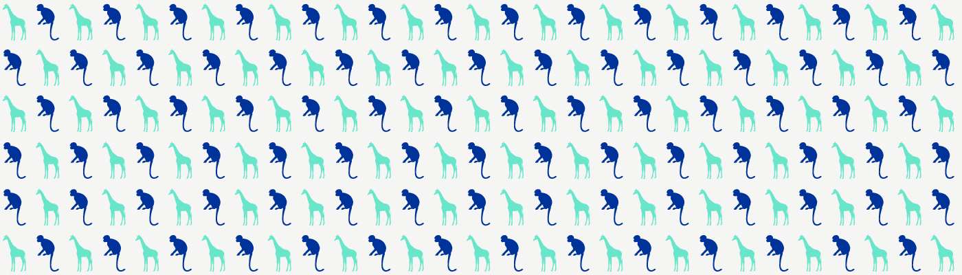
3 days on safari in data 🦒 Visualizing data on journeys across the Maasai Mara National Reserve Posted on 29 April 2022 by Yaning Wu
Visualizing air pollution across the world For this year’s World Health Day, we take a closer look at environmental influences on health Posted on 07 April 2022 by Yaning Wu and Luisa Bider
5 ways to effectively visualize survey responses On a scale of one to ten, how do you feel about visualizing survey data? Posted on 11 March 2022 by Yaning Wu
The life and works of Jane Austen – in data 📚 Celebrating one of Britain’s most-loved female authors through visualization Posted on 03 March 2022 by Annie Parker
The incredible rise of Wordle – visualized! Plotting the global success of the viral word puzzle in data graphics Posted on 25 February 2022 by Luisa Bider and Simona Tselova
Visualizing the COP26 climate conference How our users covered the UN climate change conference Posted on 09 November 2021 by Flourish team
One dataset, ten visualizations Exploring the possibilities, strengths and weaknesses of different chart types Posted on 13 October 2021 by Mafe Callejón
How data visualization can help you communicate effectively We recreated some of the IPCC's climate charts and this is what we learned Posted on 20 August 2021 by Mafe Callejón
Decoding UK elections with interactive visualizations Explore 6 ways to visualize political shifts with Flourish's versatile templates, from polling insights to post-election breakdowns Posted on 06 May 2021 by Vanessa Fillis
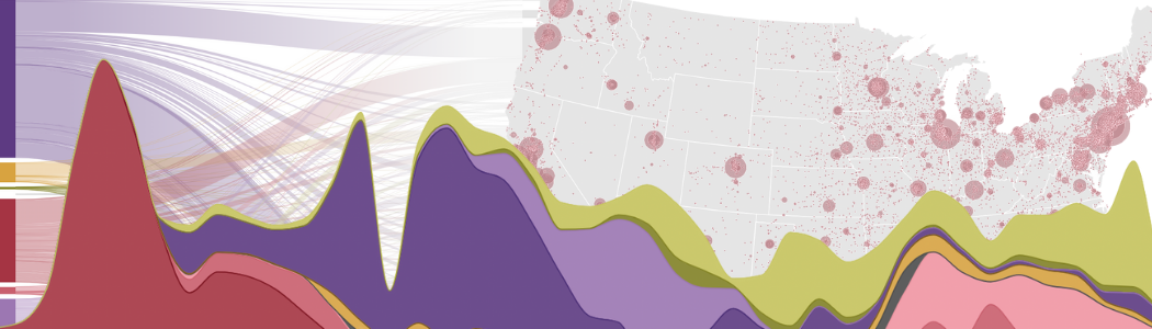
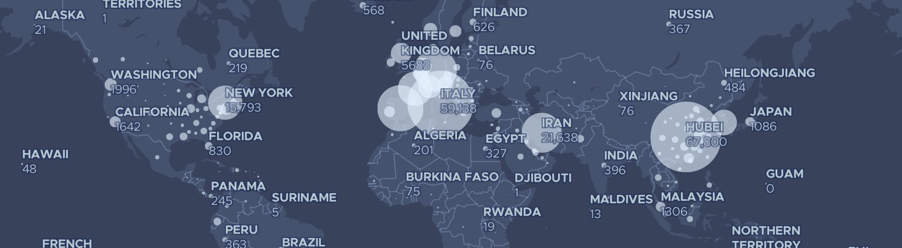
Free regularly updated Covid-19 visualizations to embed A collection of mobile-friendly graphics about the coronavirus crisis Posted on 23 March 2020 by Duncan Clark
9 ideas para hacer gráficos en elecciones Los mejores consejos para enriquecer tu cobertura electoral con Flourish Posted on 23 October 2019 by Katherine Riley, translated by Pablo Sanguinetti/Google News Lab
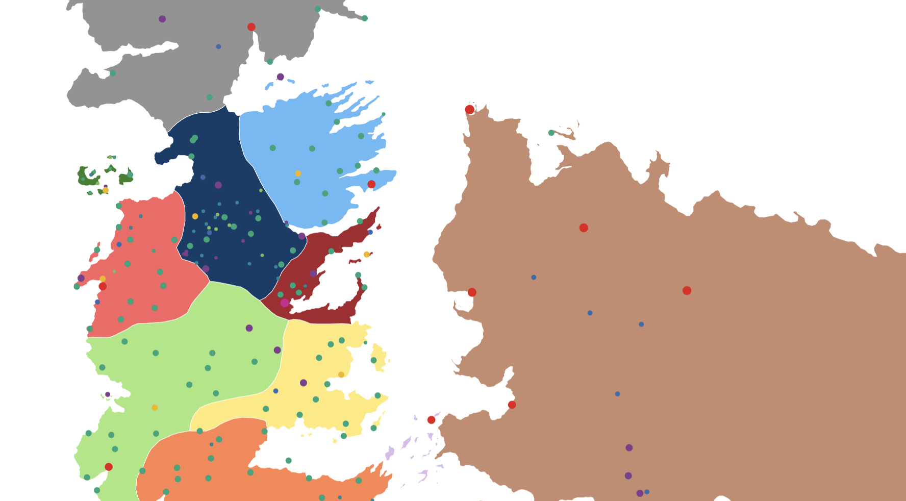
The lands and battles of Game of Thrones. Mapped! A Song of Flourish and Ice: mapping and visualizing Game of Thrones data Posted on 17 May 2019 by Katherine Riley
Pokémon GO data visualization with Flourish A few examples of using Flourish for a data-rich hobby Posted on 18 March 2019 by Mark Longair
Which American city has the worst winter weather? As the polar vortex hits the northern United States, we dig into the data Posted on 01 February 2019 by Katherine Riley
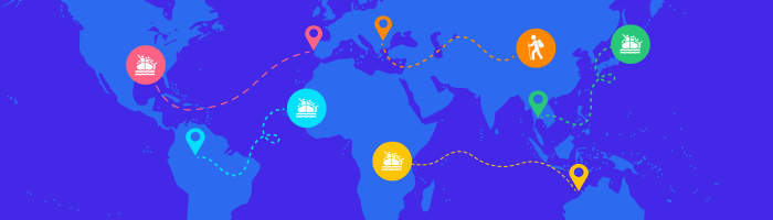
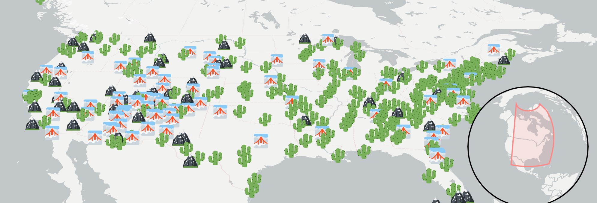
How to create stunning marker maps: dot maps, locator maps, and more Visualize data with icons, emojis and images for a more engaging user experience Posted on 11 December 2018 by Katherine Riley and Duncan Clark
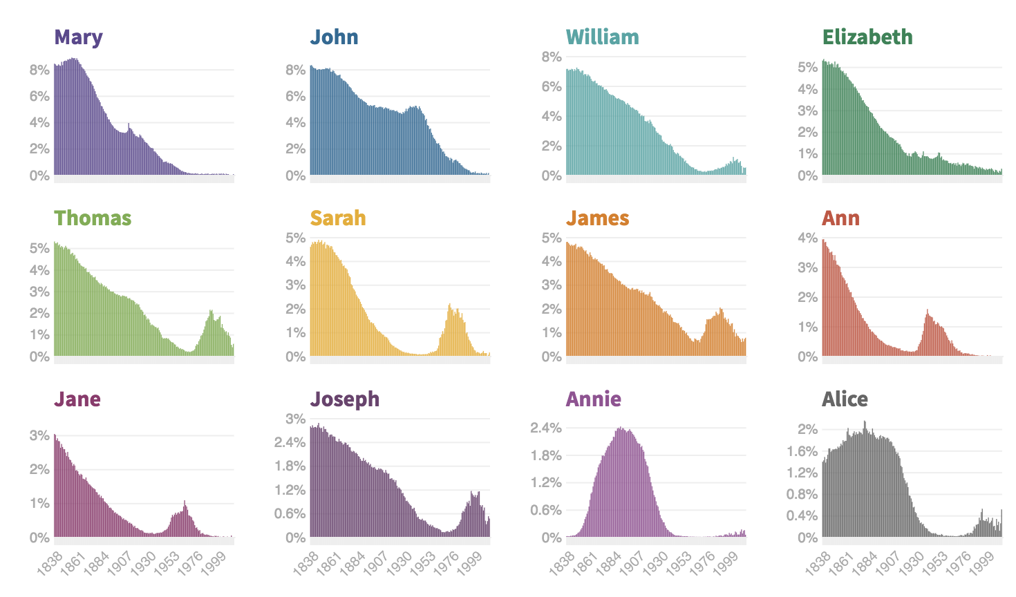
Fun with Flourish – how popular was your name in Victorian Britain? We've built a tool with the University of Edinburgh to let you see how popular your name was in Victorian Britain Posted on 04 July 2018 by Anna Powell-Smith
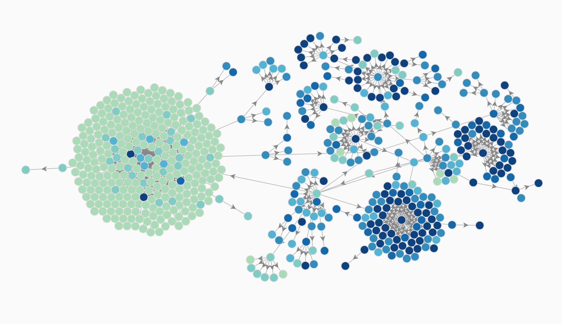
Visualizing the extraordinarily complex structure of modern corporations Exploring the ownership structures of UK companies with Flourish’s new network graph visualizations Posted on 24 April 2018 by Anna Powell-Smith
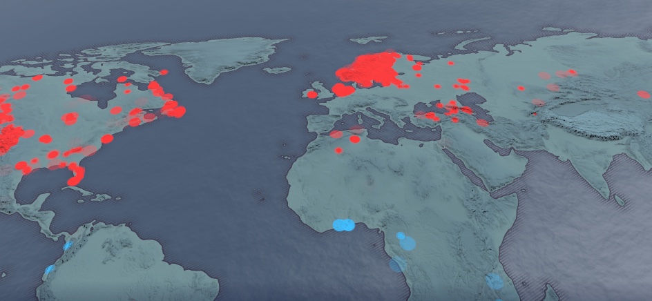
Finding climate change buried in 500 million data points This interactive Flourish map, made by trawling a huge database of daily weather records, puts 2018’s freezing winter in the context of global warming Posted on 27 February 2018 by Duncan Clark