Dot plot vs scatter plot: Everything you need to know Learn the key distinctions and how to pick the right chart for your data Posted on 17 June 2026 by Lavinia Rossi
What great scrollytelling looks like — and how to build it yourself Discover scrollytelling examples and how Flourish makes scrollytelling possible without writing a single line of code Posted on 27 May 2026 by Vanessa Fillis
Grouped bar charts: What they are and when to use them A clear guide to comparing categories side by side, and how to build them in Flourish Posted on 13 May 2026 by Lavinia Rossi
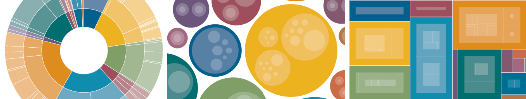
What are radial hierarchy charts and how to create one (with examples) Understand how radial charts work – explore radial trees, sunburst diagrams, and when to use each Posted on 08 May 2026 by Lavinia Rossi, Oli Darley, Simona Tselova
8 types of charts you need to master data visualization A beginner-friendly guide on what each chart shows, how to read it, and how to make it clearer Posted on 13 April 2026 by Simona Tselova
How to use radar charts for clear, insightful data stories Learn when radar charts work, when they mislead, and how to create clearer alternatives with Flourish Posted on 30 March 2026 by Duncan Clark, Simona Tselova, Lavinia Rossi
Bar graph vs line graph: how to choose the right chart A clear breakdown of when to use bar graphs versus line graphs — and how to choose the right one for your data. Posted on 20 March 2026 by Lavinia Rossi
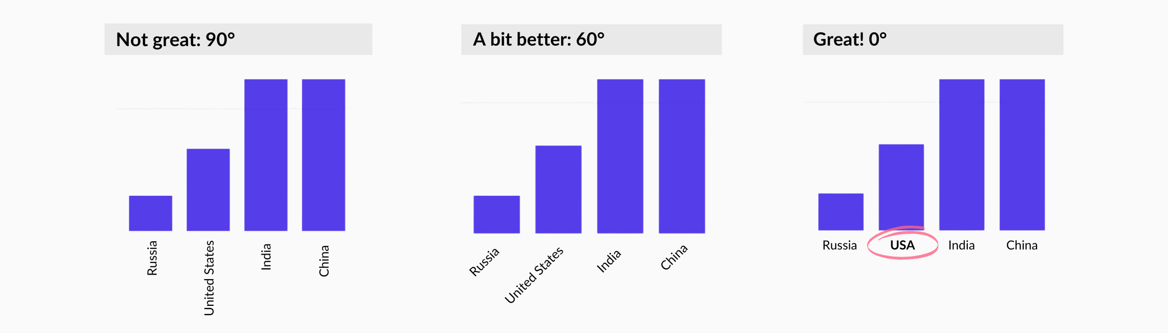
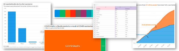
How to grab attention with data – my checklist for interactive storytelling What 3000 charts taught me about creating engaging visualizations Posted on 03 February 2026 by David Foster
Sales reporting: how to create interactive sales reports that drive business decisions A practical approach to sales reporting that leadership teams rely on Posted on 07 January 2026 by Rob Porter
Dual axis charts: why they spark debate, and how to get them right A closer look at how dual axis charts work, the ways they can mislead, and the moments when they genuinely reveal useful insights Posted on 18 December 2025 by Simona Tselova
Drive engagement: a guide to transforming charts with filters Reveal insights and comparisons in your data by adding interactive filters to your Flourish visualizations Posted on 22 October 2025 by Vanessa Fillis
How AI can help you make better charts Learn six practical ways to leverage AI for data visualization Posted on 07 July 2025 by María Fernanda Callejón
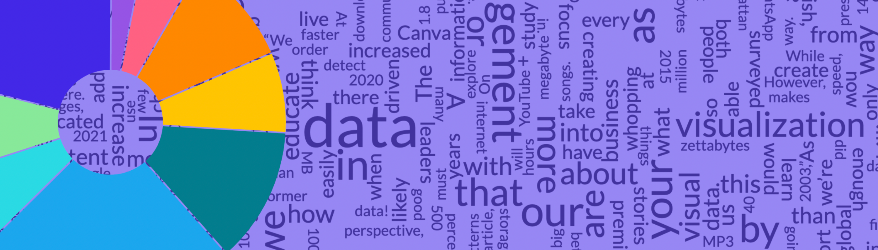
Beyond the Numbers: data that connects starts with storytelling Takeaways from Canva’s new report to elevate how your business works with data Posted on 05 June 2025 by Simona Tselova
A marketer’s guide to data storytelling: from insight to impact Showcase results, identify trends, and get buy-in with visualizations that speak louder than numbers Posted on 05 June 2025 by Cherie Robertson
From numbers to narrative: smarter ways to share sales performance Learn how to turn sales metrics into clear, useful stories that drive action Posted on 05 June 2025 by Cherie Robertson
Linear vs logarithmic: choosing the right scale for your story Discover when to use linear or logarithmic scales to bring clarity to your data and tell a stronger story Posted on 13 March 2025 by María Fernanda Callejón
8 easy ways to visualize financial market data Bring clarity to complex financial data with interactive data visualizations Posted on 19 June 2024 by Scott Barber and Vanessa Fillis
Rethinking chart legends: when and how to use them? Combining legends with titles makes your visualizations simpler and more impactful – and it’s super easy in Flourish Posted on 05 June 2024 by Simona Tselova
How to identify trends and patterns with data visualization Discover five engaging chart types to show the story behind your data, from dynamic bump charts to informative scatter plots Posted on 26 April 2024 by Mafe Callejón and Vanessa Fillis
Daring to diverge: Flourish and WPP’s journey in data storytelling Uncover the process behind creating engaging and interactive visualizations that push the boundaries of conventional data design Posted on 19 April 2024 by Oli Darley
5 pitfalls to avoid when working with color in data visualization Mastering color theory for impactful data storytelling Posted on 15 November 2023 by Vanessa Fillis, Mafe Callejón and Simona Tselova
How we’re making Flourish visualizations more accessible Explore our latest updates and learn about our commitment to accessibility Posted on 13 November 2023 by Luisa Bider
A beginner’s guide to using text in data visualization Discover the most effective techniques for using text to create clear and understandable data visualizations Posted on 15 September 2023 by Simona Tselova
How to choose the right chart type for your data Confused about which visualization type to choose? This post will help you pick the most effective Flourish visualization for your data Posted on 13 September 2023 by Vanessa Fillis and Anna Powell-Smith
Masters series: William Playfair, the father of statistical graphics Celebrating the legacy of the creator of the line chart, bar chart and pie chart 200 years after his death Posted on 22 February 2023 by Mafe Callejón
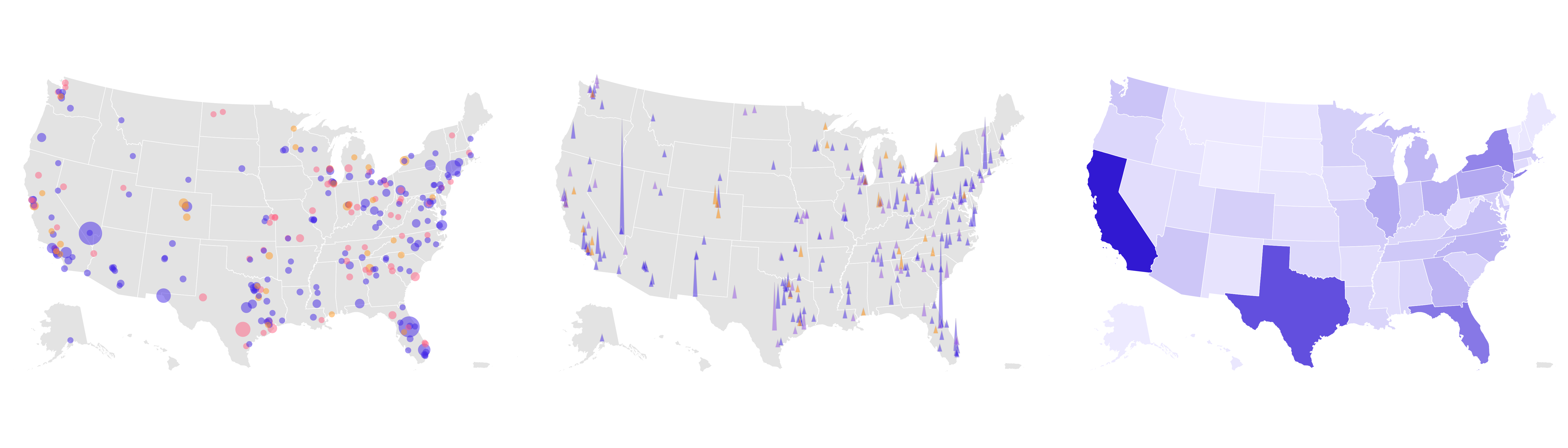
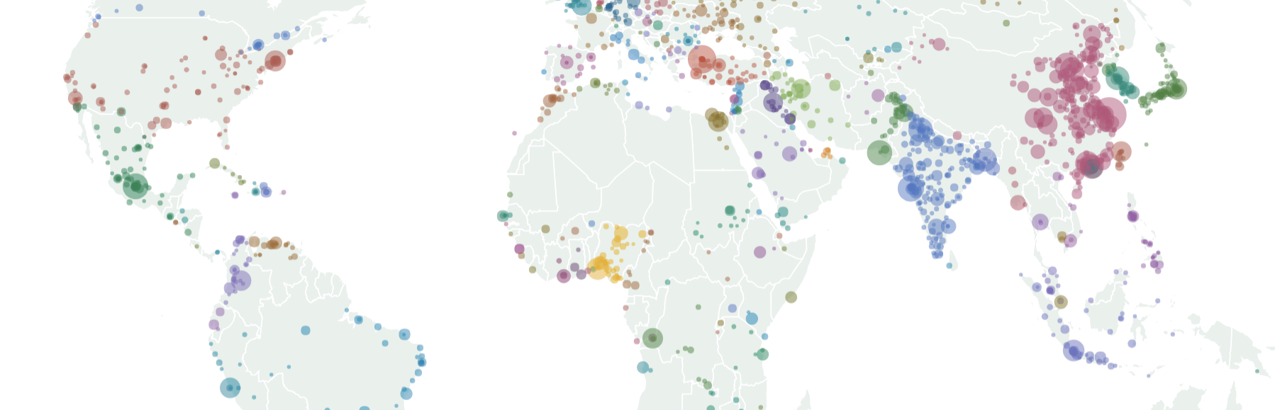
Choosing the right map type for your data Looking to represent your geographical data on a map? This post will help you pick the most effective map type for your data Posted on 01 February 2023 by Mafe Callejón
A guide to creating charts and graphs for social media Learn how to create visually appealing charts for social media using Flourish and Canva Posted on 06 January 2023 by Simona Tselova and Annie Parker
Enhance your data storytelling with animated charts Five ways to create animated charts that bring your data to the next level Posted on 02 December 2022 by Simona Tselova
7 quick ways to upgrade your data visualizations Sharing our top tips on how to best use Flourish to create compelling visualizations – without the stress Posted on 21 November 2022 by Annie Parker
PDFs are bad for data visualization and storytelling – but what’s the alternative? The use of PDFs is common among organizations, but they don’t guarantee best results Posted on 26 October 2022 by Simona Tselova
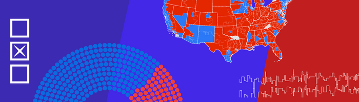
4 metrics to visualize in your elections coverage From voting intention to results, learn how you can bring elections data to life with interactive graphics Posted on 06 October 2022 by Mafe Callejón
Why data storytelling is important for your business How to effectively tell stories with data to convey a meaningful message across your industry Posted on 30 September 2022 by Simona Tselova
4 data visualization mistakes you’re probably making and how to fix them How to avoid misleading your readers with your charts Posted on 12 September 2022 by Yaning Wu and Mafe Callejón
Increasing engagement through data visualization How to flourish through data storytelling instead of data dashboarding Posted on 05 May 2022 by Simona Tselova
5 ways to effectively visualize survey responses On a scale of one to ten, how do you feel about visualizing survey data? Posted on 11 March 2022 by Yaning Wu
Masters series: Recreating John Snow's cholera map See an interactive version of John Snow's iconic cholera map Posted on 21 February 2022 by Mafe Callejón
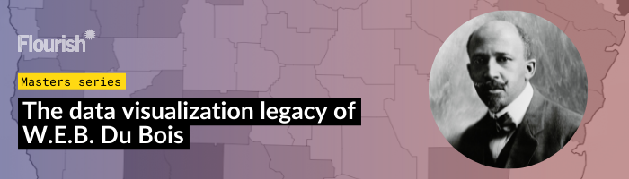
Masters series: The data visualization legacy of W.E.B. Du Bois Step-by-step guide on creating visualizatins inspired by Du Bois Posted on 18 October 2021 by Flourish team
One dataset, ten visualizations Exploring the possibilities, strengths and weaknesses of different chart types Posted on 13 October 2021 by Mafe Callejón
How data visualization can help you communicate effectively We recreated some of the IPCC's climate charts and this is what we learned Posted on 20 August 2021 by Mafe Callejón
A guide to creating compelling visualizations Introducing a five-step best data practice framework Posted on 10 August 2021 by Simona Tselova
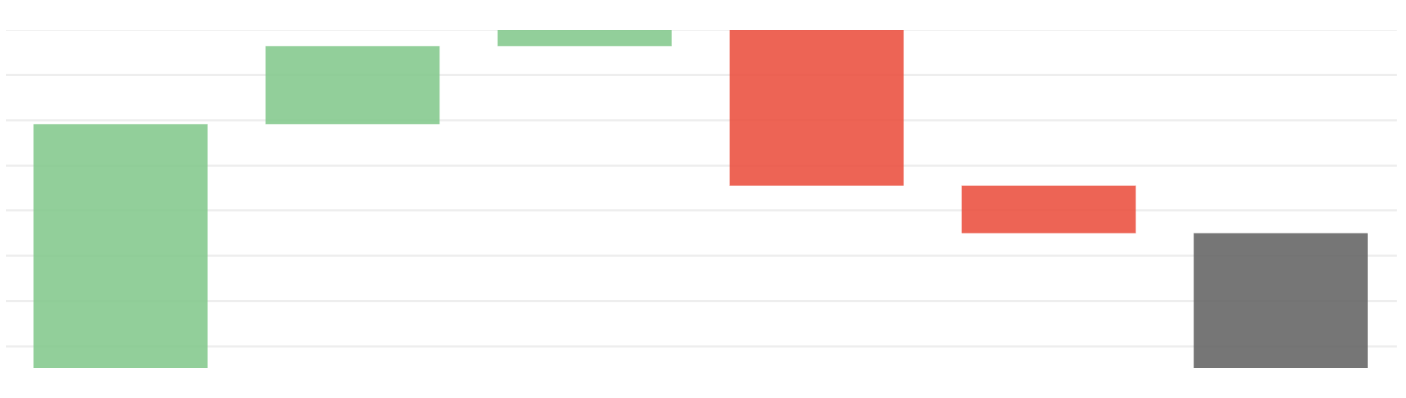
How to make interactive waterfall charts Easily create online waterfall charts that excel in visualizing financial insights Posted on 05 July 2021 by Helena Robertson
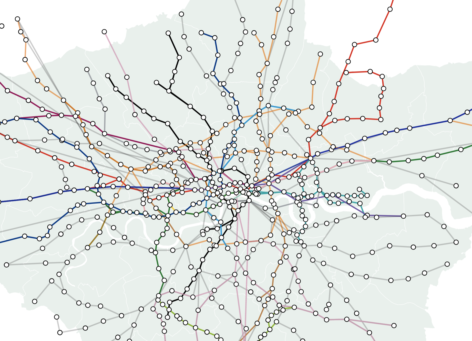
How to plot lines on a map and bring them to life with animation Visualize everything from railway lines to disputed borders with the line layers in our map templates Posted on 22 April 2021 by Helena Robertson, Luisa Bider and Vanessa Fillis
Masters series: Maarten Lambrechts' connected scatter plot Our series celebrates great visualizers and helps Flourish users follow in their tracks Posted on 06 April 2021 by Olivia Lawlor and Helena Robertson
3 ways to make your charts more accessible How to increase impact and engagement by designing for everyone Posted on 01 March 2021 by Lyndsey Pereira-Brereton and Luisa Bider
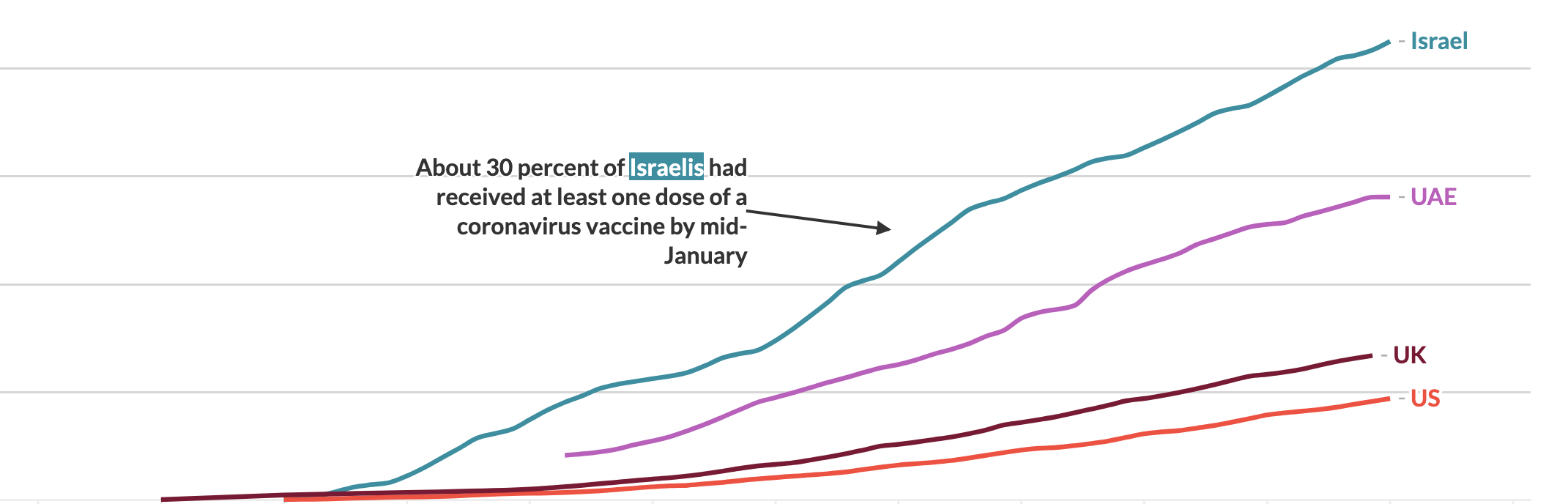
Masters series: John Burn-Murdoch’s step-by-step animated line chart We replicated John Burn-Murdoch’s animated line chart in Flourish, showcasing a compelling illustration of data storytelling Posted on 19 January 2021 by Olivia Lawlor and Helena Robertson
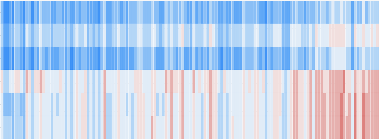
Unveiling patterns: how to master interactive heatmaps with Flourish 🔥 Explore heatmap examples, from climate science to market trends Posted on 16 July 2020 by Luisa Bider and Vanessa Fillis
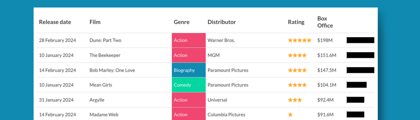
When tables are the most effective form of data visualization 7 situations where it makes sense to use an interactive table instead of a conventional visualization – and how to make them in Flourish Posted on 11 March 2019 by Vanessa Fillis and Katherine Riley
Your ultimate guide to creating custom maps with Flourish With our Projection Map template, you can upload new geographies and customize them Posted on 23 October 2018 by Flourish team
How to visualize hierarchical data with Flourish From treemaps to radial trees, Flourish’s Hierarchy template makes it possible to produce five types of zoomable graphics without coding Posted on 20 September 2018 by Vanessa Fillis and Duncan Clark
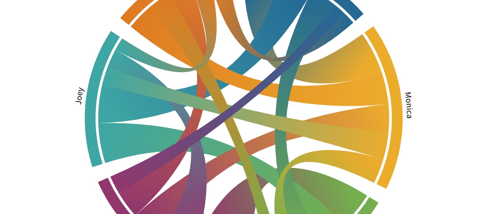
How to create interactive chord diagrams Easily visualize connections with our Chord Diagram template Posted on 25 July 2018 by Vanessa Fillis and Julien Assouline
How to create interactive parliament charts in Flourish Effortlessly visualize election results with our interactive Parliament Chart template Posted on 06 July 2018 by Vanessa Fillis and Julien Assouline