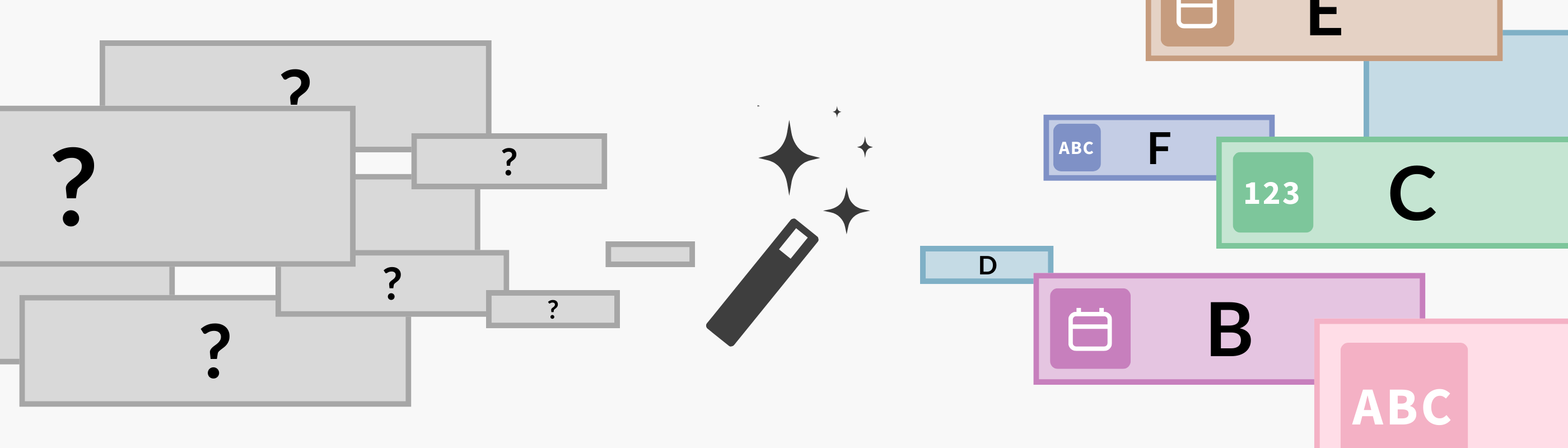
Introducing the Flourish Assistant and Connector A new way to create with AI, in Flourish and beyond Posted on 23 July 2026 by Duncan Clark
Big news: Two new ways to tell better stories with your data 🎉 Introducing ‘Start with data’ and a refreshed Flourish app in Canva Posted on 11 April 2025 by Flourish team
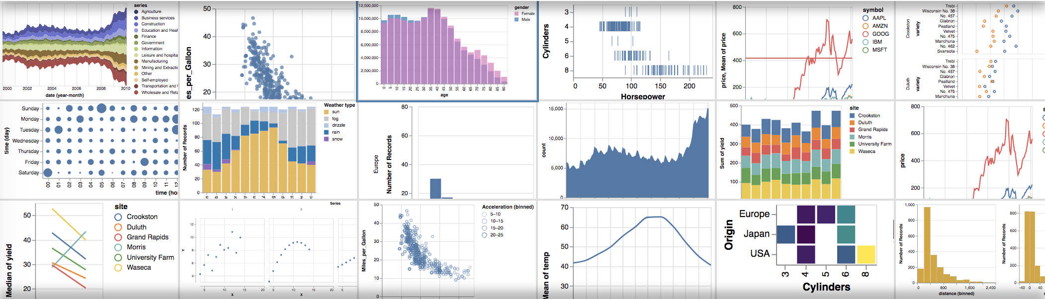
Flourish: Your data, beautifully told Our refreshed brand embodies what we stand for – human, truth and magic Posted on 12 December 2024 by Flourish Marketing Team
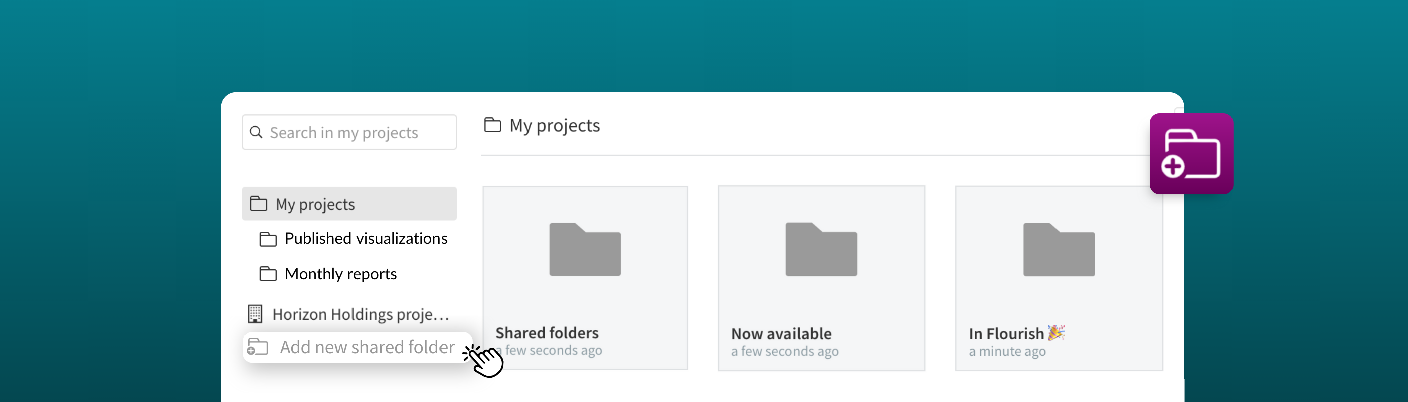
Organize, centralize, and collaborate with shared folders 🗂 The new folder system brings a level of simplicity and collaboration to managing your team’s projects Posted on 29 May 2024 by Vanessa Fillis and Simona Tselova
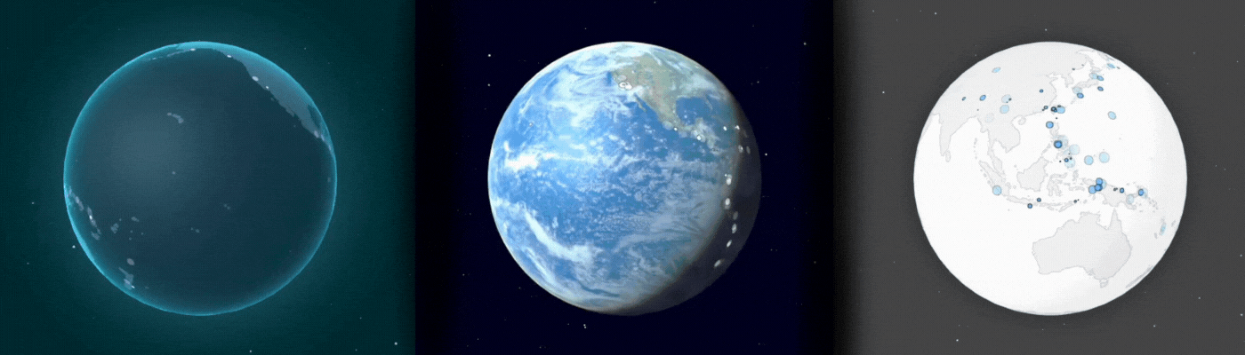
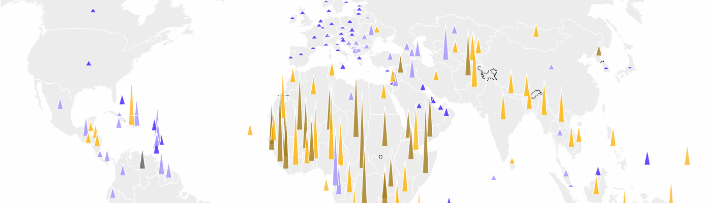
Explore the world in data: introducing the 3D Globe Redefine the way you tell stories about the world with our new 3D Globe template Posted on 01 November 2023 by Vanessa Fillis and Simona Tselova
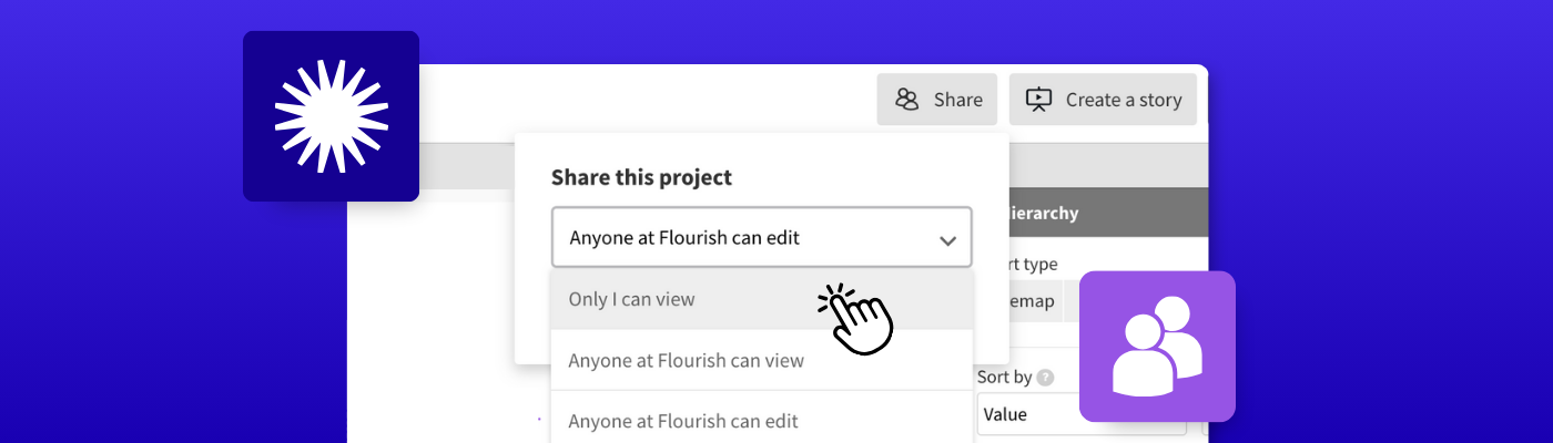
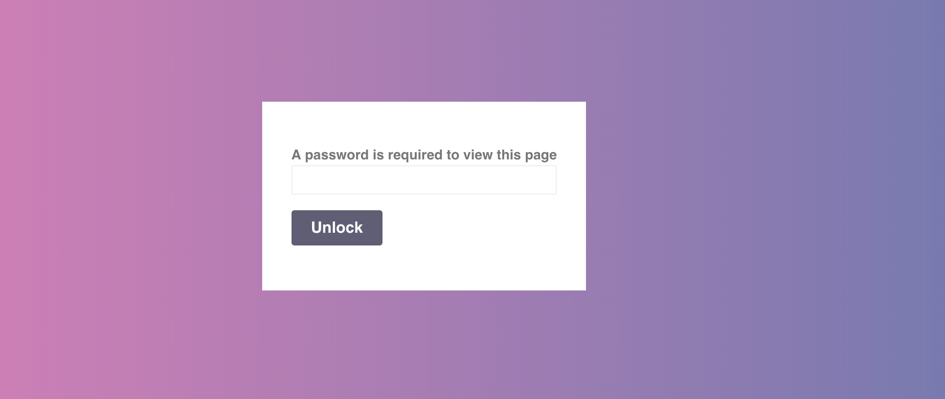
Unlock powerful collaboration with sharing permissions in Flourish Take control of your visualizations and stories for seamless teamwork Posted on 12 October 2023 by Vanessa Fillis
From static to interactive: turn SVG diagrams into exciting experiences on your website Captivate and educate your audience with interactive illustrations, infographics, and website elements Posted on 25 August 2023 by Vanessa Fillis
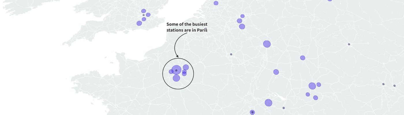
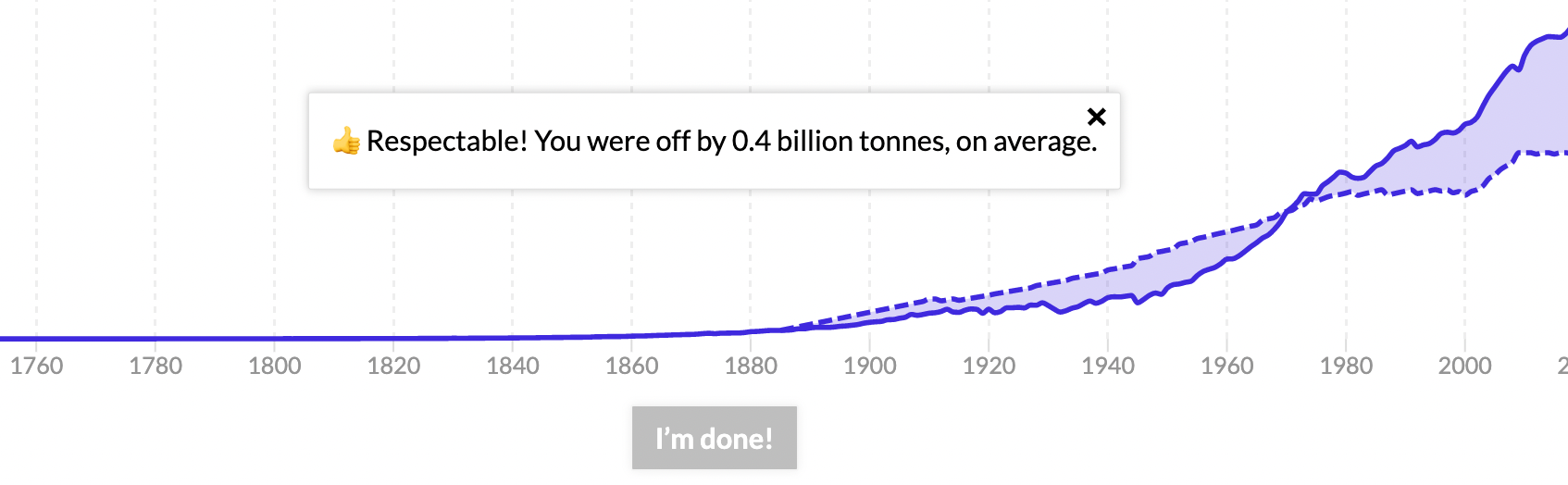
Elevate your data story with annotations Maximize the impact of your data visualizations by adding annotations to your charts and maps Posted on 03 August 2023 by Luisa Bider and Simona Tselova
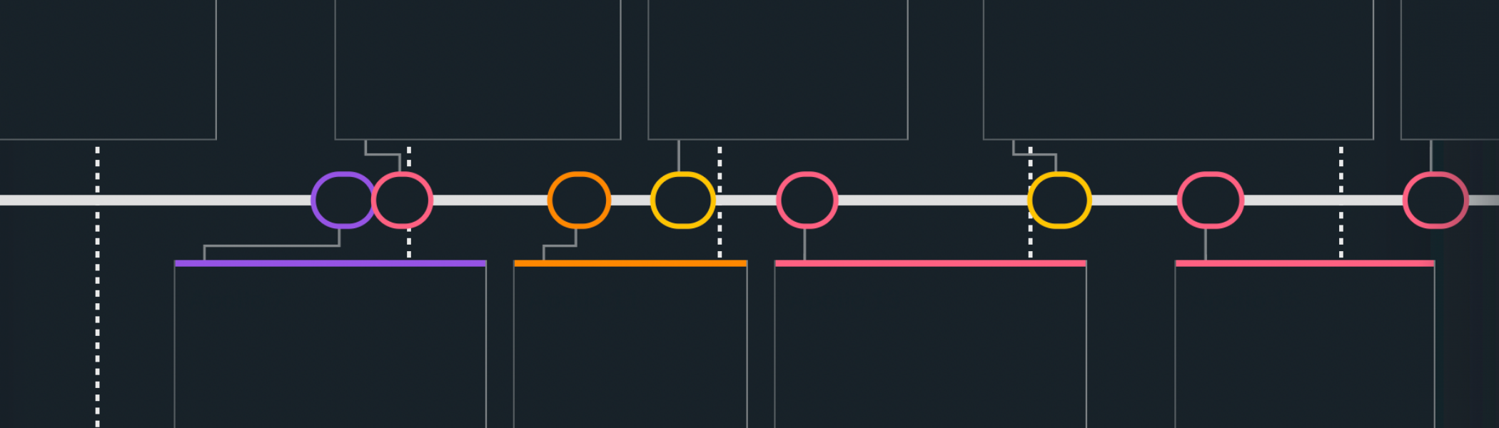
Introducing scrollytelling: the future of immersive data storytelling Creating immersive digital stories is easier than ever with our new no-code scrollytelling builder Posted on 10 May 2023 by Simona Tselova
Boost engagement with interactive calculators – from budgets to carbon footprints Discover our premium template, perfect for creating powerful, embeddable calculators – with Google Sheets integration Posted on 20 April 2023 by Luisa Bider
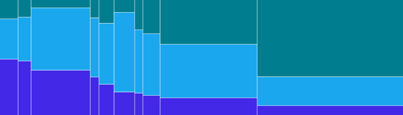
How to create interactive marimekko charts Compare magnitude and part-to-whole with our new Marimekko template Posted on 07 December 2022 by Mafe Callejón
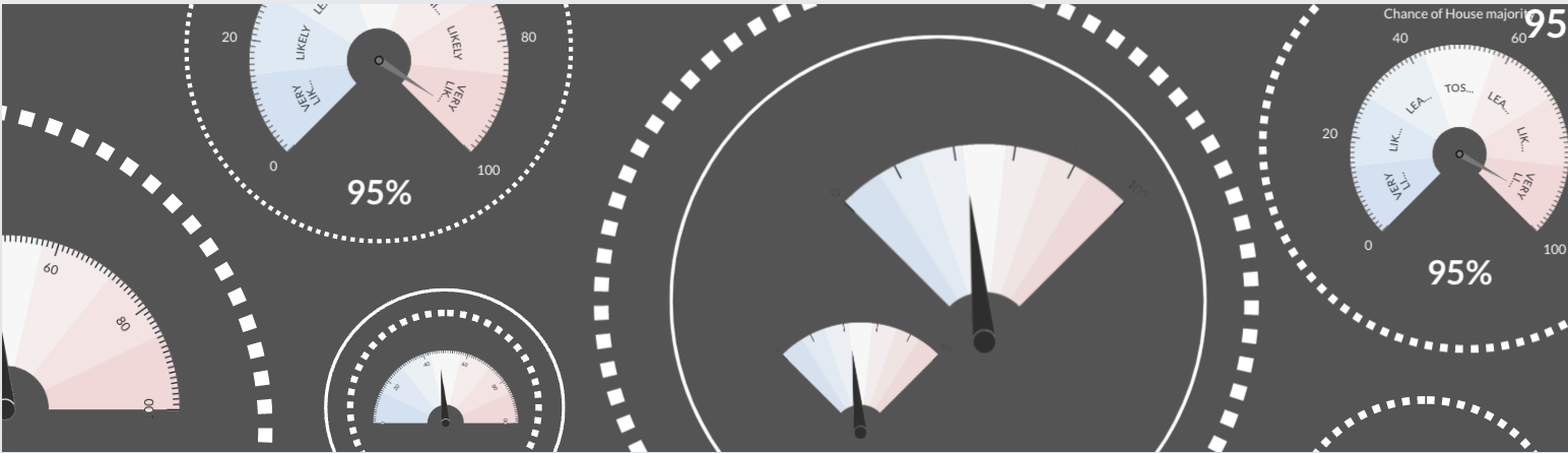
How to create interactive gauge visualizations Track everything from KPIs to elections data with our new Gauge template Posted on 04 November 2022 by Luisa Bider
Our Data Explorer template helps you find the stories in your data – and tell them beautifully The new template allows you to morph between various chart and map types to create rich and compelling data stories Posted on 08 August 2022 by Mafe Callejón
Bring your text to life with our Text Annotator template Adding definitions, explanations and notes to text is now easier than ever Posted on 25 July 2022 by Simona Tselova and Luisa Bider
Automated column selection: an easier way of adding data to Flourish The new data typing feature marks the beginning of a more intuitive data visualization process Posted on 14 July 2022 by Simona Tselova
It’s about time: bring history to life with interactive timelines 🕰️ Design beautiful, responsive and interactive timelines that represent key events over time and captivate your audience Posted on 01 July 2022 by Simona Tselova
You can now create beautiful spike maps without coding ⛰️ Our Projection Map template now includes a new mode to transform points into spikes Posted on 20 June 2022 by Mafe Callejón and Simona Tselova
Draw The Line: introducing a chart type that invites you to participate Flourish now makes it easy to create fun and engaging “you draw it”-style line charts Posted on 26 April 2022 by Luisa Bider
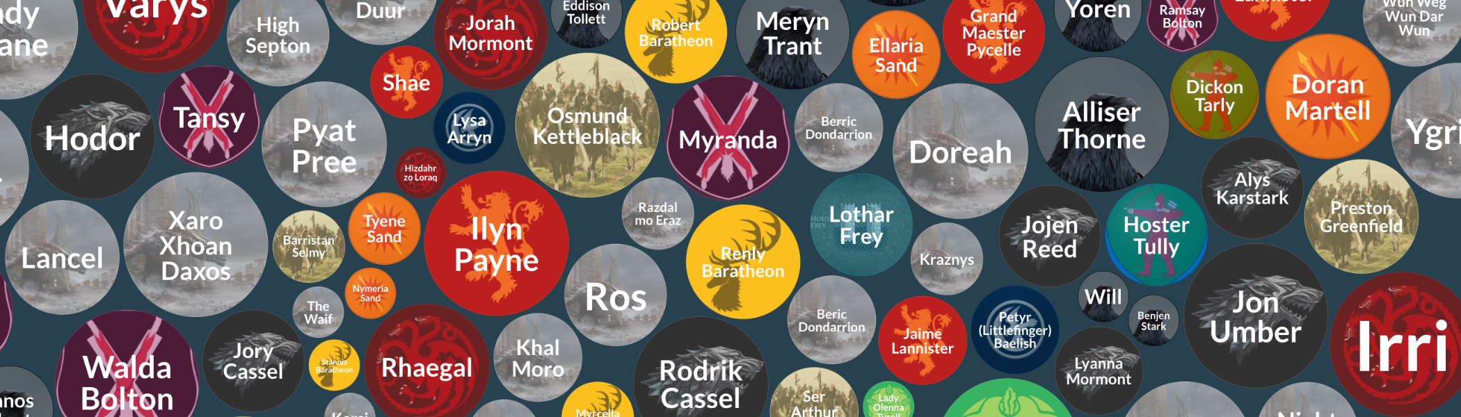
Bubbles, they bounce! Introducing bubble charts Make your visualizations pop with our new Bubble Chart template Posted on 18 February 2022 by Simona Tselova
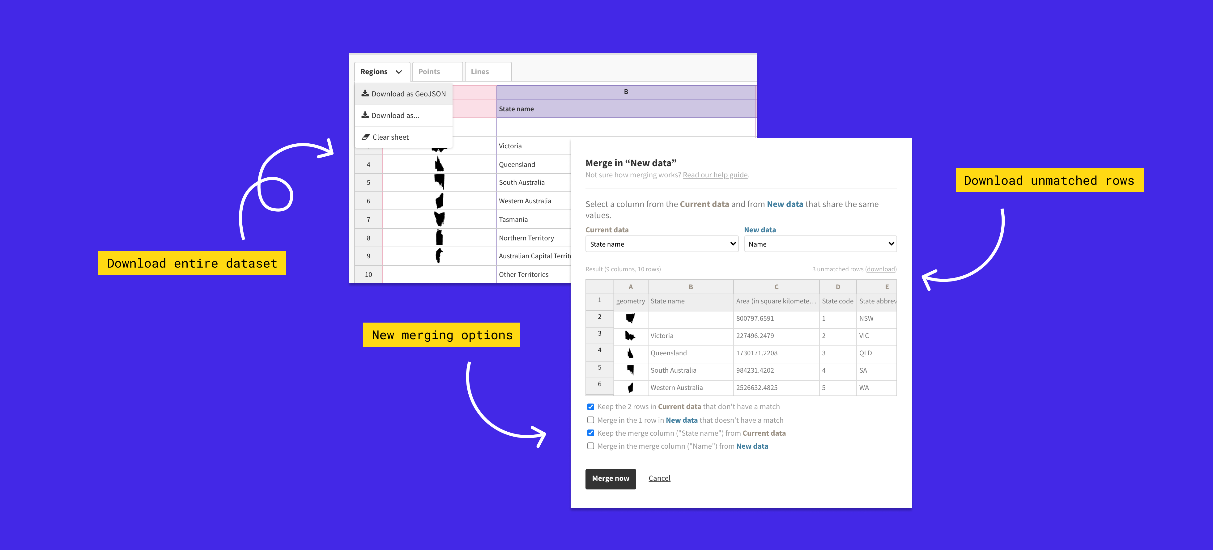
Let’s get merging! You can now join datasets more flexibly than ever Introducing our improved data joining and downloading functionality Posted on 14 December 2021 by Ilias Stathatos and Luisa Bider
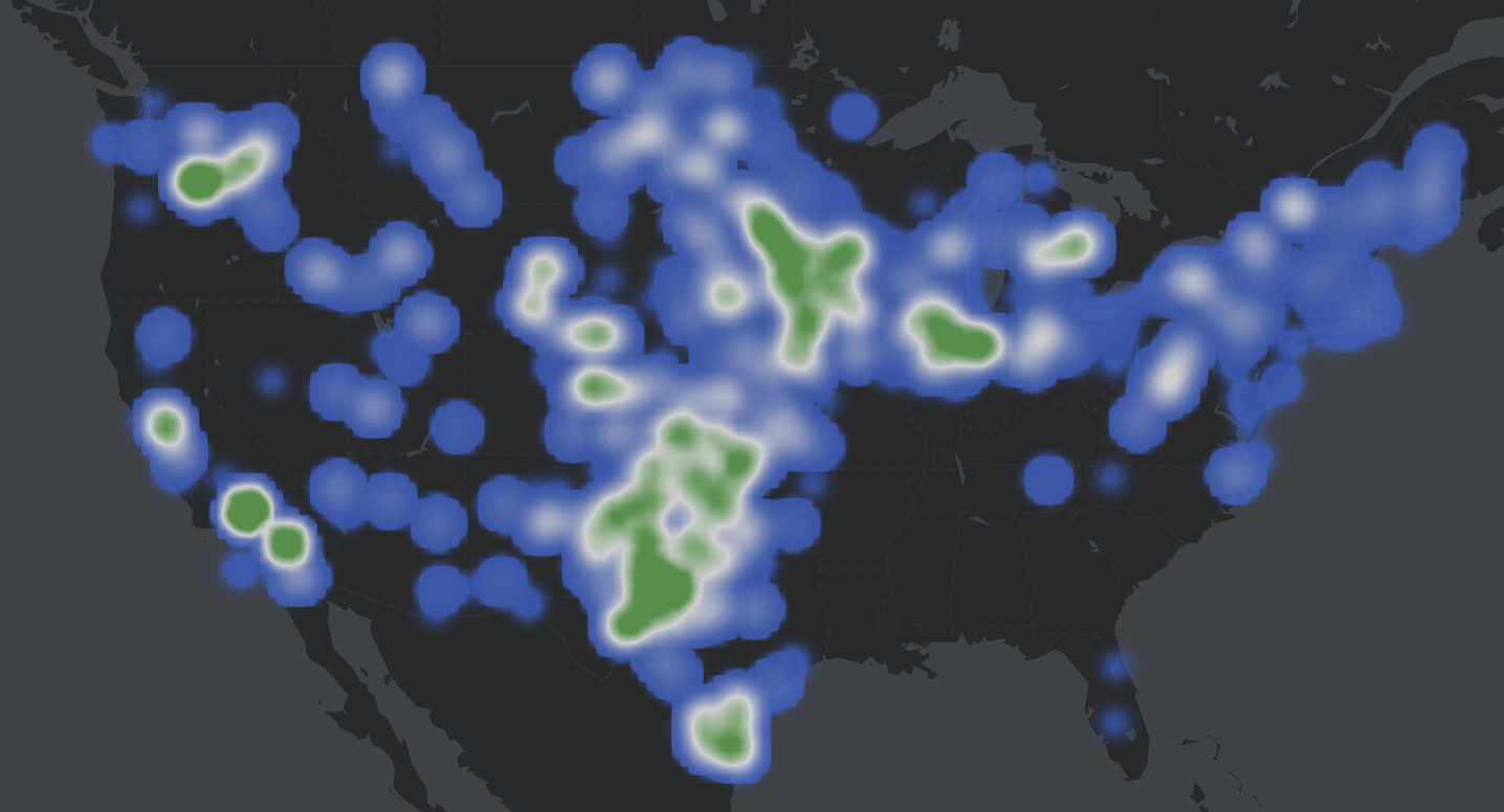
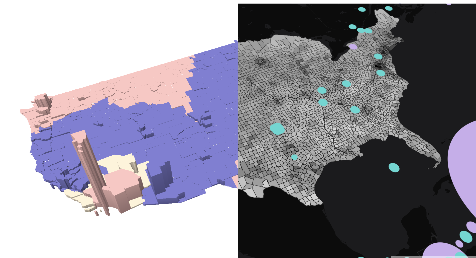
Introducing heatmaps, raster tiles and popup panels to our 3D Map template Our powerful 3D Map template now allows you to transform your points data into animated heatmaps Posted on 24 November 2021 by Luisa Bider
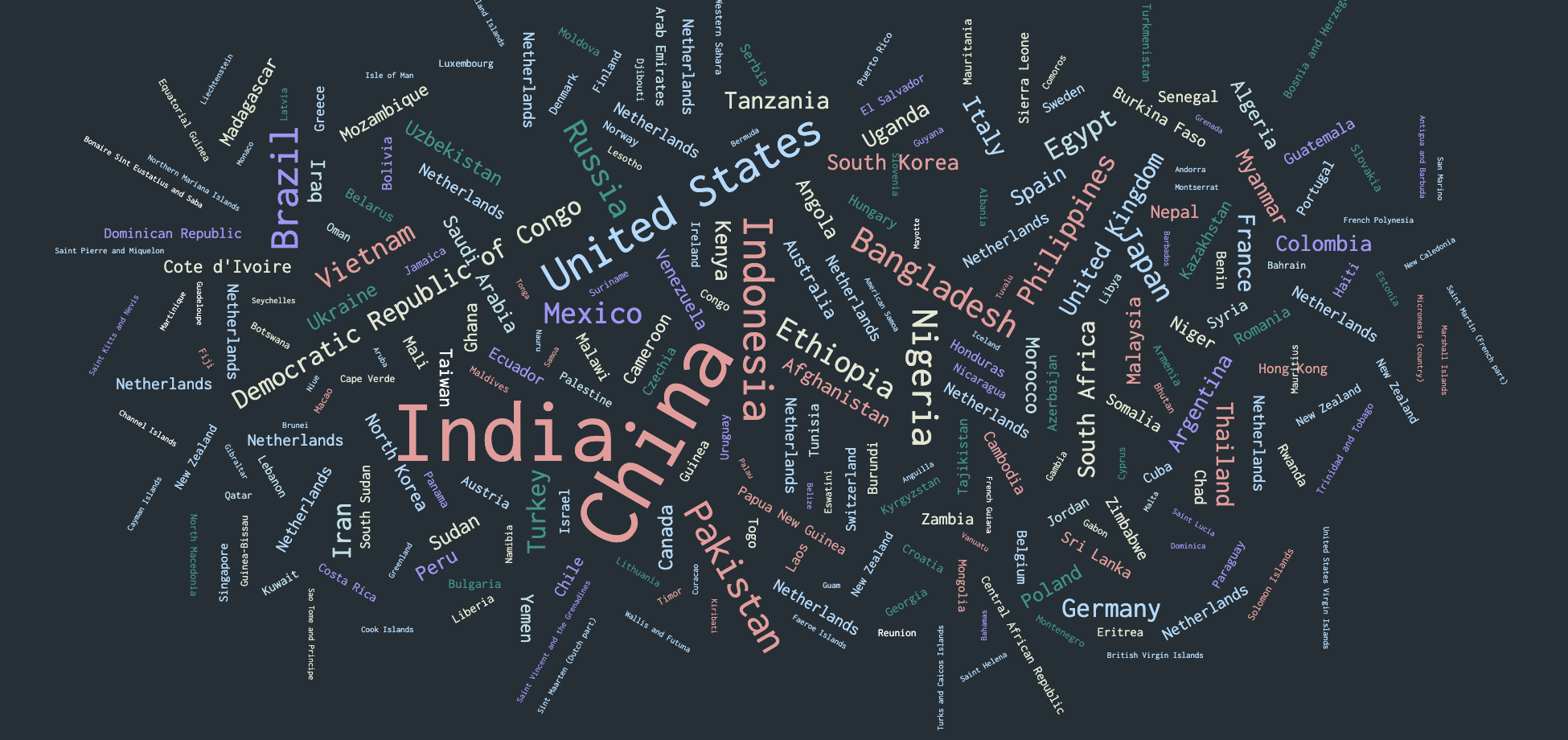
How to make a stunning word cloud in minutes 📖 Our template makes it simple to create beautiful embeddable word clouds, complete with animation and custom fonts Posted on 22 October 2021 by Ilias Stathatos
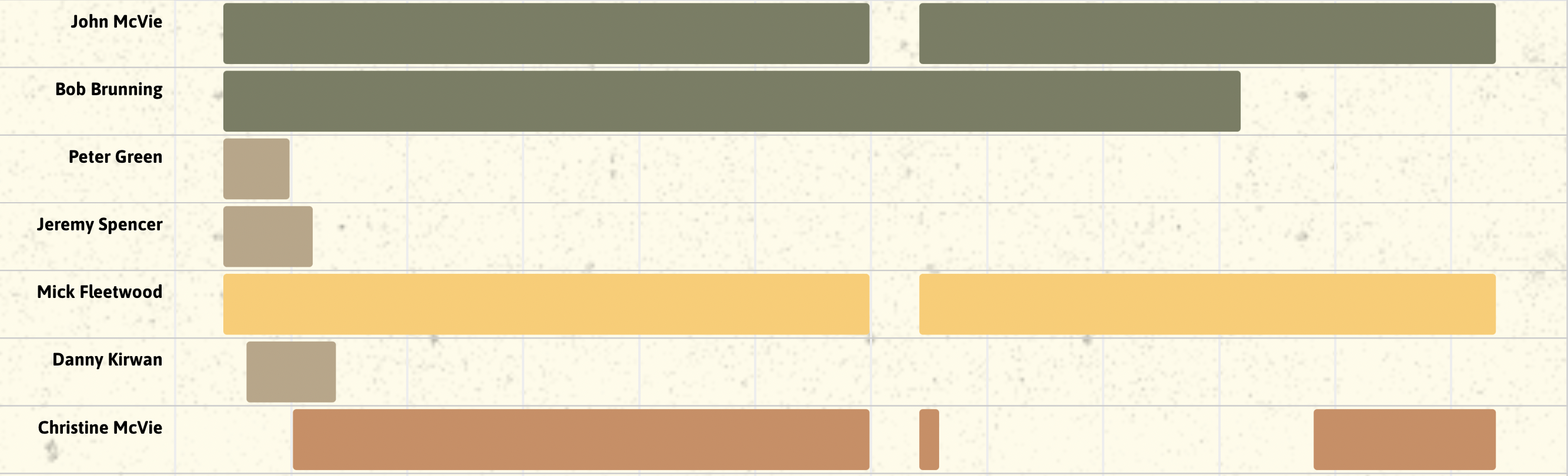
How to create beautiful, interactive Gantt charts Introducing a new Gantt template for project plans and much more Posted on 09 September 2021 by Olivia Lawlor
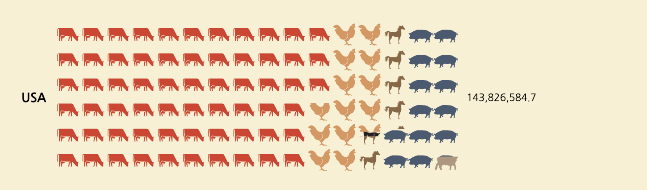
Create interactive pictograms without coding Create beautiful and interactive isotype charts with our Pictogram template Posted on 09 July 2021 by Luisa Bider and Duncan Clark
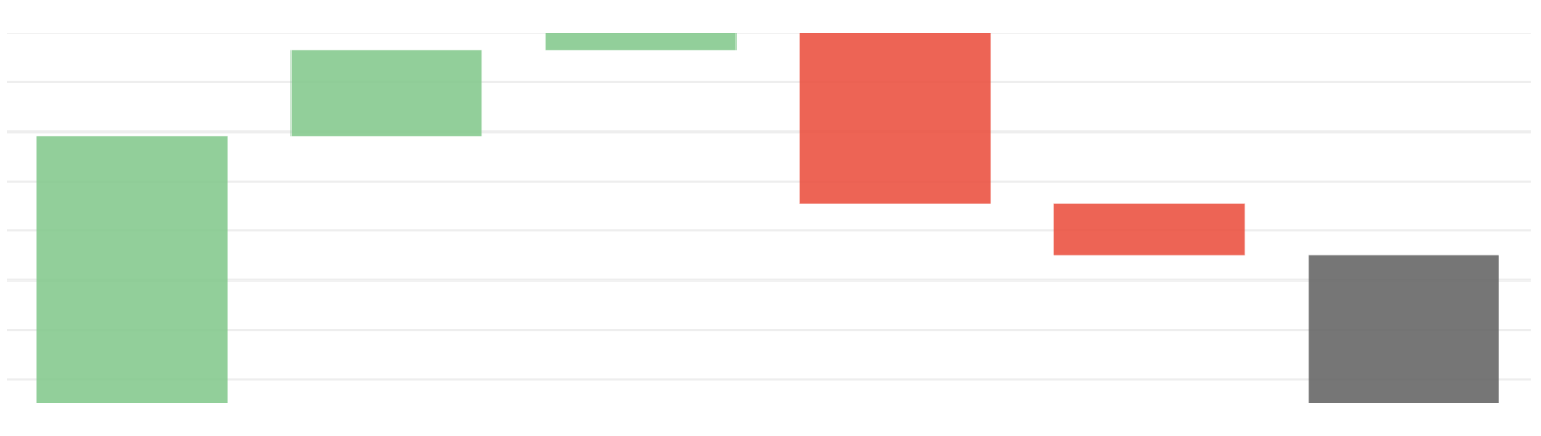
How to make interactive waterfall charts Easily create online waterfall charts that excel in visualizing financial insights Posted on 05 July 2021 by Helena Robertson
How to create eye-catching countdowns and number tickers without coding Our new templates make it easy to count up and down to numbers and dates Posted on 27 May 2021 by Luisa Bider
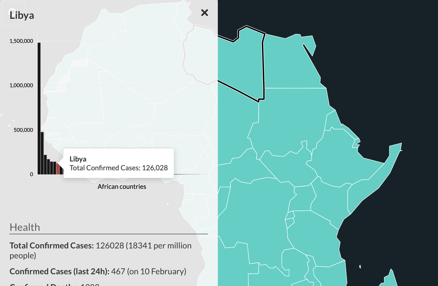
3 reasons why your charts need popups and panels The Flourish tooltip and panel overlay features offer more flexibility to tell rich data stories Posted on 04 March 2021 by Luisa Bider
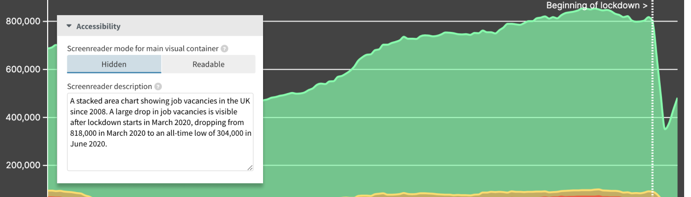
How to make your visualizations more accessible with good alternative descriptions Add text-based screenreader descriptions to the visual aspect of your Flourish graphics Posted on 18 November 2020 by Luisa Bider
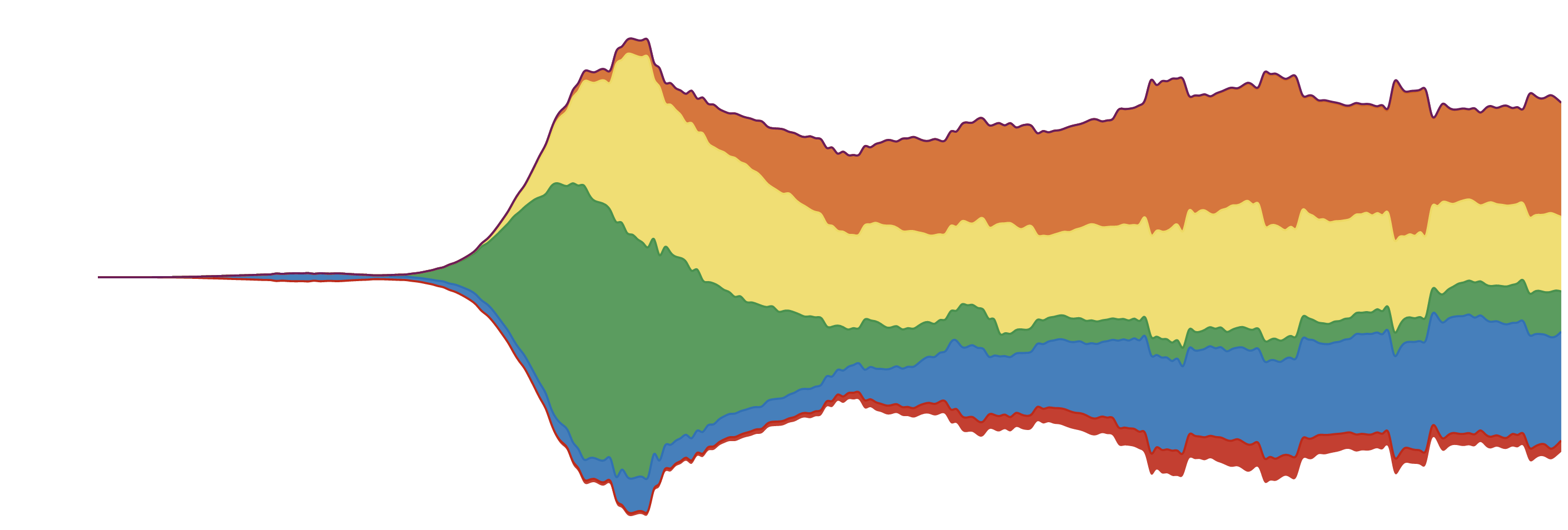
Streamgraphs: how to make them and what you need to know Streamgraphs effectively showcase data trends and patterns, and with Flourish, crafting one is easy and code-free Posted on 19 October 2020 by Luisa Bider
You can now add regions to your high-performance WebGL-based data maps Our powerful 3D Map template support regions in addition to points, timelines and basemaps Posted on 10 September 2020 by Luisa Bider
Unlock smarter decisions and enhance insights with live data visualizations Explore the benefits of creating real-time charts and maps from CSVs and Google Sheets Posted on 21 July 2020 by Luisa Bider
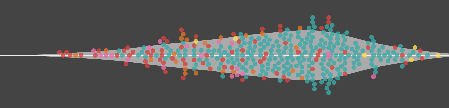
Introducing beeswarms 🐝, violin plots 🎻 and WebGL charts ⚡️ The latest version of our popular Scatter template adds both features and firepower Posted on 03 December 2019 by Katherine Riley
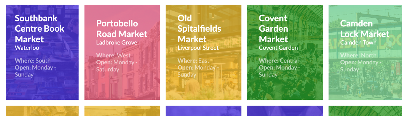
Elevate your visual storytelling with our flexible Cards template Easily create content blocks for landing pages with this highly customizable Flourish template Posted on 17 October 2019 by Sarah Soutoul
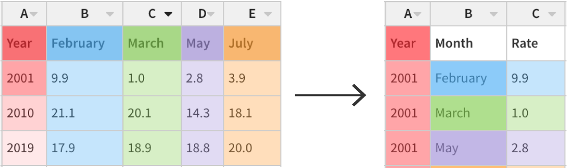
Never fear, unpivoting is here How to combine columns into long format using Flourish’s latest data table feature Posted on 15 October 2019 by Katherine Riley
(Ar)row row row your plot 🏹 You can now create interactive animated arrow plots to show the direction of change on a scatter chart or dot plot Posted on 27 August 2019 by Katherine Riley
Ready, set, race! How to make a line chart race visualization without coding The Line Chart Race template offers a dynamic perspective of your data, where every point tells a story Posted on 15 July 2019 by Duncan Clark
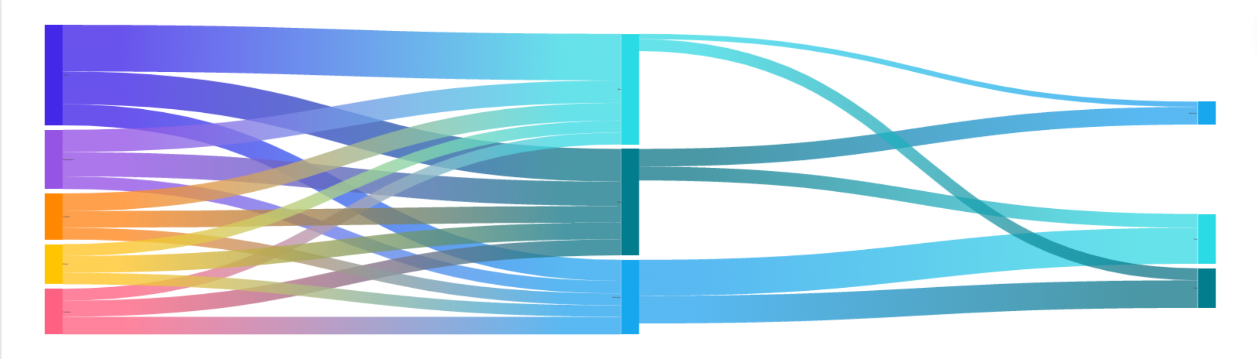
How to make animated Sankey charts and alluvial diagrams Our Sankey Diagram template lets you create stunning sankey and alluvial diagrams that help you visualize flow Posted on 12 July 2019 by Duncan Clark
How to make Bar Chart Race visualizations without coding Animated bar charts are taking social media by storm. You can now make one in seconds by uploading a spreadsheet to Flourish. Posted on 21 March 2019 by Katherine Riley
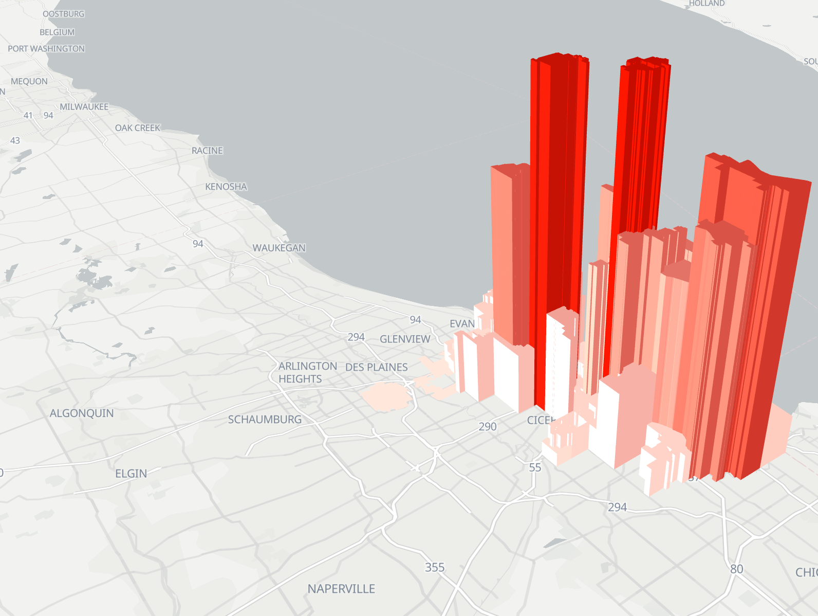
Announcing 3D region maps Use elevation levels to visualize geographic data Posted on 18 February 2019 by Katherine Riley
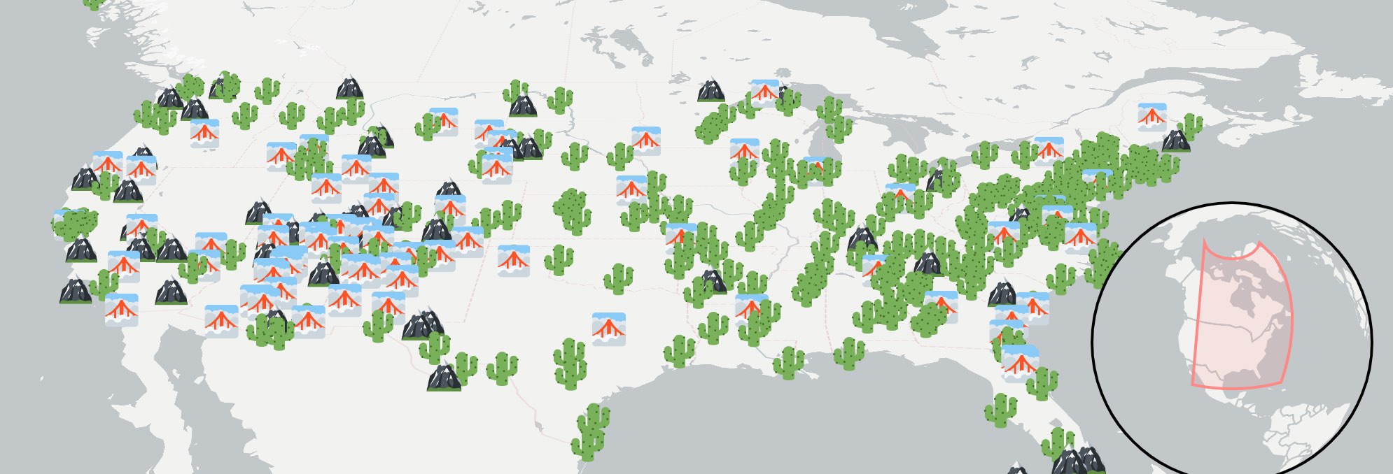
How to create stunning marker maps: dot maps, locator maps, and more Visualize data with icons, emojis and images for a more engaging user experience Posted on 11 December 2018 by Katherine Riley and Duncan Clark
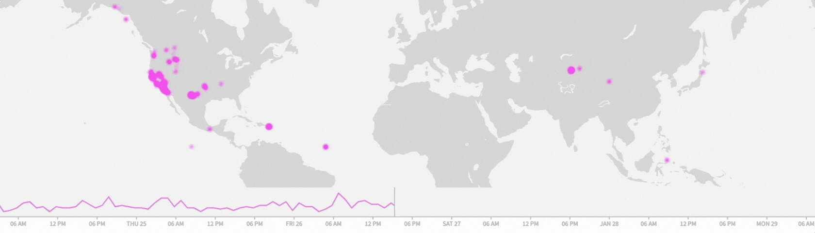
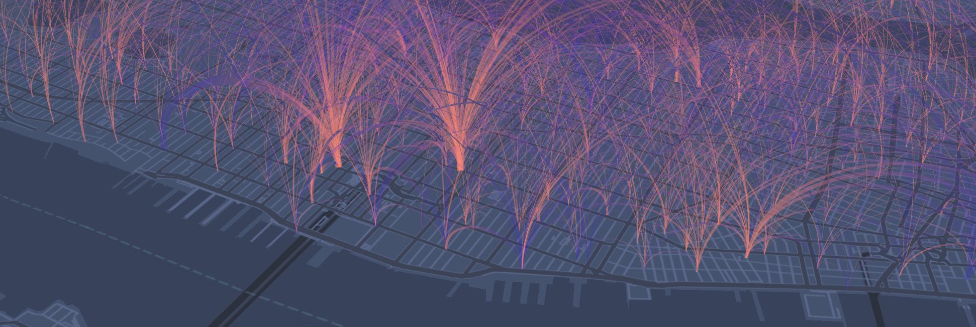
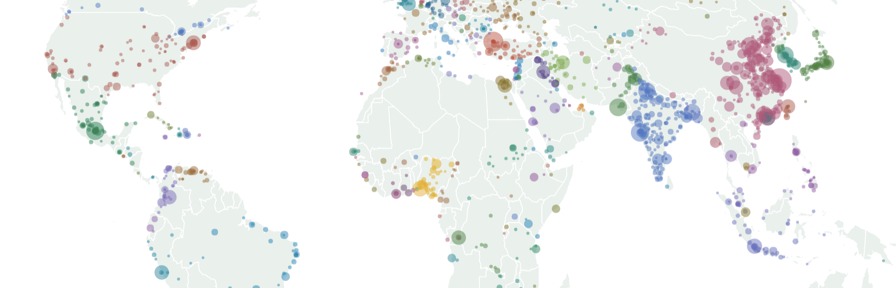
Announcing arc maps Visualize any kind of geographic flows with our new template Posted on 16 November 2018 by Katherine Riley
Your ultimate guide to creating custom maps with Flourish With our Projection Map template, you can upload new geographies and customize them Posted on 23 October 2018 by Flourish team
How Business users can manage their teams and protect their data Flourish's new company pages and approval workflows give Business users full control over users and access Posted on 24 August 2018 by Anna Powell-Smith
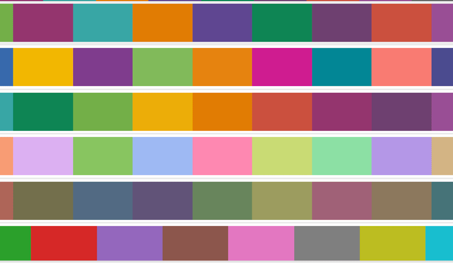
New! Tools to help you use color effectively in your visualizations Introducing the new Palette menu and other tools to give you full control over colors in your Flourish visualizations Posted on 21 August 2018 by Tim Brock
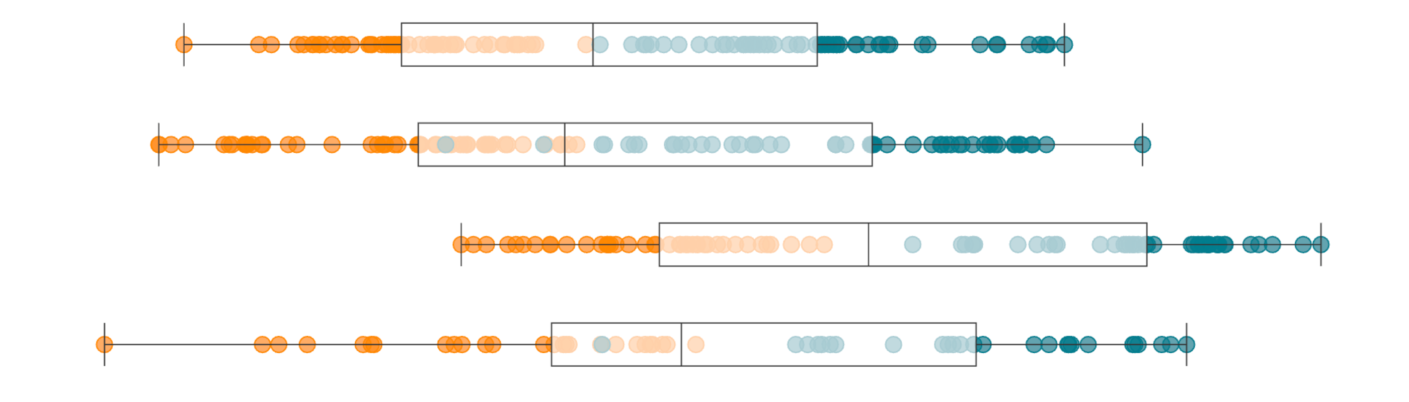
Box plots: what are they and how to build one without coding Use our box and whisker plot template to better explore the distribution of your data Posted on 22 June 2018 by Anna Powell-Smith
Now you can create and publish Vega-Lite charts in Flourish Our new template makes it easy to publish charts using Vega-Lite configuration Posted on 29 May 2018 by Anna Powell-Smith